HeroUI v3 正式发布
面向 React 与 React Native 的彻底重写。75+ Web 组件、37 个原生组件、Tailwind CSS v4、React Aria、复合组件架构,以及为 AI 辅助开发而打造的工具链。
每个组件都已重写。所有动画都已迁移到 CSS。样式与实现完全解耦。全新打造的 React Native 库。以及一套把 AI 助手视为「主要开发界面」的工具链。
概览
React(Web)
75+ 组件。无障碍能力由 React Aria Components 提供。基于 Tailwind CSS v4 + CSS 变量进行主题化。样式被独立成单独的包,可以与任意框架配合使用。
React Native
37 个组件,共享同一套设计 token、采用复合组件模式、统一的动画 API,以及自适应的呈现模式。每个平台都基于原生实现,并通过 Uniwind 提供 Tailwind CSS v4 的支持。
Watch the upstream demonstration recordingHeroUI Pro
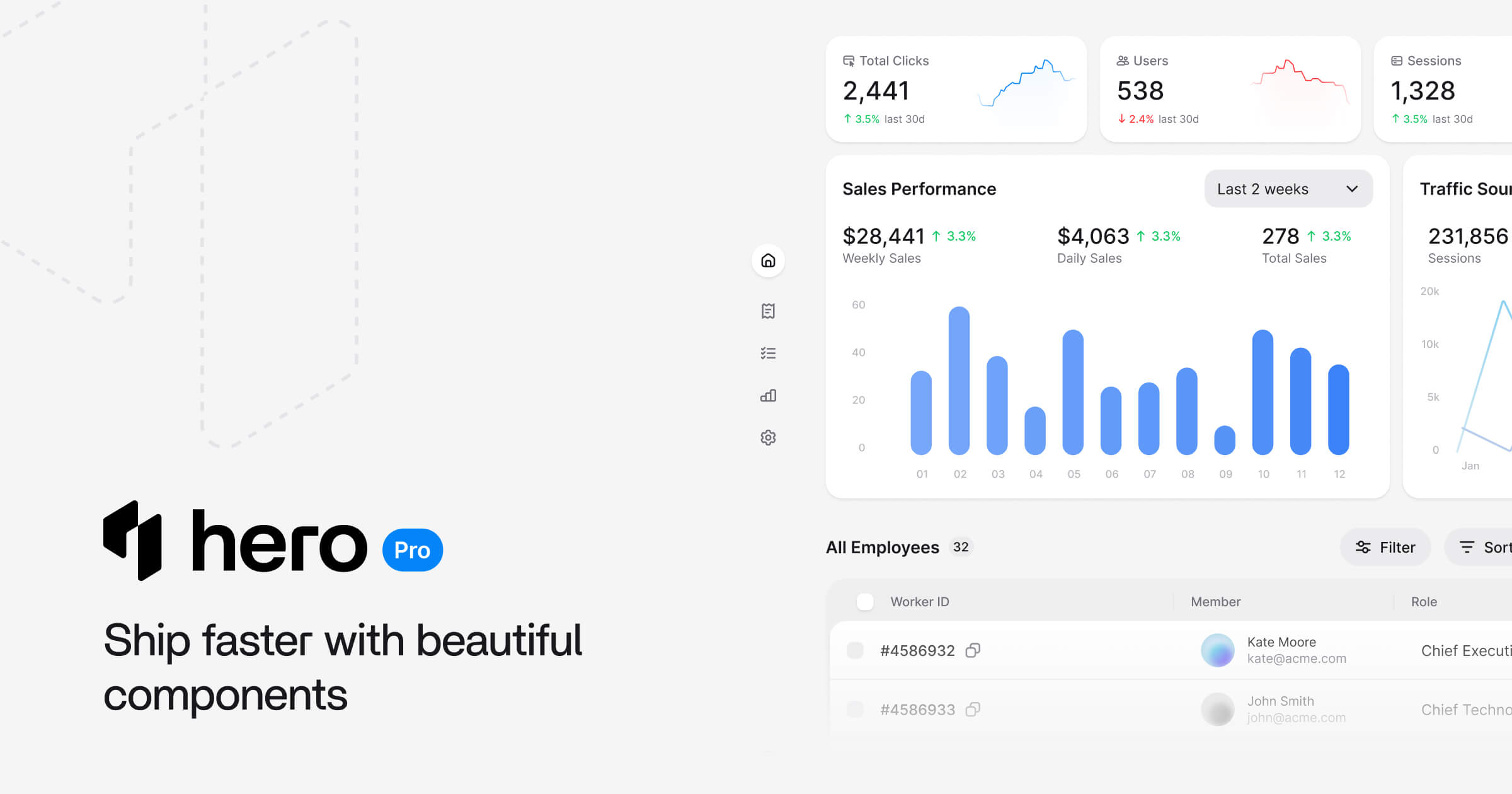
面向 React 与 React Native 的高级组件、模板与 AI 工具。包含 Command Palette、Kanban、DataGrid、Dashboard 模板等。预售价格已上线 heroui.pro。
设计原则
组合优于配置: v2 的组件是黑盒。v3 采用复合组件模式:每一个内部部件都是真实的元素,你可以为它们设置样式、调整位置、替换或移除。
样式与实现分离: @lenso/tokens 是独立的 CSS 包,@lenso/ui 负责行为逻辑。这套样式可以配合 React、原生 HTML + Tailwind 或任意框架使用。BEM 类名让每一个 slot 都能在全局层面被定制。切换主题不仅会改变变量,还能改变组件的外观与质感。
按需变身 Headless: 只要不引入 @lenso/tokens,你就拥有了一套 headless 组件库。我们负责功能与无障碍,你专注于自己的产品。
默认就有好性能: v2 的所有动画都依赖 Framer Motion。v3 已将其替换为原生的 CSS transition 与 keyframes。打包体积更小、可使用 GPU 加速,且无需任何 JS 动画运行时。
从一开始就无障碍: 已从 React Aria hooks 迁移到 React Aria Components。键盘导航、焦点管理、屏幕阅读器与 ARIA 属性均已内置。
复合组件
下面是复合组件模式在实际使用中的样子:
<Card> <Card.Header> <Card.Title>Product</Card.Title> <Card.Description>Details about this product.</Card.Description> </Card.Header> <Card.Body> <p>Card content goes here.</p> </Card.Body> <Card.Footer> <Button variant="primary">Buy now</Button> </Card.Footer></Card>代码确实多了几行。但每个部件都是真实的元素,你可以自由设置样式、调整位置或替换。这一模式贯穿整个组件库,从 Accordion 到 Toast 都是如此。
此预览复用英文版适配,不代表中文源示例已完成本地实现。
"use client";
import { ArrowsRotateLeft, Box, ChevronDown, CreditCard, PlanetEarth, Receipt, ShoppingBag,} from "@gravity-ui/icons";import { Accordion } from "@lenso/ui";import * as stylex from "@stylexjs/stylex";
const styles = stylex.create({ root: { width: "100%", maxWidth: 448 }, icon: { width: 16, height: 16, flexShrink: 0, marginInlineEnd: 12, color: "var(--muted)" },});const items = [ { title: "How do I place an order?", Icon: ShoppingBag, content: "Browse our products, add items to your cart, and proceed to checkout. You'll need to provide shipping and payment information to complete your purchase.", }, { title: "Can I modify or cancel my order?", Icon: Receipt, content: "Yes, you can modify or cancel your order before it's shipped. Once your order is processed, you can't make changes.", }, { title: "What payment methods do you accept?", Icon: CreditCard, content: "We accept all major credit cards, including Visa, Mastercard, and American Express.", }, { title: "How much does shipping cost?", Icon: Box, content: "Shipping costs vary based on your location and the size of your order. We offer free shipping for orders over $50.", }, { title: "Do you ship internationally?", Icon: PlanetEarth, content: "Yes, we ship to most countries. Please check our shipping rates and policies for more information.", }, { title: "How do I request a refund?", Icon: ArrowsRotateLeft, content: "If you're not satisfied with your purchase, you can request a refund within 30 days of purchase. Please contact our customer support team for assistance.", },];export function Basic() { return ( <Accordion xstyle={styles.root}> {items.map(({ title, content, Icon }) => ( <Accordion.Item key={title} value={title}> <Accordion.Heading> <Accordion.Trigger> <Icon aria-hidden="true" {...stylex.props(styles.icon)} /> {title} <Accordion.Indicator> <ChevronDown /> </Accordion.Indicator> </Accordion.Trigger> </Accordion.Heading> <Accordion.Panel> <Accordion.Body>{content}</Accordion.Body> </Accordion.Panel> </Accordion.Item> ))} </Accordion> );}Local adaptation source above. Derived from HeroUI v3.2.6 source.
每个复合组件都通过 React context 共享状态。根组件会创建样式 context,子组件依次消费。你无需手动逐层传递 className:
<Alert status="success"> <Alert.Indicator /> <Alert.Content> <Alert.Title>Profile updated</Alert.Title> <Alert.Description>Your changes have been saved.</Alert.Description> </Alert.Content></Alert>此预览复用英文版适配,不代表中文源示例已完成本地实现。
"use client";// Adapted from HeroUI v3.2.6 (e385ac202b2cdb94b1bf6fa76d32c31c8259cc5e), Apache-2.0.import { Alert, Button, CloseButton, Spinner } from "@lenso/ui";import * as stylex from "@stylexjs/stylex";import { s } from "../card/display.stylex";
export function Basic() { return ( <div {...stylex.props(s.alertStack)}> <Alert> <Alert.Indicator /> <Alert.Content> <Alert.Title>New features available</Alert.Title> <Alert.Description> Check out our latest updates including dark mode support and improved accessibility features. </Alert.Description> </Alert.Content> </Alert> <Alert status="accent"> <Alert.Indicator /> <Alert.Content> <Alert.Title>Update available</Alert.Title> <Alert.Description> A new version of the application is available. Please refresh to get the latest features and bug fixes. </Alert.Description> <Button xstyle={s.mobile2} size="sm" variant="primary"> Refresh </Button> </Alert.Content> <Button xstyle={s.desktopBlock} size="sm" variant="primary"> Refresh </Button> </Alert> <Alert status="danger"> <Alert.Indicator /> <Alert.Content> <Alert.Title>Unable to connect to server</Alert.Title> <Alert.Description> We're experiencing connection issues. Please try the following: <ul {...stylex.props(s.list)}> <li>Check your internet connection</li> <li {...stylex.props(s.space1)}>Refresh the page</li> <li {...stylex.props(s.space1)}>Clear your browser cache</li> </ul> </Alert.Description> <Button xstyle={s.mobile2} size="sm" variant="danger"> Retry </Button> </Alert.Content> <Button xstyle={s.desktopBlock} size="sm" variant="danger"> Retry </Button> </Alert> <Alert status="success"> <Alert.Indicator /> <Alert.Content> <Alert.Title>Profile updated successfully</Alert.Title> </Alert.Content> <CloseButton /> </Alert> <Alert status="accent"> <Alert.Indicator> <Spinner size="sm" /> </Alert.Indicator> <Alert.Content> <Alert.Title>Processing your request</Alert.Title> <Alert.Description> Please wait while we sync your data. This may take a few moments. </Alert.Description> </Alert.Content> </Alert> <Alert status="warning"> <Alert.Indicator /> <Alert.Content> <Alert.Title>Scheduled maintenance</Alert.Title> <Alert.Description> Our services will be unavailable on Sunday, March 15th from 2:00 AM to 6:00 AM UTC for scheduled maintenance. </Alert.Description> </Alert.Content> </Alert> </div> );}Local adaptation source above. Derived from HeroUI v3.2.6 source.
渐进式呈现
组件同时支持简单写法和复合写法。先从一行代码起步,需要时再补充结构:
// One line<Button>Submit</Button>
// With icon<Button> <Icon icon="gravity-ui:check" /> Submit</Button>
// Full control<Button variant="primary" size="lg" isDisabled={isLoading}> {isLoading ? <Spinner size="sm" /> : <Icon icon="gravity-ui:check" />} {isLoading ? "Saving..." : "Submit"}</Button>此预览复用英文版适配,不代表中文源示例已完成本地实现。
"use client";
import { Button } from "@lenso/ui";import * as stylex from "@stylexjs/stylex";
const styles = stylex.create({ row: { display: "flex", flexWrap: "wrap", gap: 12 } });export function Variants() { return ( <div {...stylex.props(styles.row)}> <Button variant="primary">Primary</Button> <Button variant="secondary">Secondary</Button> <Button variant="tertiary">Tertiary</Button> <Button variant="outline">Outline</Button> <Button variant="ghost">Ghost</Button> <Button variant="danger">Danger</Button> <Button variant="danger-soft">Danger Soft</Button> </div> );}Local adaptation source above. Derived from HeroUI v3.2.6 source.
Tailwind CSS v4 + CSS 变量
主题系统基于 Tailwind CSS v4 原生的 CSS 变量层与 OKLCH 颜色实现。每一个设计 token 都是一个 CSS 变量:
:root { --background: oklch(0.9702 0 0); --foreground: oklch(0.2103 0.0059 285.89); --accent: oklch(0.6204 0.195 253.83); --surface: oklch(100% 0 0); --danger: oklch(0.6532 0.2328 25.74); --radius: 0.5rem;}Tailwind 的 @theme 指令会将这些 token 映射为工具类。bg-accent、text-foreground、rounded-lg 都会解析为对应的 CSS 变量。切换浅色 / 深色模式只需替换变量值:
.dark, [data-theme="dark"] { --background: oklch(12% 0.005 285.823); --foreground: oklch(0.9911 0 0); --surface: oklch(0.2103 0.0059 285.89);}不需要 Provider 组件,也不需要 JavaScript 主题对象。一次 CSS 引入,两行代码:
@import "tailwindcss";@import "@lenso/tokens";BEM 类名
通过标准 CSS 即可在全局覆写任意组件:
@layer components { .button { @apply font-semibold tracking-wide; }
.button--primary { @apply bg-blue-600 hover:bg-blue-700; }}无需层层传递 className,也无需在 style prop 上反复折腾。设计系统的覆写就发生在 CSS 中——它本就属于这里。
自定义主题
通过定义你自己的 token 集合即可创建主题,其他一切都会随之级联:
@layer base { [data-theme="ocean"] { --accent: oklch(0.450 0.150 230); --background: oklch(0.985 0.015 225); --radius: 0.75rem; --border: oklch(0.50 0.060 230 / 22%); }}只需一个 data 属性即可应用:
<html data-theme="ocean">主题构建器 可以可视化地生成这些变量:选择颜色、调整圆角与间距,再导出 CSS。
按需引入
可以一次性引入完整样式库,也可以只挑选特定组件的样式:
@import "tailwindcss";@import "@lenso/tokens/base" layer(base);@import "@lenso/tokens/themes/default" layer(theme);@import "@lenso/tokens/components/button.css" layer(components);@import "@lenso/tokens/components/card.css" layer(components);只发布你实际用到的 CSS,避免在生产环境中携带未使用的组件样式。
尊重用户的动画
所有组件动画都通过 CSS transition 与 keyframes 实现,并绑定到对应的 data 属性。Popover 通过 [data-entering] 淡入,Button 在 [data-pressed] 时缩放,Accordion 通过 [aria-hidden="false"] 展开。
.popover[data-entering] { @apply animate-in zoom-in-90 fade-in-0 duration-200;}
.button:active,.button[data-pressed="true"] { transform: scale(0.97);}Reduce Motion
部分用户需要禁用动画。HeroUI 扩展了 Tailwind 的 motion-reduce: 变体,使其同时支持系统级偏好和自定义 data 属性:
.button { @apply transition-colors motion-reduce:transition-none;}它会响应原生的 prefers-reduced-motion: reduce 媒体查询,同时也会响应 HTML 元素上的 data-reduce-motion="true",从而支持应用级别的控制:
<html data-reduce-motion="true"> <!-- All HeroUI animations are disabled --></html>data 属性的优先级高于系统设置。将其设为 data-reduce-motion="false" 可强制开启动画,移除该属性则交由操作系统决定。所有带动画的组件都会遵循这一规则,无需额外开启。
自带动画库也无妨
Framer Motion、Motion One 或任何 CSS 动画库都可以与 HeroUI 内置的过渡共存:
import { motion } from "framer-motion";import { Button } from "@lenso/ui";
const MotionButton = motion(Button);
<MotionButton whileHover={{ scale: 1.05 }} whileTap={{ scale: 0.95 }}> Animated</MotionButton>75+ React 组件
日期与时间
六个组件:Calendar、RangeCalendar、DateField、DatePicker、DateRangePicker 与 TimeField。基于 React Aria 的国际化日期库构建,默认支持公历、佛历、波斯历等多种历法。键盘导航、屏幕阅读器标签以及按区域格式化全部开箱即用。
此预览复用英文版适配,不代表中文源示例已完成本地实现。
"use client";
/** Adapted from the pinned HeroUI v3.2.6 basic.json. Copyright NextUI Inc. Apache-2.0. Local RAC label and StyleX replace source Label and utility classes. */import { Calendar, DateField, DatePicker } from "@lenso/ui";import * as stylex from "@stylexjs/stylex";
const styles = stylex.create({ field: { width: 288 } });export function Basic() { return ( <DatePicker xstyle={styles.field} name="date"> <DatePicker.Label>Date</DatePicker.Label> <DateField.Group fullWidth> <DateField.Input>{(segment) => <DateField.Segment segment={segment} />}</DateField.Input> <DateField.Suffix> <DatePicker.Trigger> <DatePicker.TriggerIndicator /> </DatePicker.Trigger> </DateField.Suffix> </DateField.Group> <DatePicker.Popover> <Calendar aria-label="Event date"> <Calendar.Header> <Calendar.YearPickerTrigger> <Calendar.YearPickerTriggerHeading /> <Calendar.YearPickerTriggerIndicator /> </Calendar.YearPickerTrigger> <Calendar.NavButton slot="previous" /> <Calendar.NavButton slot="next" /> </Calendar.Header> <Calendar.Grid> <Calendar.GridHeader> {(day) => <Calendar.HeaderCell>{day}</Calendar.HeaderCell>} </Calendar.GridHeader> <Calendar.GridBody>{(date) => <Calendar.Cell date={date} />}</Calendar.GridBody> </Calendar.Grid> <Calendar.YearPickerGrid> <Calendar.YearPickerGridBody> {({ year }) => <Calendar.YearPickerCell year={year} />} </Calendar.YearPickerGridBody> </Calendar.YearPickerGrid> </Calendar> </DatePicker.Popover> </DatePicker> );}Local adaptation source above. Derived from HeroUI v3.2.6 source.
此预览复用英文版适配,不代表中文源示例已完成本地实现。
"use client";
/** HeroUI v3.2.6 derived work. Copyright NextUI Inc. Apache-2.0. */import { RangeCalendar } from "@lenso/ui";
export function Basic() { return ( <RangeCalendar aria-label="Trip dates" firstDayOfWeek="mon"> <RangeCalendar.Header> <RangeCalendar.Heading /> <RangeCalendar.NavButton slot="previous" /> <RangeCalendar.NavButton slot="next" /> </RangeCalendar.Header> <RangeCalendar.Grid> <RangeCalendar.GridHeader> {(day) => <RangeCalendar.HeaderCell>{day}</RangeCalendar.HeaderCell>} </RangeCalendar.GridHeader> <RangeCalendar.GridBody> {(date) => <RangeCalendar.Cell date={date} />} </RangeCalendar.GridBody> </RangeCalendar.Grid> </RangeCalendar> );}Local adaptation source above. Derived from HeroUI v3.2.6 source.
颜色
六个颜色组件:ColorPicker、ColorArea、ColorSlider、ColorField、ColorSwatch 与 ColorSwatchPicker。可以在二维色域中取色、调整色相与透明度滑块、输入 hex 值,或从色板中直接选择。
此预览复用英文版适配,不代表中文源示例已完成本地实现。
"use client";
import { ColorArea, ColorPicker, ColorSlider, ColorSwatch } from "@lenso/ui";import * as stylex from "@stylexjs/stylex";
const styles = stylex.create({ area: { maxWidth: "100%" }, slider: { gap: 4, paddingInline: 4 }, output: { color: "var(--muted)" },});export function Basic() { return ( <ColorPicker defaultValue="#0485F7"> <ColorPicker.Trigger> <ColorSwatch size="lg" /> <span>Pick a color</span> </ColorPicker.Trigger> <ColorPicker.Popover> <ColorArea aria-label="Color area" xstyle={styles.area} colorSpace="hsb" xChannel="saturation" yChannel="brightness" > <ColorArea.Thumb /> </ColorArea> <ColorSlider aria-label="Hue" channel="hue" xstyle={styles.slider} colorSpace="hsb"> <span>Hue</span> <ColorSlider.Output xstyle={styles.output} /> <ColorSlider.Track> <ColorSlider.Thumb /> </ColorSlider.Track> </ColorSlider> </ColorPicker.Popover> </ColorPicker> );}Local adaptation source above. Derived from HeroUI v3.2.6 source.
数据
需要一个支持排序、行选择、列宽调整、异步加载与自定义单元格的表格?Table 全部都能搞定。面对大数据集时,可借助 React Aria 的 Virtualizer 启用虚拟化,ListBox 也共享同样的虚拟化能力。
此预览复用英文版适配,不代表中文源示例已完成本地实现。
"use client";// HeroUI v3.2.6 virtualization adaptation (Apache-2.0); native row spacers.import { Table } from "@lenso/ui";import { styles } from "./data";const first = [ "Emma", "Liam", "Olivia", "Noah", "Ava", "James", "Sophia", "Oliver", "Isabella", "Lucas", "Mia", "Ethan", "Charlotte", "Mason", "Amelia", "Logan", "Harper", "Alexander", "Ella", "Benjamin",];const last = [ "Smith", "Johnson", "Williams", "Brown", "Jones", "Garcia", "Miller", "Davis", "Rodriguez", "Martinez", "Anderson", "Taylor", "Thomas", "Jackson", "White", "Harris", "Clark", "Lewis", "Robinson", "Walker",];const roles = [ "Software Engineer", "Senior Engineer", "Staff Engineer", "Product Manager", "Designer", "Data Analyst", "QA Engineer", "DevOps Engineer", "Marketing Manager", "Sales Representative",];const users = Array.from({ length: 1000 }, (_, index) => ({ key: index + 1, name: `${first[index % 20]} ${last[Math.floor(index / 20) % 20]}`, role: roles[index % 10], email: `${first[index % 20]!.toLowerCase()}.${last[Math.floor(index / 20) % 20]!.toLowerCase()}@acme.com`,}));export function Virtualization() { return ( <Table> <Table.ScrollContainer xstyle={styles.virtualViewport}> <Table.Content aria-label="Virtualized table with 1000 rows" xstyle={styles.resizing}> <Table.Header xstyle={styles.sticky}> <Table.Column columnKey="name" minWidth={160}> Name </Table.Column> <Table.Column columnKey="role" minWidth={220}> Role </Table.Column> <Table.Column columnKey="email" minWidth={240}> Email </Table.Column> </Table.Header> <Table.Body items={users} virtualized={{ height: 300, rowHeight: 42 }}> {(user) => ( <Table.Row itemKey={user.key}> <Table.Cell>{user.name}</Table.Cell> <Table.Cell>{user.role}</Table.Cell> <Table.Cell>{user.email}</Table.Cell> </Table.Row> )} </Table.Body> </Table.Content> </Table.ScrollContainer> </Table> );}Local adaptation source above. Derived from HeroUI v3.2.6 source.
表单
十三个表单组件:TextField、Select、Autocomplete、ComboBox、Checkbox、CheckboxGroup、RadioGroup、Switch、InputOTP、NumberField、SearchField、Slider 与 Fieldset。全部集成了 React Aria 的表单校验:isRequired、isInvalid 以及通过 FieldError 自定义错误信息——所有组件均可使用。
此预览复用英文版适配,不代表中文源示例已完成本地实现。
"use client";/** HeroUI v3.2.6 adaptation. Copyright 2026 HeroUI. SPDX-License-Identifier: Apache-2.0 */import { SelectExample, states } from "./select-example";export function Default() { return <SelectExample label="State" choices={states} />;}Local adaptation source above. Derived from HeroUI v3.2.6 source.
此预览复用英文版适配,不代表中文源示例已完成本地实现。
"use client";// Adapted from HeroUI v3.2.6 (e385ac202b2cdb94b1bf6fa76d32c31c8259cc5e), Apache-2.0.import { InputOTP, Label, Link, TextField } from "@lenso/ui";import * as stylex from "@stylexjs/stylex";import { Slots, styles } from "./parts";export function Basic() { return ( <TextField name="code" xstyle={styles.field}> <div {...stylex.props(styles.heading)}> <Label>Verify account</Label> <p {...stylex.props(styles.muted)}>We've sent a code to a****@gmail.com</p> </div> <InputOTP length={6} name="code"> <Slots /> </InputOTP> <div {...stylex.props(styles.resend)}> <p {...stylex.props(styles.muted)}>Didn't receive a code?</p> <Link xstyle={styles.link} href="#"> Resend </Link> </div> </TextField> );}Local adaptation source above. Derived from HeroUI v3.2.6 source.
浮层
七个浮层组件。Drawer 支持四种放置位置以及拖拽关闭手势。Toast 可堆叠通知,并支持自动关闭与 Promise。Menu 支持子菜单与分组组合。此外还有 Modal、AlertDialog、Popover 与 Tooltip。
此预览复用英文版适配,不代表中文源示例已完成本地实现。
"use client";
// Adapted from HeroUI v3.2.6 drawer-basic (Apache-2.0).import { Button, Drawer } from "@lenso/ui";
export function Basic() { return ( <Drawer.Provider> <Drawer swipeDirection="right"> <Drawer.Trigger render={<Button variant="secondary" />}>Open Drawer</Drawer.Trigger> <Drawer.Portal> <Drawer.Backdrop /> <Drawer.Viewport> <Drawer.Popup> <Drawer.Content> <Drawer.Header> <Drawer.Title>Drawer Title</Drawer.Title> </Drawer.Header> <Drawer.Body> <p> This is a bottom drawer built with React Aria's Modal component. It slides up from the bottom of the screen with a smooth CSS transition. </p> </Drawer.Body> <Drawer.Footer> <Drawer.Close render={<Button variant="secondary" />}>Cancel</Drawer.Close> <Drawer.Close render={<Button />}>Confirm</Drawer.Close> </Drawer.Footer> </Drawer.Content> </Drawer.Popup> </Drawer.Viewport> </Drawer.Portal> </Drawer> </Drawer.Provider> );}Local adaptation source above. Derived from HeroUI v3.2.6 source.
此预览复用英文版适配,不代表中文源示例已完成本地实现。
"use client";
// Adapted from HeroUI v3.2.6 toast-default (Apache-2.0).import { Persons } from "@gravity-ui/icons";import * as stylex from "@stylexjs/stylex";import { Button, Toast } from "@lenso/ui";import { Notifications, styles, type ToastData } from "./_shared";
function InvitationQueue() { const manager = Toast.useToastManager<ToastData>(); return ( <> <div {...stylex.props(styles.frame)}> <Button size="sm" variant="secondary" onClick={() => { const id = manager.add({ title: "You have been invited to join a team", description: "Bob sent you an invitation to join HeroUI team", type: "default", data: { indicator: <Persons />, actionStyle: "tertiary" }, actionProps: { children: "Dismiss", onClick: () => manager.close(id) }, }); }} > Show toast </Button> </div> <Notifications /> </> );}
export function Default() { return ( <Toast.Provider> <InvitationQueue /> </Toast.Provider> );}Local adaptation source above. Derived from HeroUI v3.2.6 source.
导航
Tabs、Accordion、Breadcrumbs、Pagination 与 Link。Tabs 支持水平与垂直两种排列方向。Accordion 支持单一或多个面板同时展开。
此预览复用英文版适配,不代表中文源示例已完成本地实现。
"use client";
import { Tabs } from "@lenso/ui";import * as stylex from "@stylexjs/stylex";
const styles = stylex.create({ root: { width: "100%", maxWidth: 448 }, panel: { paddingTop: 16 } });export function Basic() { return ( <Tabs defaultValue="overview" xstyle={styles.root}> <Tabs.ListContainer> <Tabs.List activateOnFocus aria-label="Options"> <Tabs.Tab value="overview">Overview</Tabs.Tab> <Tabs.Tab value="analytics">Analytics</Tabs.Tab> <Tabs.Tab value="reports">Reports</Tabs.Tab> <Tabs.Indicator /> </Tabs.List> </Tabs.ListContainer> <Tabs.Panel xstyle={styles.panel} value="overview"> <p>View your project overview and recent activity.</p> </Tabs.Panel> <Tabs.Panel xstyle={styles.panel} value="analytics"> <p>Track your metrics and analyze performance data.</p> </Tabs.Panel> <Tabs.Panel xstyle={styles.panel} value="reports"> <p>Generate and download detailed reports.</p> </Tabs.Panel> </Tabs> );}Local adaptation source above. Derived from HeroUI v3.2.6 source.
反馈
ProgressBar 与 ProgressCircle 同时支持确定态与不确定态。Meter 会根据数值映射到语义颜色:绿色代表安全,黄色代表警告,红色代表严重。Skeleton 与 Spinner 共同补齐这一组件家族。
此预览复用英文版适配,不代表中文源示例已完成本地实现。
"use client";// Adapted from HeroUI v3.2.6 (Apache-2.0).import { Meter } from "@lenso/ui";import * as stylex from "@stylexjs/stylex";const styles = stylex.create({ column: { display: "flex", width: 256, flexDirection: "column", gap: 24 },});export function Colors() { return ( <div {...stylex.props(styles.column)}> {(["default", "accent", "success", "warning", "danger"] as const).map((color) => ( <Meter key={color} color={color} value={50}> <Meter.Label> {color[0]?.toUpperCase()} {color.slice(1)} </Meter.Label> <Meter.Output /> <Meter.Track> <Meter.Fill /> </Meter.Track> </Meter> ))} </div> );}export default Colors;Local adaptation source above. Derived from HeroUI v3.2.6 source.
此预览复用英文版适配,不代表中文源示例已完成本地实现。
"use client";// Adapted from HeroUI v3.2.6 (Apache-2.0).import { Skeleton } from "@lenso/ui";import * as stylex from "@stylexjs/stylex";const styles = stylex.create({ panel: { width: 250, display: "flex", flexDirection: "column", gap: 20, borderRadius: "var(--radius-lg)", backgroundColor: "transparent", padding: 16, boxShadow: "var(--shadow-panel)", }, text: { display: "flex", flexDirection: "column", gap: 12 }, picture: { height: 128, borderRadius: "var(--radius-lg)" }, short: { height: 12, width: "60%", borderRadius: "var(--radius-lg)" }, long: { height: 12, width: "80%", borderRadius: "var(--radius-lg)" }, shortest: { height: 12, width: "40%", borderRadius: "var(--radius-lg)" },});export function Basic() { return ( <div {...stylex.props(styles.panel)}> <Skeleton xstyle={styles.picture} /> <div {...stylex.props(styles.text)}> <Skeleton xstyle={styles.short} /> <Skeleton xstyle={styles.long} /> <Skeleton xstyle={styles.shortest} /> </div> </div> );}export default Basic;Local adaptation source above. Derived from HeroUI v3.2.6 source.
按钮与切换
Button、ButtonGroup、ToggleButton、ToggleButtonGroup、CloseButton 与 Toolbar。ButtonGroup 通过共享边框将多个按钮连接在一起,并支持垂直方向。Toolbar 会将按钮、切换控件与分隔线组合到一个具备无障碍语义的 role="toolbar" 容器中。
此预览复用英文版适配,不代表中文源示例已完成本地实现。
"use client";export { Attached } from "./source";Local adaptation source above. Derived from HeroUI v3.2.6 source.
细粒度引入
你可以从根路径引入,也可以从每个组件的子路径引入,两种方式都可用:
// Root importimport { Button, Card, Table } from "@lenso/ui";
// Subpath importimport { Button } from "@lenso/ui/button";import { Card } from "@lenso/ui/card";import { Table } from "@lenso/ui/table";面向 Agent 的 UI
如今越来越多的开发者通过 prompt 来构建产品,而不是逐字阅读 API 文档。HeroUI v3 为此做好了准备。
MCP 服务器
HeroUI MCP 服务器将 AI 编码助手(Cursor、Claude Code、VS Code Copilot、Windsurf、Zed)连接到组件文档、props、源码、CSS 样式与主题变量。AI 可以直接读取权威信息源,而不必再依赖训练数据进行猜测。
{ "mcpServers": { "heroui-react": { "command": "npx", "args": ["-y", "@heroui/react-mcp@latest"] } }}对你的 AI 助手说一句「把 HeroUI 升级到最新版本」,它就会自动对比版本、检查更新日志中的破坏性变更,并完成必要的代码更新。
Agent Skills
面向 Cursor 与 Claude Code 提供可安装的知识包,覆盖组件模式、变体用法、主题说明以及升级指南。提前注入上下文,让 AI 第一次就能写出正确的 HeroUI 代码。
LLMs.txt
针对 AI 上下文窗口优化的结构化文档文件。这些文件发布在 /llms.txt 与 /llms-components.txt,为任何基于 LLM 的工具提供一份机器可读的 HeroUI API 摘要。
MCP 服务器、Agent Skills、LLMs.txt——三层组合让 AI 助手能像人类开发者从文档中获取信息一样,获得对 HeroUI 的完整访问能力。
HeroUI Native
Watch the upstream demonstration recordingHeroUI Native 是与 v3 网页版同时推出的全新组件库。渲染引擎不同,但心智模型一致。在平台差异较大的地方,API 也会贴合各自平台的原生体验。
在你的设备上试试
用设备摄像头或 Expo Go 扫描下方二维码,即可在线体验全部 37 个组件:

Android 用户: 如果扫码后跳转到浏览器并显示 404 错误,请先打开 Expo Go,再使用应用内置的扫码功能。
37 个组件
涵盖表单、导航、浮层、反馈与布局。从 Button、Input、Checkbox,到 Dialog、BottomSheet、Select、Toast 与 InputOTP,所有组件都遵循复合组件模式:
import { Dialog, Button } from "heroui-native";
<Dialog> <Dialog.Trigger asChild> <Button variant="primary">Open</Button> </Dialog.Trigger> <Dialog.Portal> <Dialog.Overlay /> <Dialog.Content> <Dialog.Close /> <Dialog.Title>Confirm action</Dialog.Title> <Dialog.Description>This cannot be undone.</Dialog.Description> </Dialog.Content> </Dialog.Portal></Dialog>跨平台一致的体验
只要你熟悉 Web 版的 HeroUI,大部分知识都能直接迁移过来。组件命名、点表示法与 prop 模式都尽可能保持一致。在平台差异较大的地方(布局基元、手势、导航等),API 会做出相应调整以贴近原生,但整体的心智模型保持一致:
// React (web)<Alert status="success"> <Alert.Indicator /> <Alert.Content> <Alert.Title>Profile updated</Alert.Title> <Alert.Description>Your changes have been saved.</Alert.Description> </Alert.Content></Alert>
// React Native — similar API, native behavior<Alert status="success"> <Alert.Indicator /> <Alert.Content> <Alert.Title>Profile updated</Alert.Title> <Alert.Description>Your changes have been saved.</Alert.Description> </Alert.Content></Alert>同时开发 Web 与移动端的团队可以共享同一套知识与模式。即便组件本身有所不同,跨平台的学习成本也极低。
共享设计 token
两个平台读取的是同一份 token 集合。accent、surface、danger、success 等颜色在 Web 与 Native 上解析结果完全一致。你不必维护两套独立的系统,品牌也能保持一致。
import { View, Text } from "react-native";
<View className="bg-surface p-4 rounded-lg"> <Text className="text-foreground text-lg font-semibold">Card Title</Text> <Text className="text-muted text-sm">Consistent on web and mobile.</Text></View>两个平台都使用 Tailwind CSS v4:Native 端通过 Uniwind,Web 端使用标准 Tailwind。
Watch the upstream demonstration recording统一的动画 API
每一个带动画的原生组件都只暴露一个 animation prop。数值、时长、弹簧参数、进出场过渡都集中在这里配置。底层由 Reanimated 负责计算,但你完全不需要直接接触它:
import { Switch } from "heroui-native";
<Switch animation={{ scale: { value: [1, 0.9] }, backgroundColor: { value: ["#172554", "#eab308"] }, }}> <Switch.Thumb /></Switch>可以在任意层级关闭动画——单个组件、整棵子树,或者全局:
// Single component<Switch.Thumb animation={false} />
// Entire subtree<Card animation="disable-all">...</Card>
// App-wide<HeroUINativeProvider config={{ animation: "disable-all" }}> <App /></HeroUINativeProvider>Reduce Motion 全自动生效。当用户在系统设置中启用它时,所有动画都会停止,无需任何额外代码。
自适应的呈现模式
Popover、Select 与 Menu 通过一个 prop 即可在 popover、bottom-sheet 与 dialog 之间切换。同一个组件,根据上下文以不同形式呈现:
<Select presentation="popover">...</Select><Select presentation="bottom-sheet">...</Select><Select presentation="dialog">...</Select>目前还没有其他 React Native 组件库提供这一能力。
Watch the upstream demonstration recording细粒度引入
每一个原生组件都有自己的入口路径,只引入你实际用到的部分即可:
import { HeroUINativeProvider } from "heroui-native/provider";import { Button } from "heroui-native/button";import { Card } from "heroui-native/card";Native 端的 AI 工具
HeroUI Native 也配套提供了自己的 MCP 服务器、Agent Skills 与 LLMs.txt,与 Web 组件库的工具链结构完全一致:
{ "mcpServers": { "heroui-native": { "command": "npx", "args": ["-y", "@heroui/native-mcp@latest"] } }}HeroUI Pro
与 v3 同步,HeroUI Pro 的预售也已经上线。面向 React 与 React Native,提供高级组件、模板与 AI 工具。
Pro 组件
超越核心组件库的更多组件:Command Palette、Kanban、Stats Dashboard、Filters、Agenda、DataGrid 等。无障碍、动画以及各平台的边界情况都已处理妥当,未来将同时支持 Web 与 Native。
模板
完整可用的响应式起步模板:Dashboard、Mail、Chat 与 Finances。布局真实、结构完整,让你从一个能直接运行的项目出发,再按需定制。
高级 AI 工具
Pro 许可包含高级版的 MCP 服务器与 Agent Skills,并内置 Pro 组件文档、使用模式与升级路径。
预售价格已上线。v2 Pro 用户可享受升级折扣,使用同一邮箱或联系客服即可。
快速上手
React(Web)
npm i @lenso/tokens @lenso/ui在你的 CSS 中加入这两行:
@import "tailwindcss";@import "@lenso/tokens";React Native
npm install heroui-native完整的安装指南请参阅 React 文档 与 React Native 文档(涵盖 peer dependencies、Uniwind 配置以及 Provider 设置)。
正在从 HeroUI v2 升级? 请按照 迁移指南 一步步完成升级。
Figma Kit v3
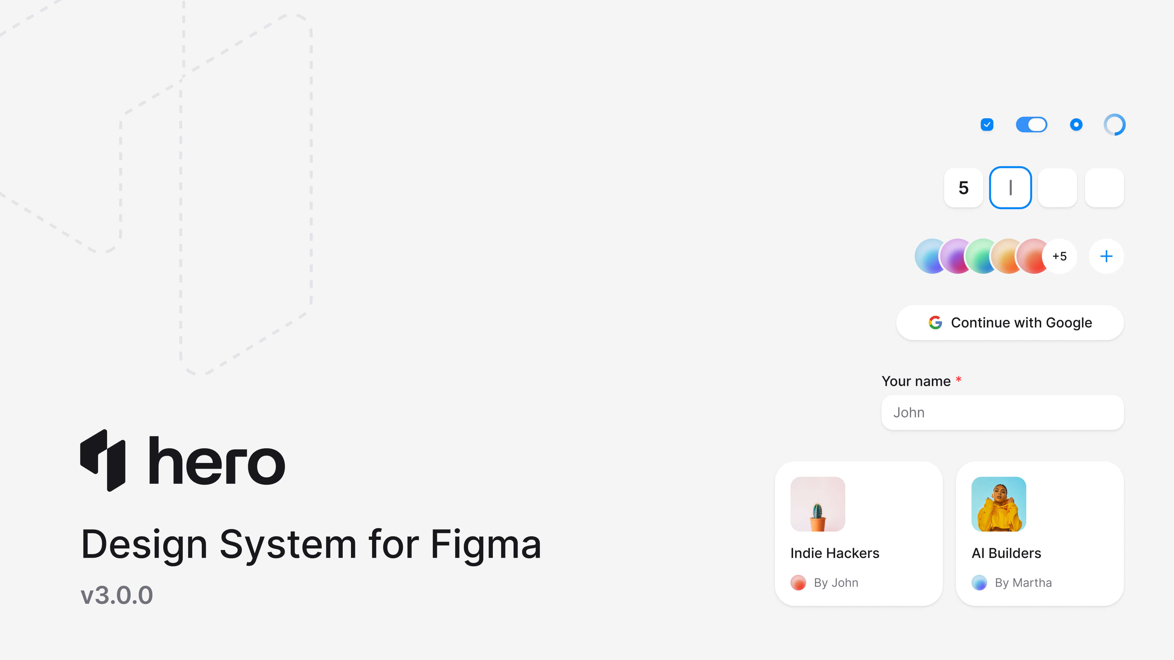
HeroUI v3 中的每一个组件在 Figma 中都有 1:1 的对应实现。变体、命名与结构完全一致。整套 Kit 全程采用 auto layout,使用与代码 token 直接对应的 Figma 变量(--accent、--surface、--radius),并借助 Figma 新推出的 slots 来实现灵活的组件组合。设计师可以像开发者写代码一样,自由调整、替换与定制组件的各个部件。
致谢
React Aria 提供了我们自己难以做到这种水准的无障碍能力层。Tailwind CSS v4 原生的 CSS 变量方案塑造了我们整个主题系统。复合组件模式则是通过研究 Radix、Ark UI 与 Base UI 在组合性问题上的解法逐步打磨而来。
感谢每一位在 alpha 与 RC 阶段提交 issue、测试预发布版本以及反馈意见的社区成员。这套组件库因为你们而变得更好。