v3.0.0-beta.6
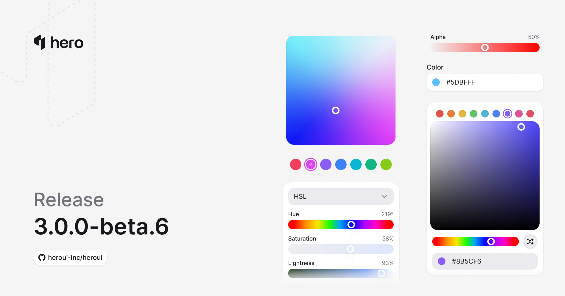
新增 6 个颜色组件(ColorPicker、ColorArea、ColorSlider、ColorField、ColorSwatch、ColorSwatchPicker)、Toast 改进,以及多项样式修复。
本次发布引入了完整的颜色系统,新增六个用于颜色选择与处理的组件:ColorPicker、ColorArea、ColorSlider、ColorField、ColorSwatch 与 ColorSwatchPicker。同时还包含 Separator 的新变体以及多项样式改进。
安装
升级到最新版本:
npm i @lenso/tokens@beta @lenso/ui@beta正在使用 AI 助手? 只需对它说一句「Hey Cursor,把 HeroUI 升级到最新版本」,AI 助手就会自动对比版本并应用必要的变更。了解更多请参阅 HeroUI MCP 服务器。
新增功能
颜色系统
我们很高兴推出完整的颜色系统——一整套用于颜色选择、处理与展示的组件。这些组件基于 React Aria 的颜色基元构建,可以无缝协同工作。
主要特性:
- 完整的色彩空间支持:支持 HSL、HSB 与 RGB 色彩空间
- 基于通道的编辑:可单独操作每一个颜色通道(hue、saturation、lightness、brightness、red、green、blue、alpha)
- 默认无障碍:完整支持键盘导航与屏幕阅读器
- 可组合的设计:自由搭配组件,构建你自己的颜色选择器
新组件
本次发布共引入 6 个 新的颜色组件:
- ColorPicker:完整的颜色选择器,包含 trigger、popover 以及可组合的内部部件。(文档)
- ColorArea:二维渐变区域,可同时选择两个颜色通道。(文档)
- ColorSlider:单通道滑块,用于精细调整颜色。(文档)
- ColorField:用于输入与编辑颜色值的文本框。(文档)
- ColorSwatch:可视化的颜色预览,支持透明度。(文档)
- ColorSwatchPicker:可选的颜色块网格,便于快速选择颜色。(文档)
ColorPicker
ColorPicker 是一个复合组件,将所有颜色组件组合在一起,提供完整的颜色选择体验。
此预览复用英文版适配,不代表中文源示例已完成本地实现。
"use client";
import { ColorArea, ColorPicker, ColorSlider, ColorSwatch } from "@lenso/ui";import * as stylex from "@stylexjs/stylex";
const styles = stylex.create({ area: { maxWidth: "100%" }, slider: { gap: 4, paddingInline: 4 }, output: { color: "var(--muted)" },});export function Basic() { return ( <ColorPicker defaultValue="#0485F7"> <ColorPicker.Trigger> <ColorSwatch size="lg" /> <span>Pick a color</span> </ColorPicker.Trigger> <ColorPicker.Popover> <ColorArea aria-label="Color area" xstyle={styles.area} colorSpace="hsb" xChannel="saturation" yChannel="brightness" > <ColorArea.Thumb /> </ColorArea> <ColorSlider aria-label="Hue" channel="hue" xstyle={styles.slider} colorSpace="hsb"> <span>Hue</span> <ColorSlider.Output xstyle={styles.output} /> <ColorSlider.Track> <ColorSlider.Thumb /> </ColorSlider.Track> </ColorSlider> </ColorPicker.Popover> </ColorPicker> );}Local adaptation source above. Derived from HeroUI v3.2.6 source.
ColorArea
二维渐变区域,可同时选择两个颜色通道,通常用于 saturation 与 brightness。
此预览复用英文版适配,不代表中文源示例已完成本地实现。
"use client";
import { ColorArea } from "@lenso/ui";
export function ColorAreaBasic() { return ( <ColorArea aria-label="Color area" defaultValue="rgb(116, 52, 255)"> <ColorArea.Thumb /> </ColorArea> );}Local adaptation source above. Derived from HeroUI v3.2.6 source.
ColorSlider
用于调整单个颜色通道(如 hue、saturation、lightness 或 alpha)的滑块。
此预览复用英文版适配,不代表中文源示例已完成本地实现。
"use client";
import { ColorSlider } from "@lenso/ui";import * as stylex from "@stylexjs/stylex";
const styles = stylex.create({ slider: { width: "100%", maxWidth: 320 } });export function Basic() { return ( <ColorSlider aria-label="Hue" channel="hue" xstyle={styles.slider} defaultValue="hsl(0, 100%, 50%)" > <span>Hue</span> <ColorSlider.Output /> <ColorSlider.Track> <ColorSlider.Thumb /> </ColorSlider.Track> </ColorSlider> );}Local adaptation source above. Derived from HeroUI v3.2.6 source.
不同的通道:
此预览复用英文版适配,不代表中文源示例已完成本地实现。
"use client";/** Adapted from HeroUI v3.2.6. Apache-2.0. */import { ColorSlider, ColorSwatch, parseColor } from "@lenso/ui";import { useState } from "react";import * as stylex from "@stylexjs/stylex";import { styles } from "../color-picker/source.stylex";export function Channels() { const [color, setColor] = useState(parseColor("hsl(0, 100%, 50%)")); return ( <div {...stylex.props(styles.column, styles.xs)}> {(["hue", "saturation", "lightness"] as const).map((channel) => ( <ColorSlider key={channel} channel={channel} value={color} onChange={setColor}> <ColorSlider.Label xstyle={styles.capitalize}>{channel}</ColorSlider.Label> <ColorSlider.Output /> <ColorSlider.Track> <ColorSlider.Thumb /> </ColorSlider.Track> </ColorSlider> ))} <div {...stylex.props(styles.row2)}> <ColorSwatch color={color} size="sm" /> <p {...stylex.props(styles.muted)}> Current color: <code {...stylex.props(styles.mono)}>{color.toString("hsl")}</code> </p> </div> </div> );}Local adaptation source above. Derived from HeroUI v3.2.6 source.
ColorField
用于直接输入颜色值的文本输入框,支持多种颜色格式。
此预览复用英文版适配,不代表中文源示例已完成本地实现。
"use client";
import { ColorField, ColorSwatch, parseColor } from "@lenso/ui";import { useState } from "react";import * as stylex from "@stylexjs/stylex";
const styles = stylex.create({ field: { width: 280, maxWidth: "100%" } });export function Basic() { const [color, setColor] = useState<ReturnType<typeof parseColor> | null>(() => parseColor("#0485F7"), ); return ( <ColorField xstyle={styles.field} name="color" value={color} onChange={setColor}> <ColorField.Label>Color</ColorField.Label> <ColorField.Group> <ColorField.Prefix> <ColorSwatch {...(color ? { color } : {})} size="xs" /> </ColorField.Prefix> <ColorField.Input /> </ColorField.Group> </ColorField> );}Local adaptation source above. Derived from HeroUI v3.2.6 source.
ColorSwatch
颜色值的可视化展示,支持透明度图案。
此预览复用英文版适配,不代表中文源示例已完成本地实现。
"use client";
import { ColorSwatch } from "@lenso/ui";import * as stylex from "@stylexjs/stylex";
const styles = stylex.create({ row: { display: "flex", alignItems: "center", gap: 12 } });export function ColorSwatchBasic() { return ( <div {...stylex.props(styles.row)}> <ColorSwatch aria-label="Blue" color="#0485F7" /> <ColorSwatch aria-label="Red" color="#EF4444" /> <ColorSwatch aria-label="Amber" color="#F59E0B" /> <ColorSwatch aria-label="Green" color="#10B981" /> <ColorSwatch aria-label="Fuchsia" color="#D946EF" /> </div> );}Local adaptation source above. Derived from HeroUI v3.2.6 source.
ColorSwatchPicker
色块网格,可从预定义的调色板中快速选择颜色。
此预览复用英文版适配,不代表中文源示例已完成本地实现。
"use client";
import { ColorSwatchPicker } from "@lenso/ui";
const colors = ["#F43F5E", "#D946EF", "#8B5CF6", "#3B82F6", "#06B6D4", "#10B981", "#84CC16"];export function Basic() { return ( <ColorSwatchPicker aria-label="Choose a color"> {colors.map((color) => ( <ColorSwatchPicker.Item key={color} color={color}> <ColorSwatchPicker.Swatch /> <ColorSwatchPicker.Indicator /> </ColorSwatchPicker.Item> ))} </ColorSwatchPicker> );}Local adaptation source above. Derived from HeroUI v3.2.6 source.
组件改进
Toast 增强
Toast 组件经过了重大改进,新增了多项功能并提升了稳定性(#6151):
新功能:
- 加载状态:新增
isLoadingprop,会显示一个 spinner 替代默认指示器 - 默认超时:Toast 现在默认 4 秒后自动关闭(可通过
timeoutprop 配置) - 宽度控制:在
Toast.Provider上新增widthprop,可自定义 Toast 的宽度 - 自适应高度:Toast 会根据内容自适应高度
- 更好的堆叠效果:通过绝对定位与高度同步,修复了 Toast 堆叠时出现的布局抖动
- 更稳健的关闭处理:将
onClose回调延迟执行,避免 Toast 过渡死锁 - 仅最前 Toast 显示关闭按钮:关闭按钮仅出现在最前一个 Toast 上,UI 更加干净
- Promise 支持增强:改进了
toast.promise(),加载状态与错误处理更加完善
新增演示:
- Promise 与加载状态
- 回调与超时处理
此预览复用英文版适配,不代表中文源示例已完成本地实现。
"use client";
// Adapted from HeroUI v3.2.6 variants, Apache-2.0.import { HardDrive, Persons } from "@gravity-ui/icons";import * as stylex from "@stylexjs/stylex";import { Button, Toast } from "@lenso/ui";import { Notifications, styles, type ToastData } from "./_shared";
function Messages() { const manager = Toast.useToastManager<ToastData>(); return ( <> <div {...stylex.props(styles.frame)}> <div {...stylex.props(styles.buttons)}> <Button size="sm" variant="tertiary" onClick={() => { const id = manager.add({ title: "You have been invited to join a team", description: "Bob sent you an invitation to join HeroUI team", type: "default", data: { indicator: <Persons />, actionStyle: "tertiary" }, actionProps: { children: "Dismiss", onClick: () => manager.close(id) }, }); }} > Default toast </Button> <Button size="sm" variant="secondary" onClick={() => { const id = manager.add({ title: "You have 2 credits left", description: "Get a paid plan for more credits", type: "accent", actionProps: { children: "Upgrade", onClick: () => manager.close(id) }, }); }} > Accent toast </Button> <Button xstyle={styles.successText} size="sm" variant="tertiary" onClick={() => { const id = manager.add({ title: "You have upgraded your plan", description: "You can continue using HeroUI Chat", type: "success", data: { actionStyle: "success" }, actionProps: { children: "Billing", onClick: () => manager.close(id) }, }); }} > Success toast </Button> <Button xstyle={styles.warningText} size="sm" variant="tertiary" onClick={() => { const id = manager.add({ title: "You have no credits left", description: "Upgrade to a paid plan to continue", type: "warning", data: { actionStyle: "warning" }, actionProps: { children: "Upgrade", onClick: () => manager.close(id) }, }); }} > Warning toast </Button> <Button size="sm" variant="danger-soft" onClick={() => { const id = manager.add({ title: "Storage is full", description: "Remove files to release space. Adding more text to demonstrate longer content display", type: "danger", data: { indicator: <HardDrive />, actionStyle: "danger" }, actionProps: { children: "Remove", onClick: () => manager.close(id) }, }); }} > Danger toast </Button> </div> </div> <Notifications /> </> );}
export function Variants() { return ( <Toast.Provider> <Messages /> </Toast.Provider> );}Local adaptation source above. Derived from HeroUI v3.2.6 source.
Separator 变体
为 Separator 组件新增了变体,提供不同的视觉风格。
Chip 组件 —— Label slot
Chip 组件现在支持 Chip.Label 子组件,以获得更好的视觉对齐。当移除起始或末尾的内容(如图标)时,标签文字会过于贴近 Chip 的边缘。为了向后兼容,纯文本的 children 会自动被包裹在 <Chip.Label> 中。
用法:
import { Chip } from '@lenso/ui';
// Automatic wrapping (backward compatible)<Chip>Label text</Chip>
// Explicit label with custom styling<Chip> <Chip.Label className="font-bold">Custom Label</Chip.Label></Chip>
// Mixing icons and labels<Chip> <Icon icon="gravity-ui:check" /> <Chip.Label>With Icon</Chip.Label></Chip>样式修复
- 浮层内容:修复了浮层内容上的模糊效果(#6136)
- Invalid 字段:在字段处于 invalid 状态时,将 ring 改为 outline(#6184)
- Link 与按钮:修复了使用按钮变体的 Link 组件的样式(#6138)
- Toast 内容:修复了 Toast 内容的垂直对齐问题(#6147)
- Safari SVG:修复了 SVG 在 Safari 中位置偏移的问题(#6149)
- Placeholder 颜色:将 placeholder 的颜色与输入文本对齐(#6139)
- Tooltip:从 tooltip 触发组件中移除了 cursor 样式
- CSS 变量:让计算变量仅依赖根变量(#6154)
Bug 修复
- 修复了视图过渡期间页面交互不可用的问题(#6128)
- 修复了 Markdown URL 的格式化问题(#6162)
- 修复了指向 ComboBox 页面的链接错误(#6164)
- 修复了
index.css中 Autocomplete 样式的引入顺序 - 修复了 CSS 类名的连字符格式(#6191)
⚠️ 破坏性变更
Toast 组件 —— Container 重命名为 Provider
为提升语义清晰度,Toast.Container 已重命名为 Toast.Provider(#6151)。
之前:
<Toast.Container placement="bottom" />之后:
<Toast.Provider placement="bottom" />其他变更:
- 默认的
gapprop 从14改为12像素 - 默认
timeout现在为4000(4 秒),无需再显式设置 - 为保持一致性,
Toast.Action已重命名为Toast.ActionButton
CSS 类名命名约定
为了一致性,CSS 类名已统一改为连字符格式(#6141)。这一调整更贴合 BEM 规范,也提升了与 Tailwind CSS 的兼容性。
重要说明:textarea 类名最初被改为 text-area,但由于与 Tailwind 原生的 textarea 类名冲突,已在 PR #6191 中回滚为 textarea。TextArea 组件相关的类名无需修改。
组件类名变更
以下 CSS 类名已更新。如果你的自定义 CSS 直接使用了这些类名,请同步更新选择器:
| 组件 | 旧类名 | 新类名 | 说明 |
|---|---|---|---|
| ComboBox | .combobox | .combo-box | 全部相关类名同步更新 |
.combobox__input-group | .combo-box__input-group | ||
.combobox__trigger | .combo-box__trigger | ||
.combobox__popover | .combo-box__popover | ||
.combobox--full-width | .combo-box--full-width | ||
| ListBox | .listbox | .list-box | 全部相关类名同步更新 |
| ListBoxItem | .listbox-item | .list-box-item | 全部相关类名同步更新 |
.listbox-item__indicator | .list-box-item__indicator | ||
.listbox-item--default | .list-box-item--default | ||
.listbox-item--danger | .list-box-item--danger | ||
| ListBoxSection | .listbox-section | .list-box-section | 全部相关类名同步更新 |
| TextArea | .textarea | .textarea | 未变更 —— 为避免与 Tailwind 冲突已回滚 |
迁移指南
之前:
/* Custom styles targeting old class names */.combobox { /* styles */}
.listbox-item { /* styles */}之后:
/* Update to new hyphenated class names */.combo-box { /* styles */}
.list-box-item { /* styles */}JavaScript / TypeScript 更新:
如果你在 JavaScript 或 TypeScript 代码中使用了这些类名:
// Before<div className="combobox" /><ListBoxItem className="listbox-item" />
// After<div className="combo-box" /><ListBoxItem className="list-box-item" />说明:组件 props 与 TypeScript 类型保持不变,仅 CSS 类名做了更新。
移除的 CSS 变量
作为 surface 颜色重构的一部分,部分 CSS 变量已被移除(#6204)。这些变量要么改为直接引用其他变量,要么被完全移除。
Surface 颜色变量
以下经过计算的 surface 颜色变量已被移除,并改为直接引用对应的变量:
已移除:
--color-surface-secondary(之前通过color-mix计算得到)--color-surface-tertiary(之前通过color-mix计算得到)
替代方案:
这些变量现在直接引用 variables.css 中定义的基础变量:
--color-surface-secondary→ 直接使用var(--surface-secondary)--color-surface-tertiary→ 直接使用var(--surface-tertiary)
基础变量 --surface-secondary 与 --surface-tertiary 现在直接定义在 variables.css 中,而不再在 theme.css 中通过计算得出。
On Surface 颜色变量
所有 --color-on-surface-* 变量都已被完全移除:
已移除:
--color-on-surface--color-on-surface-foreground--color-on-surface-hover--color-on-surface-focus--color-on-surface-secondary--color-on-surface-secondary-foreground--color-on-surface-secondary-hover--color-on-surface-secondary-focus--color-on-surface-tertiary--color-on-surface-tertiary-foreground--color-on-surface-tertiary-hover--color-on-surface-tertiary-focus
迁移方式:
如果你之前用到了这些变量,请改用对应的 surface 变量:
/* Before */.element { background: var(--color-on-surface); color: var(--color-on-surface-foreground);}
.element:hover { background: var(--color-on-surface-hover);}
/* After */.element { background: var(--surface-secondary); color: var(--surface-secondary-foreground);}
.element:hover { background: color-mix(in oklab, var(--surface-secondary) 92%, var(--surface-secondary-foreground) 8%);}或者使用 Tailwind 工具类:
// Before<div className="bg-on-surface text-on-surface-foreground" />
// After<div className="bg-surface-secondary text-surface-secondary-foreground" />相关 PR: #6204
链接
贡献者
感谢每一位为本次发布做出贡献的开发者!
HeroUI contributors