v3.0.0-beta.2
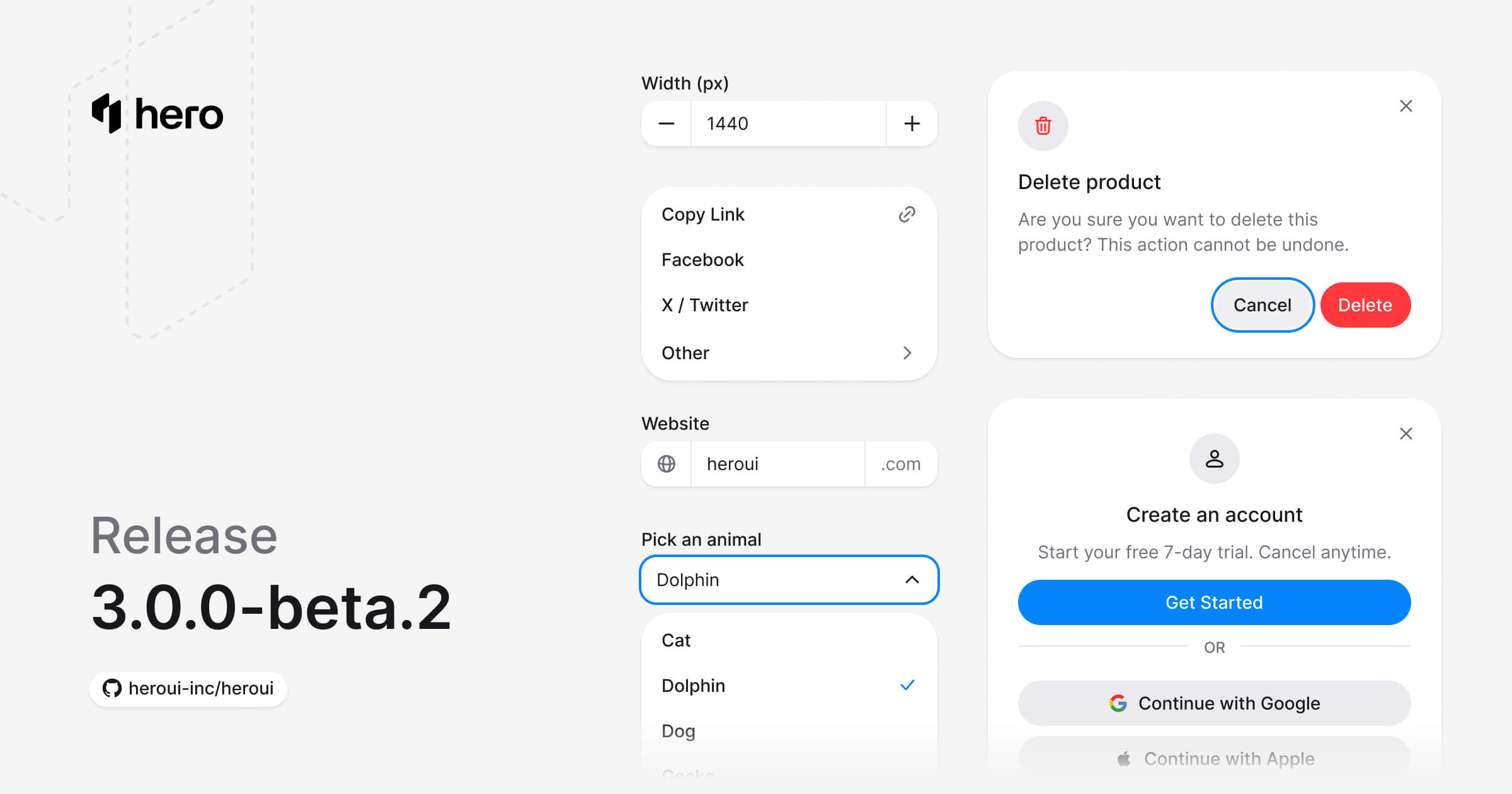
六个新组件(AlertDialog、ComboBox、Dropdown、InputGroup、Modal、NumberField)、Select API 改进以及多项组件优化。
此版本引入了六个重要的新组件,改进了 Select 组件的 API,并包含多项优化与 bug 修复。
安装
升级到最新版本:
npm i @lenso/tokens@beta @lenso/ui@beta正在使用 AI 助手? 只需对它说一句「Hey Cursor,把 HeroUI 升级到最新版本」,AI 助手就会自动对比版本并应用必要的变更。了解更多请参阅 HeroUI MCP 服务器。
新增功能
新组件
本次发布引入了 6 个 新的基础组件:
- AlertDialog:用于需要用户确认的重要决策的模态对话框。(文档)
- ComboBox:将文本输入与列表框结合,让用户可以在选项列表中过滤。(文档)
- Dropdown:展示一组可供用户选择的操作或选项。(文档)
- InputGroup:通过 prefix 与 suffix 元素将相关输入控件组合在一起,强化表单字段。(文档)
- Modal:用于聚焦用户交互与重要内容的对话框浮层。(文档)
- NumberField:数字输入框,带有递增 / 递减按钮、表单校验以及国际化格式化。(文档)
AlertDialog
此预览复用英文版适配,不代表中文源示例已完成本地实现。
"use client";
// Adapted from HeroUI v3.2.6 alert-dialog-default (Apache-2.0).import * as stylex from "@stylexjs/stylex";import { AlertDialog, Button } from "@lenso/ui";
const styles = stylex.create({ popup: { maxWidth: 400 } });
export function Default() { return ( <AlertDialog> <AlertDialog.Trigger render={<Button variant="danger" />}>Delete Project</AlertDialog.Trigger> <AlertDialog.Portal> <AlertDialog.Backdrop /> <AlertDialog.Viewport> <AlertDialog.Popup xstyle={styles.popup}> <AlertDialog.Close aria-label="Close dialog" /> <AlertDialog.Header> <AlertDialog.Icon variant="danger" /> <AlertDialog.Title>Delete project permanently?</AlertDialog.Title> </AlertDialog.Header> <AlertDialog.Body> <AlertDialog.Description> This will permanently delete <strong>My Awesome Project</strong> and all of its data. This action cannot be undone. </AlertDialog.Description> </AlertDialog.Body> <AlertDialog.Footer> <AlertDialog.Close render={<Button variant="tertiary" />}>Cancel</AlertDialog.Close> <AlertDialog.Close render={<Button variant="danger" />}> Delete Project </AlertDialog.Close> </AlertDialog.Footer> </AlertDialog.Popup> </AlertDialog.Viewport> </AlertDialog.Portal> </AlertDialog> );}Local adaptation source above. Derived from HeroUI v3.2.6 source.
ComboBox
此预览复用英文版适配,不代表中文源示例已完成本地实现。
"use client";// HeroUI v3.2.6, Apache-2.0. Native Base UI adaptation.import { AnimalPicker } from "./shared";export function Default() { return <AnimalPicker />;}Local adaptation source above. Derived from HeroUI v3.2.6 source.
Dropdown
此预览复用英文版适配,不代表中文源示例已完成本地实现。
"use client";
// Adapted from HeroUI v3.2.6 dropdown-default (Apache-2.0).import { Button, Dropdown } from "@lenso/ui";import { ActionItem, Popup } from "./_shared";
export function Default() { return ( <Dropdown> <Dropdown.Trigger render={<Button aria-label="Menu" variant="secondary" />}> Actions </Dropdown.Trigger> <Popup> <ActionItem label="New file" onClick={() => console.log("Selected: new-file")} /> <ActionItem label="Copy link" onClick={() => console.log("Selected: copy-link")} /> <ActionItem label="Edit file" onClick={() => console.log("Selected: edit-file")} /> <ActionItem label="Delete file" variant="danger" onClick={() => console.log("Selected: delete-file")} /> </Popup> </Dropdown> );}Local adaptation source above. Derived from HeroUI v3.2.6 source.
Modal
此预览复用英文版适配,不代表中文源示例已完成本地实现。
"use client";
// Adapted from HeroUI v3.2.6 modal-default (Apache-2.0).import { Rocket } from "@gravity-ui/icons";import * as stylex from "@stylexjs/stylex";import { Button, Modal } from "@lenso/ui";
const styles = stylex.create({ popup: { maxWidth: 360 }, icon: { backgroundColor: "var(--default)", color: "var(--foreground)" }, rocket: { width: 20, height: 20 }, continue: { width: "100%" },});
export function Default() { return ( <Modal> <Modal.Trigger render={<Button variant="secondary" />}>Open Modal</Modal.Trigger> <Modal.Portal> <Modal.Backdrop /> <Modal.Viewport> <Modal.Popup xstyle={styles.popup}> <Modal.Close aria-label="Close dialog" /> <Modal.Header> <Modal.Icon xstyle={styles.icon}> <Rocket {...stylex.props(styles.rocket)} /> </Modal.Icon> <Modal.Title>Welcome to HeroUI</Modal.Title> </Modal.Header> <Modal.Body> <Modal.Description> A beautiful, fast, and modern React UI library for building accessible and customizable web applications with ease. </Modal.Description> </Modal.Body> <Modal.Footer> <Modal.Close render={<Button xstyle={styles.continue} />}>Continue</Modal.Close> </Modal.Footer> </Modal.Popup> </Modal.Viewport> </Modal.Portal> </Modal> );}Local adaptation source above. Derived from HeroUI v3.2.6 source.
InputGroup
此预览复用英文版适配,不代表中文源示例已完成本地实现。
"use client";// Adapted from HeroUI v3.2.6, Apache-2.0.import { Globe } from "@gravity-ui/icons";import { InputGroup, Label, TextField } from "@lenso/ui";import * as stylex from "@stylexjs/stylex";const styles = stylex.create({ field: { width: "100%", maxWidth: 280 }, icon: { width: 16, height: 16, color: "var(--muted)" },});export function WithIconPrefixAndTextSuffix() { return ( <TextField xstyle={styles.field} name="website"> <Label>Website</Label> <InputGroup> <InputGroup.Prefix> <Globe aria-hidden="true" {...stylex.props(styles.icon)} /> </InputGroup.Prefix> <InputGroup.Input xstyle={styles.field} defaultValue="heroui" /> <InputGroup.Suffix>.com</InputGroup.Suffix> </InputGroup> </TextField> );}Local adaptation source above. Derived from HeroUI v3.2.6 source.
NumberField
此预览复用英文版适配,不代表中文源示例已完成本地实现。
"use client";
// Adapted from HeroUI v3.2.6 (e385ac202b2cdb94b1bf6fa76d32c31c8259cc5e), Apache-2.0.import { Label, NumberField, TextField } from "@lenso/ui";import { Controls, styles } from "./parts";
export function Basic() { return ( <TextField name="width" xstyle={styles.field}> <NumberField defaultValue={1024} min={0} name="width"> <Label>Width</Label> <Controls /> </NumberField> </TextField> );}Local adaptation source above. Derived from HeroUI v3.2.6 source.
样式改进
自定义变体与主题兼容性
增强了 CSS 变体与主题系统,提供更好的可定制性:
动效偏好:
- 新增
motion-safe变体,可与data-reduce-motion="true"属性配合使用 - 增强后的
motion-reduce现在支持祖先元素与伪元素
深色模式:
- 类与
data-theme="dark"属性选择器现在优先于prefers-color-scheme - 在深色模式下完整支持伪元素
主题变量:
- 扩展了浅色主题的覆盖范围,以支持嵌套主题(
:root、.light、.default、[data-theme="light"]、[data-theme="default"])
组件改进
Select 组件 API 更新
Select 组件的 API 已经过改进,与其他组件保持一致。Content 子组件已重命名为 Popover。
之前:
<Select> <Select.Trigger> <Select.Value /> <Select.Indicator /> </Select.Trigger> <Select.Content> <ListBox> {/* items */} </ListBox> </Select.Content></Select>之后:
<Select> <Select.Trigger> <Select.Value /> <Select.Indicator /> </Select.Trigger> <Select.Popover> <ListBox> {/* items */} </ListBox> </Select.Popover></Select>Chip 组件改进
Chip 组件的尺寸已更新,以提升一致性:
- 小(
sm):px-1 py-0 text-xs - 中(
md):text-xs(现在显式设置) - 大(
lg):px-3 py-1 text-sm font-medium
Separator 组件增强
Separator 组件现在能自动检测是否被放置在 surface 组件中(使用 bg-surface),并应用合适的分隔线颜色以获得更好的可见性。同时新增了 isOnSurface prop,用于手动控制。
新增的计算变量:
--color-separator-on-surface:通过color-mix自动生成的计算变量,确保分隔线在 surface 背景上仍然清晰可见。与其他计算变量一样,可在你的主题中覆盖它。
用法:
<div className="bg-surface"> <Separator isOnSurface /></div>当 Separator 检测到外层存在 SurfaceContext Provider(由 Card、Alert、Popover、Modal 等组件提供)时,isOnSurface prop 会自动启用。
你也可以直接在 Tailwind 类中使用这个计算变量:
<div className="bg-surface"> <div className="h-px w-full bg-separator-on-surface" /></div>动画改进
- 更新了加载状态 spinner 的颜色,提升可见性
- 调整了 Select 与 Slider 组件的样式,改进动画效果
- 改进了 Checkbox 动画(过渡更快)
- 在伪元素中更好地支持
prefers-reduced-motion
⚠️ 破坏性变更
Select 组件
为与 ComboBox、Dropdown 等组件保持一致,Select.Content 子组件已重命名为 Select.Popover。
迁移:
将所有 Select.Content 替换为 Select.Popover:
// Before<Select.Content> <ListBox>...</ListBox></Select.Content>
// After<Select.Popover> <ListBox>...</ListBox></Select.Popover>类型导入:
// Beforeimport type { SelectContentProps } from "@lenso/ui"
// Afterimport type { SelectPopoverProps } from "@lenso/ui"命名导出:
// Beforeimport { SelectContent } from "@lenso/ui"
// Afterimport { SelectPopover } from "@lenso/ui"CSS 变量与工具类:divider → separator
为与 Separator 组件名保持一致,所有与 divider 相关的 CSS 变量与工具类均已重命名为 separator。
CSS 变量:
/* Before */border-bottom: 1px solid var(--divider);
/* After */border-bottom: 1px solid var(--separator);Tailwind 工具类:
// Before<div className="bg-divider" /><div className="border-divider" />
// After<div className="bg-separator" /><div className="border-separator" />主题覆盖:
如果你的自定义主题中覆盖了 separator 相关变量,请同步更新:
/* Before */:root { --divider: oklch(92% 0.004 286.32);}
.dark { --divider: oklch(22% 0.006 286.033);}
/* After */:root { --separator: oklch(92% 0.004 286.32);}
.dark { --separator: oklch(22% 0.006 286.033);}Bug 修复
- 修复了加载状态 spinner 的颜色,提升可见性
- 修复了 bordered 状态下焦点样式优先于 hover 状态的表现
- 修复了文档中的动画卡顿问题
- 改进了模态表单的样式
- 增强了 motion-reduce 在伪元素上的支持
- 修复了移动端触摸交互后悬停状态保留的问题——将 hover 样式包裹在
@media (hover: hover)媒体查询中。同时通过移除不必要的="true"data 属性值选择器,简化了相关代码。
链接
贡献者
感谢每一位为本次发布做出贡献的开发者!
HeroUI contributors