v3.0.0-beta.1
重大重新设计,带来全新的设计系统、8 个新组件以及更佳的开发者体验。
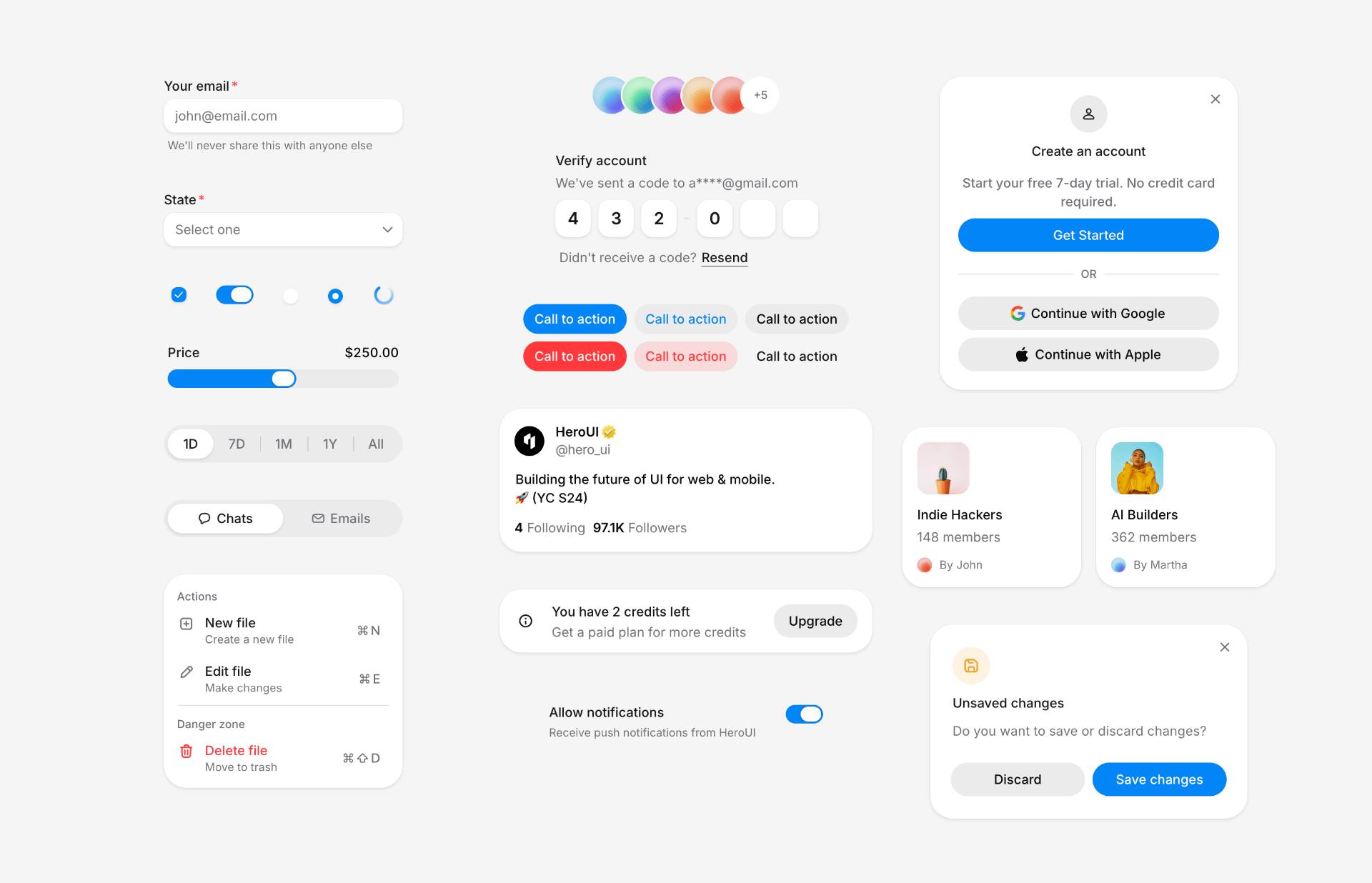
此版本对 HeroUI v3 进行了全面重新设计,将 v2 的美观与动效与 v3 的简洁性融为一体。所有组件均经过重新设计,新增 8 个组件,并对设计系统进行了改进,包括更完善的颜色 token、阴影体系与整体架构。
安装
升级到最新版本:
npm i @lenso/tokens@beta @lenso/ui@beta正在使用 AI 助手? 只需对它说一句「Hey Cursor,把 HeroUI 升级到最新版本」,AI 助手就会自动对比版本并应用必要的变更。了解更多请参阅 HeroUI MCP 服务器。
新增功能
全新的设计系统
我们花了数周时间打造一套全新的设计系统,将 HeroUI v2 的灵魂与 v3 的简洁性融合在一起。每一个组件都经过重新设计,注重细节、流畅的动效以及更佳的开发者体验。新的设计系统已发布在我们的 Figma Kit v3。
 Watch the upstream demonstration recording
本次重新设计带来了:
- 让 v3 的视觉愿景落地、并具备独特辨识度的全新色彩系统
- 更精致的阴影系统,呈现更好的层次感
- 全新的变量与 token,提供更强的定制能力
- 基于表单的组件自动具备
isOnSurface支持 - 增强的边框与间距 token
- 更好的对比度与无障碍体验
- Web 与 Native 之间一致的组件模式
新组件
本次发布共引入 8 个 新的基础组件:
- Alert:带状态指示器,用于展示重要的消息与通知。
- Checkbox 与 CheckboxGroup:用于在列表中选择多个条目。
- InputOTP:用于身份验证流程的一次性密码输入框。
- ListBox:展示一组可单选或多选的选项。
- Select:基于 ListBox 构建的下拉选择组件。
- Slider:从一个范围中选择数值,支持自定义刻度与标签。
- Surface:用于构建带高度的容器的基础 surface 组件。
Alert
此预览复用英文版适配,不代表中文源示例已完成本地实现。
"use client";// Adapted from HeroUI v3.2.6 (e385ac202b2cdb94b1bf6fa76d32c31c8259cc5e), Apache-2.0.import { Alert, Button, CloseButton, Spinner } from "@lenso/ui";import * as stylex from "@stylexjs/stylex";import { s } from "../card/display.stylex";
export function Basic() { return ( <div {...stylex.props(s.alertStack)}> <Alert> <Alert.Indicator /> <Alert.Content> <Alert.Title>New features available</Alert.Title> <Alert.Description> Check out our latest updates including dark mode support and improved accessibility features. </Alert.Description> </Alert.Content> </Alert> <Alert status="accent"> <Alert.Indicator /> <Alert.Content> <Alert.Title>Update available</Alert.Title> <Alert.Description> A new version of the application is available. Please refresh to get the latest features and bug fixes. </Alert.Description> <Button xstyle={s.mobile2} size="sm" variant="primary"> Refresh </Button> </Alert.Content> <Button xstyle={s.desktopBlock} size="sm" variant="primary"> Refresh </Button> </Alert> <Alert status="danger"> <Alert.Indicator /> <Alert.Content> <Alert.Title>Unable to connect to server</Alert.Title> <Alert.Description> We're experiencing connection issues. Please try the following: <ul {...stylex.props(s.list)}> <li>Check your internet connection</li> <li {...stylex.props(s.space1)}>Refresh the page</li> <li {...stylex.props(s.space1)}>Clear your browser cache</li> </ul> </Alert.Description> <Button xstyle={s.mobile2} size="sm" variant="danger"> Retry </Button> </Alert.Content> <Button xstyle={s.desktopBlock} size="sm" variant="danger"> Retry </Button> </Alert> <Alert status="success"> <Alert.Indicator /> <Alert.Content> <Alert.Title>Profile updated successfully</Alert.Title> </Alert.Content> <CloseButton /> </Alert> <Alert status="accent"> <Alert.Indicator> <Spinner size="sm" /> </Alert.Indicator> <Alert.Content> <Alert.Title>Processing your request</Alert.Title> <Alert.Description> Please wait while we sync your data. This may take a few moments. </Alert.Description> </Alert.Content> </Alert> <Alert status="warning"> <Alert.Indicator /> <Alert.Content> <Alert.Title>Scheduled maintenance</Alert.Title> <Alert.Description> Our services will be unavailable on Sunday, March 15th from 2:00 AM to 6:00 AM UTC for scheduled maintenance. </Alert.Description> </Alert.Content> </Alert> </div> );}Local adaptation source above. Derived from HeroUI v3.2.6 source.
Checkbox 与 CheckboxGroup
此预览复用英文版适配,不代表中文源示例已完成本地实现。
"use client";/** Adapted from HeroUI v3.2.6. SPDX-License-Identifier: Apache-2.0 */import { Checkbox } from "@lenso/ui";
export function Basic() { return ( <Checkbox name="basic-terms"> <Checkbox.Content> <Checkbox.Control> <Checkbox.Indicator /> </Checkbox.Control> Accept terms and conditions </Checkbox.Content> </Checkbox> );}Local adaptation source above. Derived from HeroUI v3.2.6 source.
此预览复用英文版适配,不代表中文源示例已完成本地实现。
"use client";/** Adapted from HeroUI v3.2.6. SPDX-License-Identifier: Apache-2.0 */import { Checkbox, CheckboxGroup, TextField } from "@lenso/ui";import { labelStyles } from "@lenso/tokens/label";import { descriptionStyles } from "@lenso/tokens/description";import { checkboxSupportingStyles } from "@lenso/tokens/checkbox";import { useId } from "react";import * as stylex from "@stylexjs/stylex";
const interests = [ { value: "coding", label: "Coding", description: "Love building software" }, { value: "design", label: "Design", description: "Enjoy creating beautiful interfaces" }, { value: "writing", label: "Writing", description: "Passionate about content creation" },];export function Basic() { const id = useId(); return ( <TextField name="interests"> <CheckboxGroup aria-labelledby={`${id}-label`} aria-describedby={`${id}-help`}> <span id={`${id}-label`} {...stylex.props(labelStyles.label)}> Select your interests </span> <span id={`${id}-help`} {...stylex.props(descriptionStyles.description)}> Choose all that apply </span> {interests.map((interest) => ( <Checkbox key={interest.value} value={interest.value} aria-label={interest.label} aria-describedby={`${id}-${interest.value}`} > <Checkbox.Content> <Checkbox.Control> <Checkbox.Indicator /> </Checkbox.Control> {interest.label} </Checkbox.Content> <span id={`${id}-${interest.value}`} {...stylex.props(descriptionStyles.description, checkboxSupportingStyles.direct)} > {interest.description} </span> </Checkbox> ))} </CheckboxGroup> </TextField> );}Local adaptation source above. Derived from HeroUI v3.2.6 source.
InputOTP
此预览复用英文版适配,不代表中文源示例已完成本地实现。
"use client";// Adapted from HeroUI v3.2.6 (e385ac202b2cdb94b1bf6fa76d32c31c8259cc5e), Apache-2.0.import { InputOTP, Label, Link, TextField } from "@lenso/ui";import * as stylex from "@stylexjs/stylex";import { Slots, styles } from "./parts";export function Basic() { return ( <TextField name="code" xstyle={styles.field}> <div {...stylex.props(styles.heading)}> <Label>Verify account</Label> <p {...stylex.props(styles.muted)}>We've sent a code to a****@gmail.com</p> </div> <InputOTP length={6} name="code"> <Slots /> </InputOTP> <div {...stylex.props(styles.resend)}> <p {...stylex.props(styles.muted)}>Didn't receive a code?</p> <Link xstyle={styles.link} href="#"> Resend </Link> </div> </TextField> );}Local adaptation source above. Derived from HeroUI v3.2.6 source.
ListBox
此预览复用英文版适配,不代表中文源示例已完成本地实现。
"use client";
// Adapted from HeroUI v3.2.6 list-box-default (Apache-2.0).import * as stylex from "@stylexjs/stylex";import { descriptionStyles } from "@lenso/tokens/description";import { labelStyles } from "@lenso/tokens/label";import { Avatar, ListBox, ListBoxItem } from "@lenso/ui";
const users = [ { key: "1", textValue: "Bob", color: "blue" }, { key: "2", textValue: "Fred", color: "green" }, { key: "3", textValue: "Martha", color: "purple" },] as const;const styles = stylex.create({ root: { width: 220 }, details: { display: "flex", flexDirection: "column" },});
export function Default() { return ( <ListBox aria-label="Users" xstyle={styles.root} selectionMode="single"> {users.map((user) => ( <ListBoxItem key={user.key} itemKey={user.key} textValue={user.textValue}> <Avatar size="sm"> <Avatar.Image alt={user.textValue} src={`https://heroui-assets.nyc3.cdn.digitaloceanspaces.com/avatars/${user.color}.jpg`} /> <Avatar.Fallback>{user.textValue[0]}</Avatar.Fallback> </Avatar> <div {...stylex.props(styles.details)}> <span {...stylex.props(labelStyles.label)}>{user.textValue}</span> <span {...stylex.props(descriptionStyles.description)}> {user.textValue.toLowerCase()}@heroui.com </span> </div> <ListBoxItem.Indicator /> </ListBoxItem> ))} </ListBox> );}Local adaptation source above. Derived from HeroUI v3.2.6 source.
Select
此预览复用英文版适配,不代表中文源示例已完成本地实现。
"use client";/** HeroUI v3.2.6 adaptation. Copyright 2026 HeroUI. SPDX-License-Identifier: Apache-2.0 */import { SelectExample, states } from "./select-example";export function Default() { return <SelectExample label="State" choices={states} />;}Local adaptation source above. Derived from HeroUI v3.2.6 source.
Slider
此预览复用英文版适配,不代表中文源示例已完成本地实现。
"use client";/** Adapted from HeroUI v3.2.6. SPDX-License-Identifier: Apache-2.0 */import { Slider } from "@lenso/ui";import * as stylex from "@stylexjs/stylex";
const styles = stylex.create({ slider: { width: "100%", maxWidth: 320 } });export function Default() { return ( <Slider xstyle={styles.slider} defaultValue={30}> <Slider.Label>Volume</Slider.Label> <Slider.Output /> <Slider.Control> <Slider.Track> <Slider.Fill /> </Slider.Track> <Slider.Thumb aria-label="Volume" /> </Slider.Control> </Slider> );}Local adaptation source above. Derived from HeroUI v3.2.6 source.
Surface
此预览复用英文版适配,不代表中文源示例已完成本地实现。
"use client";// Adapted from HeroUI v3.2.6 (e385ac202b2cdb94b1bf6fa76d32c31c8259cc5e), Apache-2.0.import { Surface } from "@lenso/ui";import * as stylex from "@stylexjs/stylex";import { s } from "../card/display.stylex";
const variants = [ { variant: "default", label: "Default", description: "This is a default surface variant. It uses bg-surface styling.", }, { variant: "secondary", label: "Secondary", description: "This is a secondary surface variant. It uses bg-surface-secondary styling.", }, { variant: "tertiary", label: "Tertiary", description: "This is a tertiary surface variant. It uses bg-surface-tertiary styling.", }, { variant: "transparent", label: "Transparent", description: "This is a transparent surface variant. It has no background, suitable for overlays and cards with custom backgrounds.", },] as const;export function Variants() { return ( <div {...stylex.props(s.column4)}> {variants.map(({ variant, label, description }) => ( <div key={variant} {...stylex.props(s.column2)}> <p {...stylex.props(s.textSm, s.medium, s.muted)}>{label}</p> <Surface xstyle={[s.surface, variant === "transparent" && s.border]} variant={variant}> <h3 {...stylex.props(s.textBase, s.semibold, s.foreground)}>Surface Content</h3> <p {...stylex.props(s.textSm, s.muted)}>{description}</p> </Surface> </div> ))} </div> );}Local adaptation source above. Derived from HeroUI v3.2.6 source.
组件 API 改进
多个组件的 API 都得到了改进:
- Link:新增
underline与underlineOffsetprop,支持更细粒度的定制
此预览复用英文版适配,不代表中文源示例已完成本地实现。
"use client";
import { Link } from "@lenso/ui";
export function LinkBasic() { return ( <Link href="#"> Call to action <Link.Icon aria-hidden="true" /> </Link> );}Local adaptation source above. Derived from HeroUI v3.2.6 source.
- Card:变体与样式系统得到改进
此预览复用英文版适配,不代表中文源示例已完成本地实现。
"use client";// Adapted from HeroUI v3.2.6 (e385ac202b2cdb94b1bf6fa76d32c31c8259cc5e), Apache-2.0.// oxlint-disable jsx-a11y/prefer-tag-over-role -- A named SVG needs img semantics; an HTML img cannot render this icon.import { CircleDollar } from "@gravity-ui/icons";import { Avatar, Button, Card, CloseButton, Link } from "@lenso/ui";import * as stylex from "@stylexjs/stylex";import { s } from "./display.stylex";
const DOCS = "https://heroui-assets.nyc3.cdn.digitaloceanspaces.com/docs/";const AVATARS = "https://heroui-assets.nyc3.cdn.digitaloceanspaces.com/avatars/";
export function WithImages() { return ( <div {...stylex.props(s.gridOuter)}> <div {...stylex.props(s.grid)}> <Card xstyle={s.firstCard}> <div {...stylex.props(s.imageFrame)}> <img alt="Cherries" {...stylex.props(s.imageZoom)} loading="lazy" src={`${DOCS}cherries.jpeg`} /> </div> <div {...stylex.props(s.flexContent)}> <Card.Header xstyle={s.gap1}> <Card.Title xstyle={s.titleInset}>Become an ACME Creator!</Card.Title> <Card.Description> Lorem ipsum dolor sit amet consectetur. Sed arcu donec id aliquam dolor sed amet faucibus etiam. </Card.Description> <CloseButton aria-label="Close banner" xstyle={s.close} /> </Card.Header> <Card.Footer xstyle={s.footer}> <div {...stylex.props(s.column)}> <span {...stylex.props(s.textSm, s.medium, s.foreground)}>Only 10 spots</span> <span {...stylex.props(s.textXs, s.muted)}>Submission ends Oct 10.</span> </div> <Button xstyle={s.fullAuto}>Apply Now</Button> </Card.Footer> </div> </Card> <div {...stylex.props(s.gridRow)}> <div {...stylex.props(s.gridHalf)}> <Card xstyle={s.span12}> <div {...stylex.props(s.close, s.z10)}> <CloseButton aria-label="Close notification" /> </div> <Card.Header xstyle={s.gap3}> <CircleDollar aria-label="Dollar sign icon" {...stylex.props(s.primary, s.icon8, s.shrink0)} role="img" /> <div {...stylex.props(s.column1)}> <span {...stylex.props(s.textXs, s.medium, s.muted, s.uppercase)}>PAYMENT</span> <Card.Title xstyle={s.responsiveTitle}>You can now withdraw on crypto</Card.Title> <Card.Description xstyle={s.responsiveXs}> Add your wallet in settings to withdraw </Card.Description> </div> </Card.Header> <Card.Footer> <Link aria-label="Go to settings" href="#" rel="noopener noreferrer"> Go to settings <Link.Icon aria-hidden="true" /> </Link> </Card.Footer> </Card> <div {...stylex.props(s.gridRow)}> <Card xstyle={s.smallCard}> <Card.Header> <Avatar xstyle={s.roundedAvatar}> <Avatar.Image alt="Demo 1" src={`${DOCS}demo1.jpg`} /> <Avatar.Fallback>JK</Avatar.Fallback> </Avatar> </Card.Header> <Card.Content xstyle={s.mt1}> <p {...stylex.props(s.textSm, s.leading4, s.medium)}>Indie Hackers</p> <p {...stylex.props(s.textXs, s.muted)}>148 members</p> </Card.Content> <Card.Footer xstyle={s.row2}> <Avatar xstyle={s.avatarMini}> <Avatar.Image alt="John" src={`${AVATARS}red.jpg`} /> <Avatar.Fallback>JK</Avatar.Fallback> </Avatar> <p {...stylex.props(s.textXs, s.muted)}>By John</p> </Card.Footer> </Card> <Card xstyle={s.smallCard}> <Card.Header> <Avatar xstyle={s.roundedAvatar}> <Avatar.Image alt="Demo 2" src={`${DOCS}demo2.jpg`} /> <Avatar.Fallback>AB</Avatar.Fallback> </Avatar> </Card.Header> <Card.Content xstyle={s.mt1}> <p {...stylex.props(s.textSm, s.leading4, s.medium)}>AI Builders</p> <p {...stylex.props(s.textXs, s.muted)}>362 members</p> </Card.Content> <Card.Footer xstyle={s.row2}> <Avatar xstyle={s.avatarMini}> <Avatar.Image alt="John" src={`${AVATARS}blue.jpg`} /> <Avatar.Fallback>M</Avatar.Fallback> </Avatar> <p {...stylex.props(s.textXs, s.muted)}>By Martha</p> </Card.Footer> </Card> </div> </div> <Card xstyle={s.robotCard}> <img alt="NEO Home Robot" aria-hidden="true" {...stylex.props(s.imageCover)} src={`${DOCS}neo2.jpeg`} /> <Card.Header xstyle={[s.z10, s.white]}> <Card.Title xstyle={[s.textXs, s.semibold, s.tracking, s.black70]}>NEO</Card.Title> <Card.Description xstyle={[s.textSm, s.medium, s.black50]}> Home Robot </Card.Description> </Card.Header> <Card.Footer xstyle={s.robotFooter}> <div> <div {...stylex.props(s.textSm, s.medium, s.black)}>Available soon</div> <div {...stylex.props(s.textXs, s.black60)}>Get notified</div> </div> <Button xstyle={s.whiteButton} size="sm" variant="tertiary"> Notify me </Button> </Card.Footer> </Card> </div> <div {...stylex.props(s.gridRow)}> <Card xstyle={s.robotLarge}> <img alt="NEO Home Robot" aria-hidden="true" {...stylex.props(s.imageCover)} src={`${DOCS}neo1.jpeg`} /> <Card.Footer xstyle={s.robotLargeFooter}> <div> <div {...stylex.props(s.responsiveBase, s.medium, s.black)}>NEO</div> <div {...stylex.props(s.responsiveXs, s.medium, s.black50)}>$499/m</div> </div> <Button xstyle={s.whiteButton} size="sm" variant="tertiary"> Get now </Button> </Card.Footer> </Card> <div {...stylex.props(s.robotStack)}> <Card xstyle={s.eventCard} variant="transparent"> <img alt="Futuristic Robot" {...stylex.props(s.eventImage)} loading="lazy" src={`${DOCS}robot1.jpeg`} /> <div {...stylex.props(s.eventContent)}> <Card.Title xstyle={s.textSm}>Bridging the Future</Card.Title> <Card.Description xstyle={s.textXs}>Today, 6:30 PM</Card.Description> </div> </Card> <Card xstyle={s.eventCard} variant="transparent"> <img alt="Avocado" {...stylex.props(s.eventImage)} loading="lazy" src={`${DOCS}avocado.jpeg`} /> <div {...stylex.props(s.eventContent)}> <Card.Title xstyle={s.textSm}>Avocado Hackathon</Card.Title> <Card.Description xstyle={s.textXs}>Wed, 4:30 PM</Card.Description> </div> </Card> <Card xstyle={s.eventCard} variant="transparent"> <img alt="Sound Electro event" {...stylex.props(s.eventImage)} loading="lazy" src={`${DOCS}oranges.jpeg`} /> <div {...stylex.props(s.eventContent)}> <Card.Title xstyle={s.textSm}>Sound Electro | Beyond art</Card.Title> <Card.Description xstyle={s.textXs}>Fri, 8:00 PM</Card.Description> </div> </Card> </div> </div> </div> </div> );}Local adaptation source above. Derived from HeroUI v3.2.6 source.
- Chip:新增尺寸变体并改进了颜色系统
此预览复用英文版适配,不代表中文源示例已完成本地实现。
"use client";// Adapted from HeroUI v3.2.6 (e385ac202b2cdb94b1bf6fa76d32c31c8259cc5e), Apache-2.0.import { Chip } from "@lenso/ui";import * as stylex from "@stylexjs/stylex";import { s } from "../card/display.stylex";
export function ChipBasic() { return ( <div {...stylex.props(s.wrap3)}> <Chip>Default</Chip> <Chip color="accent">Accent</Chip> <Chip color="success">Success</Chip> <Chip color="warning">Warning</Chip> <Chip color="danger">Danger</Chip> </div> );}Local adaptation source above. Derived from HeroUI v3.2.6 source.
- Switch:从底层重新设计,视觉与动画都得到优化
此预览复用英文版适配,不代表中文源示例已完成本地实现。
"use client";/** Adapted from HeroUI v3.2.6. SPDX-License-Identifier: Apache-2.0 */import { Switch } from "@lenso/ui";
export function Basic() { return ( <Switch> <Switch.Content> <Switch.Control> <Switch.Thumb /> </Switch.Control> Enable notifications </Switch.Content> </Switch> );}Local adaptation source above. Derived from HeroUI v3.2.6 source.
- RadioGroup:从底层重新设计,API 与样式更佳
此预览复用英文版适配,不代表中文源示例已完成本地实现。
export { Basic } from "./examples";Local adaptation source above. Derived from HeroUI v3.2.6 source.
灵活的组件模式
HeroUI 现在支持更灵活的组件写法。复合组件可以带 .Root 也可以不带 .Root,也可以使用命名导出——三种写法表现完全一致。
可用模式:
import { Avatar } from "@lenso/ui"
// 1. Compound pattern (no .Root needed) - recommended<Avatar> <Avatar.Image src="/avatar.jpg" alt="User" /> <Avatar.Fallback>JD</Avatar.Fallback></Avatar>
// 2. Compound pattern with .Root - still supported<Avatar.Root> <Avatar.Image src="/avatar.jpg" alt="User" /> <Avatar.Fallback>JD</Avatar.Fallback></Avatar.Root>
// 3. Named exportsimport { AvatarRoot, AvatarImage, AvatarFallback } from "@lenso/ui"
<AvatarRoot> <AvatarImage src="/avatar.jpg" alt="User" /> <AvatarFallback>JD</AvatarFallback></AvatarRoot>简单组件(如 Button)的写法也完全一致:
import { Button } from "@lenso/ui"
// No .Root needed<Button>Label</Button>
// Or with .Root<Button.Root>Label</Button.Root>
// Or named exportimport { ButtonRoot } from "@lenso/ui"<ButtonRoot>Label</ButtonRoot>你也可以在同一个组件中混用复合写法与命名导出:
import { Avatar, AvatarFallback } from "@lenso/ui"
<Avatar> <Avatar.Image src="/avatar.jpg" alt="User" /> <AvatarFallback>JD</AvatarFallback></Avatar>由此带来的好处:
- 更简洁的 API:主组件不再强制要求
.Root后缀 - 灵活性:可以在「复合写法」、「带
.Root的复合写法」与「命名导出」之间自由选择 - 向后兼容:
.Root写法依然可用 - 命名一致性:统一了命名约定(例如使用「Container」而非「Wrapper」)
全局动画控制
HeroUI 现在通过 data-reduce-motion 属性提供了便捷的全局动画控制方式。只需在 <html> 或 <body> 标签上加上 data-reduce-motion="true",即可禁用整个应用中的所有动画。
<!DOCTYPE html><html data-reduce-motion="true"> <!-- All HeroUI animations will be disabled --></html>HeroUI 会自动通过 prefers-reduced-motion 媒体查询尊重用户的动画偏好,并扩展了 Tailwind 的 motion-reduce: 变体,使其同时支持系统偏好与基于 data 属性的手动控制。这样既能灵活控制动画,也能符合无障碍最佳实践。
了解更多关于动画与动效偏好的内容,请参阅 动画文档。
⚠️ 破坏性变更
设计系统变量
Panel → Surface 与 Overlay
--panel 变量已被替换为 --surface 与 --overlay,以更好地区分非浮层组件(Card、Accordion)与浮层组件(Tooltip、Popover、Modal)。
之前:
--panel: var(--white);--panel-foreground: var(--foreground);--shadow-panel: 0 0 1px 0 rgba(0, 0, 0, 0.3) inset, 0 2px 8px 0 rgba(0, 0, 0, 0.08);之后:
--surface: var(--white);--surface-foreground: var(--foreground);--overlay: var(--white);--overlay-foreground: var(--foreground);--shadow-surface: 0 2px 4px 0 rgba(0, 0, 0, 0.04), 0 1px 2px 0 rgba(0, 0, 0, 0.06), 0 0 1px 0 rgba(0, 0, 0, 0.06);--shadow-overlay: 0 4px 16px 0 rgba(24, 24, 27, 0.08), 0 8px 24px 0 rgba(24, 24, 27, 0.09);迁移:
- 非浮层组件请将
bg-panel替换为bg-surface - 浮层组件请将
bg-panel替换为bg-overlay - 将
shadow-panel替换为shadow-surface或shadow-overlay - 将
--color-panel替换为--color-surface或--color-overlay
Surface 层级简化
--surface-1、--surface-2 与 --surface-3 变量已被移除。Surface 各层级现在通过 color-mix 自动从 --surface 计算得出,因此你只需声明基础的 surface 颜色。
之前(手动声明):
--surface-1: var(--background);--surface-2: var(--color-neutral-100);--surface-3: var(--color-neutral-200);之后(自动计算):
/* You only declare the base surface */--surface: var(--white);--surface-foreground: var(--foreground);
/* HeroUI automatically calculates these using color-mix */--color-surface-secondary: color-mix(in oklab, var(--surface) 94%, var(--surface-foreground) 6%);--color-surface-tertiary: color-mix(in oklab, var(--surface) 92%, var(--surface-foreground) 8%);--color-surface-quaternary: color-mix(in oklab, var(--surface) 86%, var(--surface-foreground) 14%);自定义:
可以通过 Tailwind 的 @theme 指令覆盖默认的计算结果:
@theme inline { --color-surface-secondary: color-mix(in oklab, var(--surface) 96%, var(--surface-foreground) 4%); --color-surface-tertiary: color-mix(in oklab, var(--surface) 94%, var(--surface-foreground) 6%); --color-surface-quaternary: color-mix(in oklab, var(--surface) 90%, var(--surface-foreground) 10%);}迁移:
- 将
bg-surface-1替换为bg-surface(基础 surface) - 将
bg-surface-2替换为bg-surface-secondary(自动计算) - 将
bg-surface-3替换为bg-surface-tertiary(自动计算)
同样的自动计算模式也适用于:
- 背景色阶:从
--background计算 →background-secondary、background-tertiary、background-quaternary - 柔和色:从状态色计算 →
accent-soft、danger-soft、warning-soft、success-soft
边框宽度默认值变更
默认边框宽度已从 1px 改为 0px。边框现在改为按需启用,而不是默认存在。
之前:
--border-width: 1px;之后:
--border-width: 0px; /* no border by default */迁移:
- 如果你的样式依赖默认边框,请在自定义样式中显式设置
border-width - 表单字段现在默认使用
transparent边框
边框颜色默认值变更
默认边框颜色的不透明度已从 15% 改为 0%(透明)。
之前:
--border: oklch(0 0 0 / 15%);之后:
--border: oklch(0 0 0 / 0%);字段边框默认值:
--field-border: transparent; /* no border by default on form fields */阴影系统更新
阴影系统已被完全重新设计,为 surface 与 overlay 各自提供独立的阴影。
之前:
--panel-shadow: 0 0 1px 0 rgba(0, 0, 0, 0.3) inset, 0 2px 8px 0 rgba(0, 0, 0, 0.08);--field-shadow: 0 0 0 0 rgba(255, 255, 255, 0.1) inset, 0 1px 2px 0 rgba(0, 0, 0, 0.05);之后(浅色模式):
--surface-shadow: 0 2px 4px 0 rgba(0, 0, 0, 0.04), 0 1px 2px 0 rgba(0, 0, 0, 0.06), 0 0 1px 0 rgba(0, 0, 0, 0.06);--overlay-shadow: 0 4px 16px 0 rgba(24, 24, 27, 0.08), 0 8px 24px 0 rgba(24, 24, 27, 0.09);--field-shadow: 0 2px 4px 0 rgba(0, 0, 0, 0.04), 0 1px 2px 0 rgba(0, 0, 0, 0.06), 0 0 1px 0 rgba(0, 0, 0, 0.06);之后(深色模式):
--surface-shadow: 0 0 0 0 transparent inset; /* No shadow on dark mode */--overlay-shadow: 0 0 0 0 transparent inset; /* No shadow on dark mode */--field-shadow: 0 0 0 0 transparent inset; /* Transparent shadow to allow ring utilities to work */强调色更新
强调色经过更新,对比度与视觉吸引力都有所提升。
之前:
--accent: var(--color-neutral-950);--accent-foreground: var(--snow);之后:
--accent: oklch(0.6204 0.195 253.83);--accent-foreground: var(--snow);状态颜色优化
success、warning 与 danger 颜色经过优化,一致性与对比度都更佳。
Success:
- 之前:
oklch(0.5503 0.1244 153.56) - 之后:
oklch(0.7329 0.1935 150.81) - 浅色模式下,前景色从
var(--snow)改为var(--eclipse)
Warning:
- 之前:
oklch(0.7186 0.1521 64.85) - 之后:
oklch(0.7819 0.1585 72.33)(浅色),oklch(0.8203 0.1388 76.34)(深色)
Danger:
- 之前:
oklch(0.6259 0.1908 29.19) - 之后:
oklch(0.6532 0.2328 25.74)(浅色),oklch(0.594 0.1967 24.63)(深色)
组件 API 变更
Chip 组件
Chip 组件的 type prop 已重命名为 color,同时新增 size prop,并引入了新的 soft 变体。
之前:
import { Chip } from "@lenso/ui";
<Chip type="danger" variant="secondary">Label</Chip>之后:
import { Chip } from "@lenso/ui";
<Chip color="danger" variant="soft" size="md">Label</Chip>迁移:
- 将
typeprop 替换为colorprop - 使用
sizeprop(sm、md、lg)控制 Chip 尺寸 soft变体提供低调的外观,适用于不那么突出的 Chip
Link 组件
Link 组件现在支持 underline 与 underlineOffset prop,并加入了对 asChild 的支持。
之前:
import { Link } from "@lenso/ui";
<Link href="#">Link text</Link>之后:
import { Link } from "@lenso/ui";
<Link href="#" underline="hover" underlineOffset={4}>Link text</Link>新增 prop:
underline:"none" | "hover" | "always"—— 控制下划线的可见性underlineOffset:number—— 控制下划线相对文本的偏移
类型引用语法
由于采用了双模式实现,通过命名空间语法引用类型的方式不再支持。请改用对象样式语法或具名类型导入。
之前(不再可用):
type AvatarProps = Avatar.RootProps之后(方式 1 —— 对象样式语法):
type AvatarProps = Avatar["RootProps"]之后(方式 2 —— 具名类型导入,推荐):
import type { AvatarRootProps } from "@lenso/ui"
type AvatarProps = AvatarRootProps此变更会影响访问 prop 类型的所有复合组件。
Tabs 组件重命名
为保持一致性,Tabs 组件的包装元素已重命名:
- 复合属性:
Tabs.ListWrapper→Tabs.ListContainer - 命名导出:
TabListWrapper→TabListContainer - CSS 类:
.tabs__list-wrapper→.tabs__list-container - data 属性:
data-slot="tabs-list-wrapper"→data-slot="tabs-list-container"
迁移:
请查找并替换所有 TabListWrapper,将其改为 TabListContainer:
# Component usageTabListWrapper → TabListContainerTabs.ListWrapper → Tabs.ListContainer
# CSS selectors (if using custom styles).tabs__list-wrapper → .tabs__list-container[data-slot="tabs-list-wrapper"] → [data-slot="tabs-list-container"]已移除的变量
以下变量已被移除:
--panel→ 改用--surface或--overlay--panel-foreground→ 改用--surface-foreground或--overlay-foreground--surface-1、--surface-2、--surface-3→ 改用背景色阶或 surface 层级--accent-soft→ 改用--color-accent-soft(现已自动计算)--radius-panel与--radius-panel-inner→ 改用标准的 radius 取值
设计系统更新
全新的色彩系统
Surface 与 Overlay 概念
设计系统现在区分两类带高度的组件:
- Surface:用于直接放置在页面上的非浮层组件,如 Card、Accordion、Disclosure Group
- Overlay:用于浮在页面之上的浮层组件,如 Tooltip、Popover、Modal、Menu
这种区分带来:
- 更好的视觉层级
- 更合适的阴影深度
- 更优的深色模式对比度
- 更清晰的组件语义
自动计算的色彩系统
HeroUI 现在使用 CSS color-mix 自动计算各种色阶以及柔和色变体。你只需声明基础颜色,剩下的交给 HeroUI 处理。
背景色阶
背景色阶会自动从 --background 计算:
/* You only declare the base */--background: oklch(0.9702 0 0);--foreground: var(--eclipse);
/* HeroUI automatically calculates these */--color-background-secondary: color-mix(in oklab, var(--color-background) 96%, var(--color-foreground) 4%);--color-background-tertiary: color-mix(in oklab, var(--color-background) 92%, var(--color-foreground) 8%);--color-background-quaternary: color-mix(in oklab, var(--color-background) 86%, var(--color-foreground) 14%);Surface 层级
Surface 各层级会自动从 --surface 计算:
/* You only declare the base */--surface: var(--white);--surface-foreground: var(--foreground);
/* HeroUI automatically calculates these */--color-surface-secondary: color-mix(in oklab, var(--surface) 94%, var(--surface-foreground) 6%);--color-surface-tertiary: color-mix(in oklab, var(--surface) 92%, var(--surface-foreground) 8%);--color-surface-quaternary: color-mix(in oklab, var(--surface) 86%, var(--surface-foreground) 14%);柔和色变体
柔和色变体会自动从状态色计算:
/* You declare the base status colors */--accent: oklch(0.6204 0.195 253.83);--danger: oklch(0.6532 0.2328 25.74);--warning: oklch(0.7819 0.1585 72.33);--success: oklch(0.7329 0.1935 150.81);
/* HeroUI automatically calculates these at 15% opacity */--color-accent-soft: color-mix(in oklab, var(--color-accent) 15%, transparent);--color-danger-soft: color-mix(in oklab, var(--color-danger) 15%, transparent);--color-warning-soft: color-mix(in oklab, var(--color-warning) 15%, transparent);--color-success-soft: color-mix(in oklab, var(--color-success) 15%, transparent);每个柔和色变体都包含悬停态(20% 不透明度)以及对应的前景色,以保证合适的对比度。
自定义:
可以通过 Tailwind 的 @theme 指令覆盖任意自动计算结果:
@theme inline { /* Adjust surface levels */ --color-surface-secondary: color-mix(in oklab, var(--surface) 96%, var(--surface-foreground) 4%);
/* Adjust soft colors */ --color-accent-soft: color-mix(in oklab, var(--color-accent) 20%, transparent);}这套自动计算系统减少了你需要管理的变量数量,同时在需要时仍能完全自定义。
阴影系统
阴影系统经过重新设计,提供:
- 为 surface 与 overlay 提供各自独立的阴影
- 更好的层次感
- 深色模式支持(透明阴影)
- 一致的字段阴影
阴影会自动适配浅色与深色模式,为每种主题提供合适的层次提示。
焦点系统
焦点颜色现在使用强调色,以保持一致性:
--focus: var(--accent);这样既能让焦点指示器与你的品牌色一致,也能保留无障碍能力。
排版 token
部分与排版相关的变量已被移除,转而推荐直接使用 Tailwind 的排版工具类。设计系统现在专注于颜色与间距 token,将排版交给 Tailwind 处理。
迁移指南
第 1 步:更新设计系统变量
将旧的 panel 变量替换为 surface / overlay:
/* Before */.my-card { background: var(--panel); box-shadow: var(--shadow-panel);}
/* After */.my-card { background: var(--surface); box-shadow: var(--shadow-surface);}
.my-tooltip { background: var(--overlay); box-shadow: var(--shadow-overlay);}第 2 步:更新 surface 层级
Surface 层级现在会自动从 --surface 计算得出,因此无需手动声明。直接使用新的工具类即可:
/* Before */.bg-surface-1 → .bg-surface (base surface).bg-surface-2 → .bg-surface-secondary (auto-calculated).bg-surface-3 → .bg-surface-tertiary (auto-calculated)
/* You can also use background shades */.bg-surface-2 → .bg-background-secondary (auto-calculated from --background).bg-surface-3 → .bg-background-tertiary (auto-calculated from --background)说明: Surface 层级(surface-secondary、surface-tertiary 等)会基于你的 --surface 颜色自动计算。除非你想自定义计算方式,否则不需要手动声明任何 CSS 变量。
第 3 步:更新组件 props
更新 Chip 与 Link 组件:
// Chip: type → color, add size if needed<Chip type="danger" /> → <Chip color="danger" size="md" />
// Link: Add underline props if customizing underlines<Link href="#">Text</Link> // Still works, underline props are optional第 4 步:简化组件写法(可选)
如果你在 v3.0.0-alpha.35 中已经采用了 .Root 后缀,现在可以将其移除以简化代码:
之前(v3.0.0-alpha.35):
<Avatar.Root> <Avatar.Image src="..." alt="..." /> <Avatar.Fallback>JD</Avatar.Fallback></Avatar.Root>之后(更简洁):
<Avatar> <Avatar.Image src="..." alt="..." /> <Avatar.Fallback>JD</Avatar.Fallback></Avatar>说明: 如果你更喜欢 .Root 写法,它仍然可用。
第 5 步:更新类型引用
如果你之前用命名空间语法来引用类型,请改用对象样式语法或具名导入:
之前:
type ButtonProps = Button.RootProps之后(方式 1 —— 对象样式):
type ButtonProps = Button["RootProps"]之后(方式 2 —— 具名导入,推荐):
import type { ButtonRootProps } from "@lenso/ui"
type ButtonProps = ButtonRootProps第 6 步:更新 Tabs 组件
将 TabListWrapper 替换为 TabListContainer:
之前:
import { Tabs } from "@lenso/ui"
<Tabs.Root> <Tabs.ListWrapper> <Tabs.List> <Tabs.Tab id="home">Home<Tabs.Indicator /></Tabs.Tab> </Tabs.List> </Tabs.ListWrapper> <Tabs.Panel id="home">Content</Tabs.Panel></Tabs.Root>之后:
import { Tabs } from "@lenso/ui"
<Tabs> <Tabs.ListContainer> <Tabs.List> <Tabs.Tab id="home">Home<Tabs.Indicator /></Tabs.Tab> </Tabs.List> </Tabs.ListContainer> <Tabs.Panel id="home">Content</Tabs.Panel></Tabs>第 7 步:处理边框相关变更
如果你的自定义样式依赖默认边框:
/* Add explicit borders where needed */.my-component { border-width: 1px; border-color: var(--color-border);}第 8 步:更新状态颜色
如果你曾经定制过状态颜色,请查阅新的取值并按需调整你的自定义主题:
/* Check if your custom status colors need updates */--success: oklch(0.7329 0.1935 150.81); /* New value */--warning: oklch(0.7819 0.1585 72.33); /* New value */--danger: oklch(0.6532 0.2328 25.74); /* New value */自动化迁移
对于较大的代码库,可以借助查找 / 替换:
# Panel → Surface--panel → --surfacebg-panel → bg-surfaceshadow-panel → shadow-surface
# Panel → Overlay (for floating components)--panel → --overlay (where appropriate)bg-panel → bg-overlay (for tooltips, popovers, etc.)shadow-panel → shadow-overlay (for floating components)
# Chip type proptype=" → color="
# Surface levelsbg-surface-1 → bg-surfacebg-surface-2 → bg-surface-secondarybg-surface-3 → bg-surface-tertiary
# Tabs componentTabListWrapper → TabListContainerTabs.ListWrapper → Tabs.ListContainer
# Type referencesComponent.RootProps → Component["RootProps"] or use named imports组件更新
Card 组件
Card 组件经过优化,变体更丰富、语义结构更合理。该组件现已使用新的 surface 系统,样式更加一致。
Accordion 组件
Accordion 现在也使用 surface 系统,与其他组件在视觉上更加一致。
表单组件
表单组件(Input、TextField、TextArea)已更新为使用新的字段边框系统(默认透明),在保留无障碍能力的前提下呈现更简洁的外观。
组件模式更新
所有组件现在都支持灵活的写法。支持双模式的组件包括:
- 简单组件:Button、Link、Spinner、Chip、Kbd
- 复合组件:Accordion、Avatar、Card、Disclosure、Fieldset、Popover、RadioGroup、Switch、Tabs、Tooltip
以上所有组件都可以使用三种写法中的任意一种:不带 .Root 的复合写法、带 .Root 的复合写法,或具名导出。
HeroUI Pro
HeroUI Pro 正基于全新的设计系统从零进行重塑。新版 Pro 将带来:
- 基于 HeroUI v3 构建的新组件
- Tailwind CSS v4 原生支持
- 基于 CSS 的原生动画
- 更强的可定制能力
我们将很快分享更多更新。
路线图
我们正以发布稳定版本为目标,计划在 2025 年的 第四季度 完成。本次 beta 让我们距离这个目标更进一步:
- 更完整的组件集合
- 更精炼的设计系统
- 更佳的开发者体验
- 更好的性能
社区
Native 端的反响非常热烈。感谢你在我们打造 HeroUI v3 的过程中给予的支持!你的反馈让我们每一天都在变得更好。
来看看社区的声音:HeroUI Native 用户反响
链接
贡献者
感谢每一位为本次发布做出贡献的开发者,是你们让我们打造出了一套既美观又实用的设计系统!
HeroUI contributors