v3.0.0-rc.1
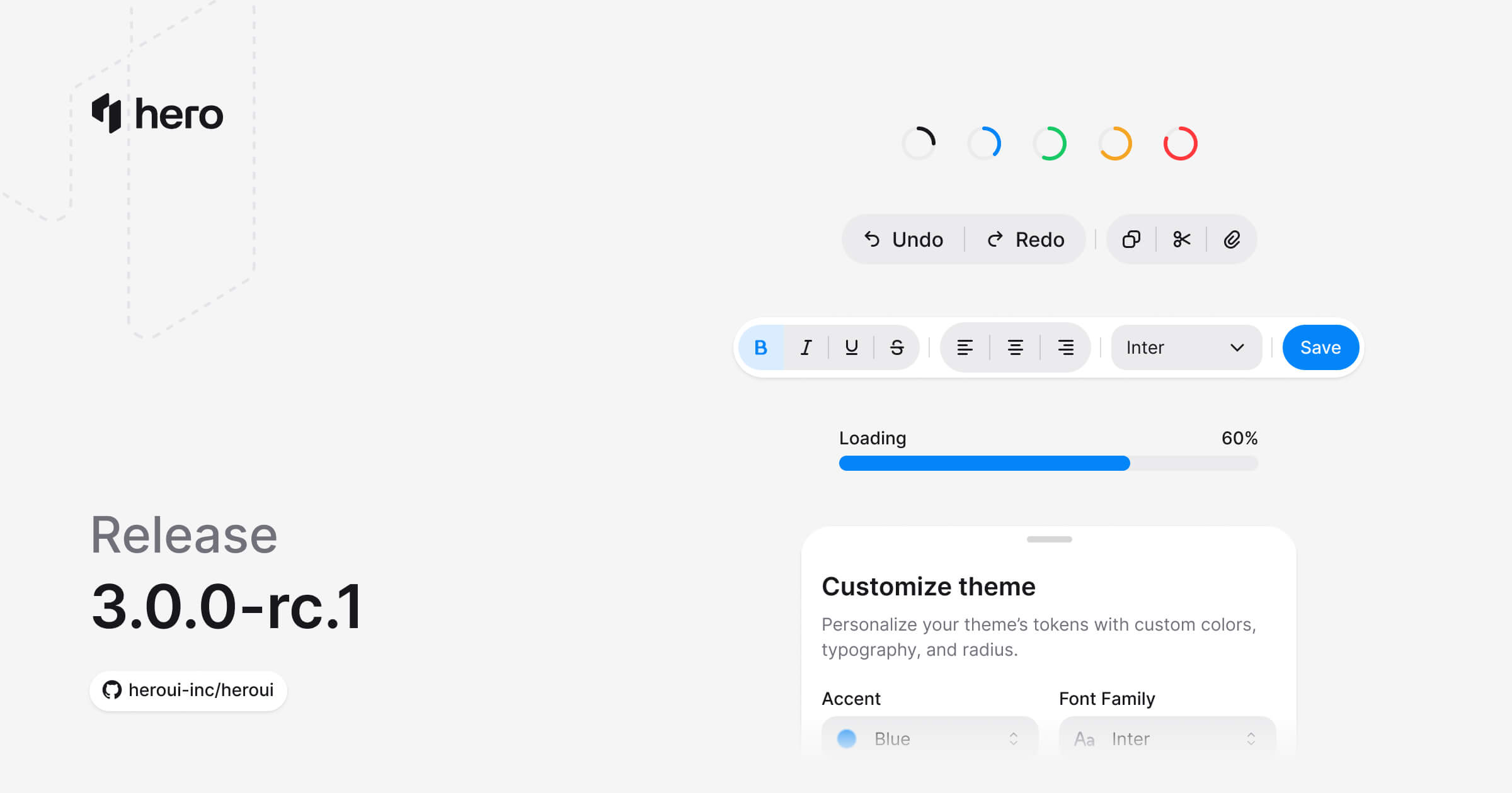
新增 7 个组件(Drawer、ToggleButton、ToggleButtonGroup、Meter、ProgressBar、ProgressCircle、Toolbar),Table 与 ListBox 支持虚拟化,ButtonGroup 多项改进,以及若干 bug 修复。
新增七个组件:Drawer、ToggleButton、ToggleButtonGroup、Meter、ProgressBar、ProgressCircle 与 Toolbar。Table 与 ListBox 支持虚拟化,ButtonGroup 新增 Separator 子组件并支持垂直方向,React Aria Components 升级到 v1.16.0。
安装
升级到最新版本:
npm i @lenso/tokens@rc @lenso/ui@rc正在使用 AI 助手? 只需对它说一句「Hey Cursor,把 HeroUI 升级到最新版本」,AI 助手就会自动对比版本并应用必要的变更。了解更多请参阅 HeroUI MCP 服务器。
新增功能
新组件
- Drawer:滑出式面板,支持拖拽关闭、4 种放置位置、多种背景遮罩变体以及可滚动的内容区(文档)
- ToggleButton:选中 / 未选中两态的切换按钮,支持全部按钮变体以及仅图标模式(文档)
- ToggleButtonGroup:单选或多选的切换按钮组,支持 attached / detached 布局以及方向设置(文档)
- Meter:在已知范围内呈现某个数值——例如磁盘占用、密码强度、配额等(文档)
- ProgressBar:线性进度条,支持确定 / 不确定态、多种颜色与自定义格式(文档)
- ProgressCircle:基于 SVG 的环形进度条,可自定义轨道圆与填充圆(文档)
- Toolbar:将按钮、切换控件与分隔线按水平或垂直方向组合在一起的工具栏组件(文档)
Drawer
带有背景遮罩的滑出式浮层面板,支持顶部 / 底部 / 左侧 / 右侧四种放置位置、拖拽关闭手势以及多种背景遮罩变体。复合部件包括:Trigger、Backdrop、Content、Dialog、Header、Heading、Body、Footer、Handle、CloseTrigger。
此预览复用英文版适配,不代表中文源示例已完成本地实现。
"use client";
// Adapted from HeroUI v3.2.6 drawer-basic (Apache-2.0).import { Button, Drawer } from "@lenso/ui";
export function Basic() { return ( <Drawer.Provider> <Drawer swipeDirection="right"> <Drawer.Trigger render={<Button variant="secondary" />}>Open Drawer</Drawer.Trigger> <Drawer.Portal> <Drawer.Backdrop /> <Drawer.Viewport> <Drawer.Popup> <Drawer.Content> <Drawer.Header> <Drawer.Title>Drawer Title</Drawer.Title> </Drawer.Header> <Drawer.Body> <p> This is a bottom drawer built with React Aria's Modal component. It slides up from the bottom of the screen with a smooth CSS transition. </p> </Drawer.Body> <Drawer.Footer> <Drawer.Close render={<Button variant="secondary" />}>Cancel</Drawer.Close> <Drawer.Close render={<Button />}>Confirm</Drawer.Close> </Drawer.Footer> </Drawer.Content> </Drawer.Popup> </Drawer.Viewport> </Drawer.Portal> </Drawer> </Drawer.Provider> );}Local adaptation source above. Derived from HeroUI v3.2.6 source.
放置位置:
此预览复用英文版适配,不代表中文源示例已完成本地实现。
"use client";
// Adapted from HeroUI v3.2.6 drawer-placements (Apache-2.0).import * as stylex from "@stylexjs/stylex";import { Button, CloseIcon, Drawer } from "@lenso/ui";import { styles } from "./styles";
export function Placements() { const placements = ["bottom", "top", "left", "right"] as const; return ( <div {...stylex.props(styles.row)}> {placements.map((placement) => ( <Drawer.Provider key={placement}> <Drawer swipeDirection={ placement === "bottom" ? "down" : placement === "top" ? "up" : placement } > <Drawer.Trigger render={<Button variant="secondary" />}> {placement.charAt(0).toUpperCase() + placement.slice(1)} </Drawer.Trigger> <Drawer.Portal> <Drawer.Backdrop /> <Drawer.Viewport> <Drawer.Popup> <Drawer.Content> <Drawer.Close aria-label="Close drawer" render={ <Button isIconOnly size="sm" variant="tertiary" xstyle={styles.cornerClose} /> } > <CloseIcon /> </Drawer.Close> {placement === "bottom" && <Drawer.Handle />} <Drawer.Header> <Drawer.Title> {placement.charAt(0).toUpperCase() + placement.slice(1)} Drawer </Drawer.Title> </Drawer.Header> <Drawer.Body> <p> This drawer slides in from the <strong>{placement}</strong> edge of the screen. </p> </Drawer.Body> <Drawer.Footer> <Drawer.Close render={<Button variant="secondary" />}>Cancel</Drawer.Close> <Drawer.Close render={<Button />}>Done</Drawer.Close> </Drawer.Footer> {placement === "top" && <Drawer.Handle />} </Drawer.Content> </Drawer.Popup> </Drawer.Viewport> </Drawer.Portal> </Drawer> </Drawer.Provider> ))} </div> );}Local adaptation source above. Derived from HeroUI v3.2.6 source.
配合表单使用:
此预览复用英文版适配,不代表中文源示例已完成本地实现。
"use client";
// Adapted from HeroUI v3.2.6 drawer-with-form (Apache-2.0).import * as stylex from "@stylexjs/stylex";import { Button, CloseIcon, Drawer, Input, Label, TextField } from "@lenso/ui";import { styles } from "./styles";
export function WithForm() { return ( <Drawer.Provider> <Drawer swipeDirection="right"> <Drawer.Trigger render={<Button variant="secondary" />}>Edit Profile</Drawer.Trigger> <Drawer.Portal> <Drawer.Backdrop /> <Drawer.Viewport> <Drawer.Popup> <Drawer.Content> <Drawer.Close aria-label="Close drawer" render={ <Button isIconOnly size="sm" variant="tertiary" xstyle={styles.cornerClose} /> } > <CloseIcon /> </Drawer.Close> <Drawer.Header> <Drawer.Title>Edit Profile</Drawer.Title> </Drawer.Header> <Drawer.Body> <form {...stylex.props(styles.form)}> <TextField fullWidth name="name"> <Label>Name</Label> <Input type="text" placeholder="Enter your name" variant="secondary" /> </TextField> <TextField fullWidth name="email"> <Label>Email</Label> <Input type="email" placeholder="Enter your email" variant="secondary" /> </TextField> <TextField fullWidth name="bio"> <Label>Bio</Label> <Input placeholder="Tell us about yourself" variant="secondary" /> </TextField> </form> </Drawer.Body> <Drawer.Footer> <Drawer.Close render={<Button variant="secondary" />}>Cancel</Drawer.Close> <Drawer.Close render={<Button />}>Save Changes</Drawer.Close> </Drawer.Footer> </Drawer.Content> </Drawer.Popup> </Drawer.Viewport> </Drawer.Portal> </Drawer> </Drawer.Provider> );}Local adaptation source above. Derived from HeroUI v3.2.6 source.
Toggle Button
具备状态的切换按钮,可在选中与未选中之间切换。支持全部按钮变体与尺寸、仅图标模式,以及受控 / 非受控两种使用方式。
此预览复用英文版适配,不代表中文源示例已完成本地实现。
"use client";
import { Heart } from "@gravity-ui/icons";import { ToggleButton } from "@lenso/ui";
export function Basic() { return ( <ToggleButton> <ToggleButton.Icon> <Heart /> </ToggleButton.Icon> Like </ToggleButton> );}Local adaptation source above. Derived from HeroUI v3.2.6 source.
变体:
此预览复用英文版适配,不代表中文源示例已完成本地实现。
"use client";// Adapted from HeroUI v3.2.6 (e385ac2), Apache-2.0.import { Heart } from "@gravity-ui/icons";import { ToggleButton } from "@lenso/ui";import * as stylex from "@stylexjs/stylex";import { styles } from "./source.stylex";export function Variants() { return ( <div {...stylex.props(styles.row)}> <ToggleButton> <ToggleButton.Icon> <Heart /> </ToggleButton.Icon> Default </ToggleButton> <ToggleButton variant="ghost"> <ToggleButton.Icon> <Heart /> </ToggleButton.Icon> Ghost </ToggleButton> </div> );}Local adaptation source above. Derived from HeroUI v3.2.6 source.
Toggle Button Group
单选或多选的切换按钮组。支持 attached(连接式)与 detached(分离式)两种布局、垂直方向、整宽展示,以及一个 Separator 子组件。
此预览复用英文版适配,不代表中文源示例已完成本地实现。
"use client";
import { Bold, Italic, Strikethrough, Underline } from "@gravity-ui/icons";import { ToggleButton, ToggleButtonGroup } from "@lenso/ui";
export function Basic() { return ( <ToggleButtonGroup multiple aria-label="Text formatting"> <ToggleButton isIconOnly aria-label="Bold" value="bold"> <ToggleButton.Icon> <Bold /> </ToggleButton.Icon> </ToggleButton> <ToggleButton isIconOnly aria-label="Italic" value="italic"> <ToggleButtonGroup.Separator /> <ToggleButton.Icon> <Italic /> </ToggleButton.Icon> </ToggleButton> <ToggleButton isIconOnly aria-label="Underline" value="underline"> <ToggleButtonGroup.Separator /> <ToggleButton.Icon> <Underline /> </ToggleButton.Icon> </ToggleButton> <ToggleButton isIconOnly aria-label="Strikethrough" value="strikethrough"> <ToggleButtonGroup.Separator /> <ToggleButton.Icon> <Strikethrough /> </ToggleButton.Icon> </ToggleButton> </ToggleButtonGroup> );}Local adaptation source above. Derived from HeroUI v3.2.6 source.
选择模式:
此预览复用英文版适配,不代表中文源示例已完成本地实现。
"use client";export { SelectionMode } from "./source";Local adaptation source above. Derived from HeroUI v3.2.6 source.
Attached 模式:
此预览复用英文版适配,不代表中文源示例已完成本地实现。
"use client";export { Attached } from "./source";Local adaptation source above. Derived from HeroUI v3.2.6 source.
Meter
在已知范围内呈现某个数值——例如磁盘占用、密码强度、配额等。复合部件包括:Root、Output、Track、Fill。
此预览复用英文版适配,不代表中文源示例已完成本地实现。
"use client";
import { Meter } from "@lenso/ui";import * as stylex from "@stylexjs/stylex";const styles = stylex.create({ meter: { width: 256 } });
export function Basic() { return ( <Meter aria-label="Storage" xstyle={styles.meter} value={60}> <Meter.Label>Storage</Meter.Label> <Meter.Output /> <Meter.Track> <Meter.Fill /> </Meter.Track> </Meter> );}Local adaptation source above. Derived from HeroUI v3.2.6 source.
颜色:
此预览复用英文版适配,不代表中文源示例已完成本地实现。
"use client";// Adapted from HeroUI v3.2.6 (Apache-2.0).import { Meter } from "@lenso/ui";import * as stylex from "@stylexjs/stylex";const styles = stylex.create({ column: { display: "flex", width: 256, flexDirection: "column", gap: 24 },});export function Colors() { return ( <div {...stylex.props(styles.column)}> {(["default", "accent", "success", "warning", "danger"] as const).map((color) => ( <Meter key={color} color={color} value={50}> <Meter.Label> {color[0]?.toUpperCase()} {color.slice(1)} </Meter.Label> <Meter.Output /> <Meter.Track> <Meter.Fill /> </Meter.Track> </Meter> ))} </div> );}export default Colors;Local adaptation source above. Derived from HeroUI v3.2.6 source.
Progress Bar
线性进度指示器,支持确定 / 不确定态、颜色变体、多种尺寸以及自定义数值显示。复合部件包括:Root、Output、Track、Fill。
此预览复用英文版适配,不代表中文源示例已完成本地实现。
"use client";
import { ProgressBar } from "@lenso/ui";import * as stylex from "@stylexjs/stylex";const styles = stylex.create({ progress: { width: 256 } });
export function Basic() { return ( <ProgressBar aria-label="Loading" xstyle={styles.progress} value={60}> <ProgressBar.Label>Loading</ProgressBar.Label> <ProgressBar.Output /> <ProgressBar.Track> <ProgressBar.Fill /> </ProgressBar.Track> </ProgressBar> );}Local adaptation source above. Derived from HeroUI v3.2.6 source.
不确定态:
此预览复用英文版适配,不代表中文源示例已完成本地实现。
"use client";// Adapted from HeroUI v3.2.6 (Apache-2.0); null is Base UI's indeterminate value.import { ProgressBar } from "@lenso/ui";import * as stylex from "@stylexjs/stylex";const styles = stylex.create({ progress: { width: 256 } });export function Indeterminate() { return ( <ProgressBar aria-label="Loading" xstyle={styles.progress} value={null}> <ProgressBar.Label>Loading...</ProgressBar.Label> <ProgressBar.Track> <ProgressBar.Fill /> </ProgressBar.Track> </ProgressBar> );}export default Indeterminate;Local adaptation source above. Derived from HeroUI v3.2.6 source.
Progress Circle
基于 SVG 的环形进度条,提供 TrackCircle 与 FillCircle 两个子组件,便于直接控制 SVG。同时支持确定与不确定态。
此预览复用英文版适配,不代表中文源示例已完成本地实现。
"use client";
import { ProgressCircle } from "@lenso/ui";
export function Basic() { return ( <ProgressCircle aria-label="Loading" value={60}> <ProgressCircle.Track> <ProgressCircle.TrackCircle /> <ProgressCircle.FillCircle /> </ProgressCircle.Track> </ProgressCircle> );}Local adaptation source above. Derived from HeroUI v3.2.6 source.
自定义 SVG:
此预览复用英文版适配,不代表中文源示例已完成本地实现。
"use client";// Adapted from HeroUI v3.2.6 (Apache-2.0).import { ProgressCircle } from "@lenso/ui";import * as stylex from "@stylexjs/stylex";const styles = stylex.create({ row: { display: "flex", alignItems: "flex-end", gap: 24 } });export function CustomSvg() { return ( <div {...stylex.props(styles.row)}> <ProgressCircle aria-label="Thin circle" value={60}> <ProgressCircle.Track strokeWidth={2} viewBox="0 0 36 36"> <ProgressCircle.TrackCircle cx={18} cy={18} r={17} strokeWidth={2} /> <ProgressCircle.FillCircle cx={18} cy={18} r={17} strokeWidth={2} /> </ProgressCircle.Track> </ProgressCircle> <ProgressCircle aria-label="Default circle" value={60}> <ProgressCircle.Track> <ProgressCircle.TrackCircle /> <ProgressCircle.FillCircle /> </ProgressCircle.Track> </ProgressCircle> <ProgressCircle aria-label="Thick circle" value={60}> <ProgressCircle.Track strokeWidth={6} viewBox="0 0 36 36"> <ProgressCircle.TrackCircle cx={18} cy={18} r={15} strokeWidth={6} /> <ProgressCircle.FillCircle cx={18} cy={18} r={15} strokeWidth={6} /> </ProgressCircle.Track> </ProgressCircle> </div> );}export default CustomSvg;Local adaptation source above. Derived from HeroUI v3.2.6 source.
Toolbar
将按钮、切换按钮与分隔线组合到一个具备无障碍语义的工具栏中。支持水平或垂直方向,可与 ButtonGroup 和 ToggleButtonGroup 组合使用。
此预览复用英文版适配,不代表中文源示例已完成本地实现。
"use client";export { Basic } from "./source";Local adaptation source above. Derived from HeroUI v3.2.6 source.
配合 Button Group 使用:
此预览复用英文版适配,不代表中文源示例已完成本地实现。
"use client";export { WithButtonGroup } from "./source";Local adaptation source above. Derived from HeroUI v3.2.6 source.
组件改进
ButtonGroup 的增强
新增的 ButtonGroup.Separator 子组件可在按钮之间显式插入一条视觉分隔线。在水平和垂直两种方向下都能正常工作。
此预览复用英文版适配,不代表中文源示例已完成本地实现。
"use client";// Adapted from HeroUI v3.2.6 (e385ac2), Apache-2.0.import { ChevronDown, ChevronLeft, ChevronRight, CodeFork, Ellipsis, Picture, Pin, QrCode, Star, TextAlignCenter, TextAlignJustify, TextAlignLeft, TextAlignRight, ThumbsDown, ThumbsUp, Video,} from "@gravity-ui/icons";import { Button, ButtonGroup, Chip, Dropdown } from "@lenso/ui";import * as stylex from "@stylexjs/stylex";import { basicStyles as styles } from "./basic.stylex";import { styles as sourceStyles } from "./source.stylex";export function Basic() { return ( <div {...stylex.props(styles.root)}> <div {...stylex.props(styles.section)}> <ButtonGroup> <Button>Merge pull request</Button> <Dropdown> <Dropdown.Trigger render={<Button isIconOnly aria-label="More options" xstyle={styles.splitTrigger} />} > <ButtonGroup.Separator /> <Button.Icon> <ChevronDown /> </Button.Icon> </Dropdown.Trigger> <Dropdown.Portal> <Dropdown.Positioner side="bottom" align="end"> <Dropdown.Popup xstyle={styles.popup}> {[ { id: "merge", label: "Create a merge commit", description: "All commits from this branch will be added to the base branch", }, { id: "squash", label: "Squash and merge", description: "The 14 commits from this branch will be combined into one commit in the base branch", }, { id: "rebase", label: "Rebase and merge", description: "The 14 commits from this branch will be rebased and added to the base branch", }, ].map((item) => ( <Dropdown.Item key={item.id} xstyle={styles.item}> <span {...stylex.props(sourceStyles.menuLabel)}>{item.label}</span> <span {...stylex.props(sourceStyles.menuDescription)}> {item.description} </span> </Dropdown.Item> ))} </Dropdown.Popup> </Dropdown.Positioner> </Dropdown.Portal> </Dropdown> </ButtonGroup> </div> <div {...stylex.props(styles.section)}> <div {...stylex.props(styles.row)}> <ButtonGroup variant="tertiary"> <Button> <CodeFork {...stylex.props(styles.smallIcon)} /> Fork <Chip color="accent" size="sm" variant="soft"> 24 </Chip> </Button> <Button isIconOnly aria-label="More fork options"> <ButtonGroup.Separator /> <Button.Icon> <ChevronDown /> </Button.Icon> </Button> </ButtonGroup> <ButtonGroup variant="tertiary"> <Button isIconOnly aria-label="Show QR code"> <Button.Icon> <QrCode /> </Button.Icon> </Button> <Button> <ButtonGroup.Separator /> Scan to pay </Button> </ButtonGroup> <ButtonGroup variant="tertiary"> <Button> <Button.Icon> <ThumbsUp /> </Button.Icon> <span {...stylex.props(styles.count)}>2.4K</span> </Button> <Button isIconOnly aria-label="Dislike"> <ButtonGroup.Separator /> <Button.Icon> <ThumbsDown /> </Button.Icon> </Button> </ButtonGroup> <ButtonGroup variant="tertiary"> <Button> <Star {...stylex.props(styles.smallIcon)} /> Star </Button> <Button xstyle={styles.countButton}> <ButtonGroup.Separator /> <Chip color="accent" size="sm" variant="soft"> 104 </Chip> </Button> </ButtonGroup> <ButtonGroup variant="tertiary"> <Button> <Button.Icon> <Pin /> </Button.Icon> Pinned </Button> <Button isIconOnly aria-label="More pin options"> <ButtonGroup.Separator /> <Button.Icon> <ChevronDown /> </Button.Icon> </Button> </ButtonGroup> </div> </div> <div {...stylex.props(styles.section)}> <ButtonGroup variant="tertiary"> <Button> <Button.Icon> <ChevronLeft /> </Button.Icon> Previous </Button> <Button> <ButtonGroup.Separator /> Next <Button.Icon> <ChevronRight /> </Button.Icon> </Button> </ButtonGroup> </div> <div {...stylex.props(styles.section)}> <ButtonGroup variant="tertiary"> <Button> <Button.Icon> <Picture /> </Button.Icon> Photos </Button> <Button> <ButtonGroup.Separator /> <Button.Icon> <Video /> </Button.Icon> Videos </Button> <Button isIconOnly aria-label="More options"> <ButtonGroup.Separator /> <Button.Icon> <Ellipsis /> </Button.Icon> </Button> </ButtonGroup> </div> <div {...stylex.props(styles.section)}> <ButtonGroup variant="tertiary"> <Button>Left</Button> <Button> <ButtonGroup.Separator /> Center </Button> <Button> <ButtonGroup.Separator /> Right </Button> </ButtonGroup> </div> <div {...stylex.props(styles.section)}> <ButtonGroup variant="tertiary"> {[ { label: "Align left", icon: <TextAlignLeft /> }, { label: "Align center", icon: <TextAlignCenter /> }, { label: "Align right", icon: <TextAlignRight /> }, { label: "Justify", icon: <TextAlignJustify /> }, ].map((item, index) => ( <Button key={item.label} isIconOnly aria-label={item.label}> {index > 0 && <ButtonGroup.Separator />} <Button.Icon>{item.icon}</Button.Icon> </Button> ))} </ButtonGroup> </div> </div> );}Local adaptation source above. Derived from HeroUI v3.2.6 source.
Table 与 ListBox 的虚拟化
Table 与 ListBox 现在可以借助 React Aria 的 Virtualizer 来支持大数据集的虚拟化渲染。Virtualizer、TableLayout 和 ListLayout 都已从 @lenso/ui 重新导出。
此预览复用英文版适配,不代表中文源示例已完成本地实现。
"use client";// HeroUI v3.2.6 virtualization adaptation (Apache-2.0); native row spacers.import { Table } from "@lenso/ui";import { styles } from "./data";const first = [ "Emma", "Liam", "Olivia", "Noah", "Ava", "James", "Sophia", "Oliver", "Isabella", "Lucas", "Mia", "Ethan", "Charlotte", "Mason", "Amelia", "Logan", "Harper", "Alexander", "Ella", "Benjamin",];const last = [ "Smith", "Johnson", "Williams", "Brown", "Jones", "Garcia", "Miller", "Davis", "Rodriguez", "Martinez", "Anderson", "Taylor", "Thomas", "Jackson", "White", "Harris", "Clark", "Lewis", "Robinson", "Walker",];const roles = [ "Software Engineer", "Senior Engineer", "Staff Engineer", "Product Manager", "Designer", "Data Analyst", "QA Engineer", "DevOps Engineer", "Marketing Manager", "Sales Representative",];const users = Array.from({ length: 1000 }, (_, index) => ({ key: index + 1, name: `${first[index % 20]} ${last[Math.floor(index / 20) % 20]}`, role: roles[index % 10], email: `${first[index % 20]!.toLowerCase()}.${last[Math.floor(index / 20) % 20]!.toLowerCase()}@acme.com`,}));export function Virtualization() { return ( <Table> <Table.ScrollContainer xstyle={styles.virtualViewport}> <Table.Content aria-label="Virtualized table with 1000 rows" xstyle={styles.resizing}> <Table.Header xstyle={styles.sticky}> <Table.Column columnKey="name" minWidth={160}> Name </Table.Column> <Table.Column columnKey="role" minWidth={220}> Role </Table.Column> <Table.Column columnKey="email" minWidth={240}> Email </Table.Column> </Table.Header> <Table.Body items={users} virtualized={{ height: 300, rowHeight: 42 }}> {(user) => ( <Table.Row itemKey={user.key}> <Table.Cell>{user.name}</Table.Cell> <Table.Cell>{user.role}</Table.Cell> <Table.Cell>{user.email}</Table.Cell> </Table.Row> )} </Table.Body> </Table.Content> </Table.ScrollContainer> </Table> );}Local adaptation source above. Derived from HeroUI v3.2.6 source.
ButtonGroup 的方向
ButtonGroup 现在接受一个 orientation prop("horizontal" | "vertical"),并在两种方向下都正确处理边框圆角与分隔线方向。根元素也已从 <div> 升级为 React Aria 的 Group,从而具备正确的 role="group" 语义。
此预览复用英文版适配,不代表中文源示例已完成本地实现。
"use client";export { Orientation } from "./source";Local adaptation source above. Derived from HeroUI v3.2.6 source.
ButtonGroup 的焦点环
成组按钮上的焦点环现在使用 ring-inset,确保焦点环留在按钮内部边界,而不会与相邻按钮重叠。
细粒度的组件引入
@lenso/ui 现在支持按组件的子路径入口,方便更明确地按需引入(#6301):
// Before — root entrypointimport { Button } from "@lenso/ui";
// After — granular subpath importimport { Button } from "@lenso/ui/button";依赖更新
将 react-aria-components 从 v1.15.1 升级到 v1.16.0,同时升级了相关包:
| 包名 | 旧版本 | 新版本 |
|---|---|---|
react-aria-components | 1.15.1 | 1.16.0 |
@react-aria/i18n | 3.12.15 | 3.12.16 |
@react-aria/utils | 3.33.0 | 3.33.1 |
@react-types/shared | 3.33.0 | 3.33.1 |
@react-types/color | 3.1.3 | 3.1.4 |
@internationalized/date | 3.11.0 | 3.12.0 |
@react-stately/data | 3.15.1 | 3.15.2 |
Bug 修复
- InputGroup:聚焦样式现在仅在实际的 input / textarea 获得焦点时(
:has([data-slot]:focus))才会触发,不再因:focus-within而被任意可聚焦的子元素触发(#6274) - Avatar:fallback 元素现在会从父级继承
border-radius,而不再硬编码为rounded-full,因此className覆盖能够正确生效(#6300) - Modal 与 AlertDialog:背景遮罩的点击事件不会再透过 portal 传播到父级元素(#6297)
- Table:修复了 Firefox 中表头圆角与背景色溢出的问题(#6298)
链接
贡献者
感谢每一位为本次发布做出贡献的开发者!
HeroUI contributors