v3.0.0-beta.1
Major redesign with new design system, 8 new components, and improved developer experience.
This release introduces a comprehensive redesign of HeroUI v3, merging v2's beauty and animations with v3's simplicity. All components redesigned, 8 new components, and improved design system with better color tokens, shadows, and architecture.
Installation
Update to the latest version:
npm i @lenso/tokens@beta @lenso/ui@betaUsing AI assistants? Simply prompt "Hey Cursor, update HeroUI to the latest version" and your AI assistant will automatically compare versions and apply the necessary changes. Learn more about the HeroUI MCP Server.
What's New
New Design System
We've spent weeks crafting a new design system that merges the soul of HeroUI v2 with the simplicity of v3. Every component has been redesigned with attention to detail, smooth animations, and improved developer experience. The new design system is available in our Figma Kit V3.
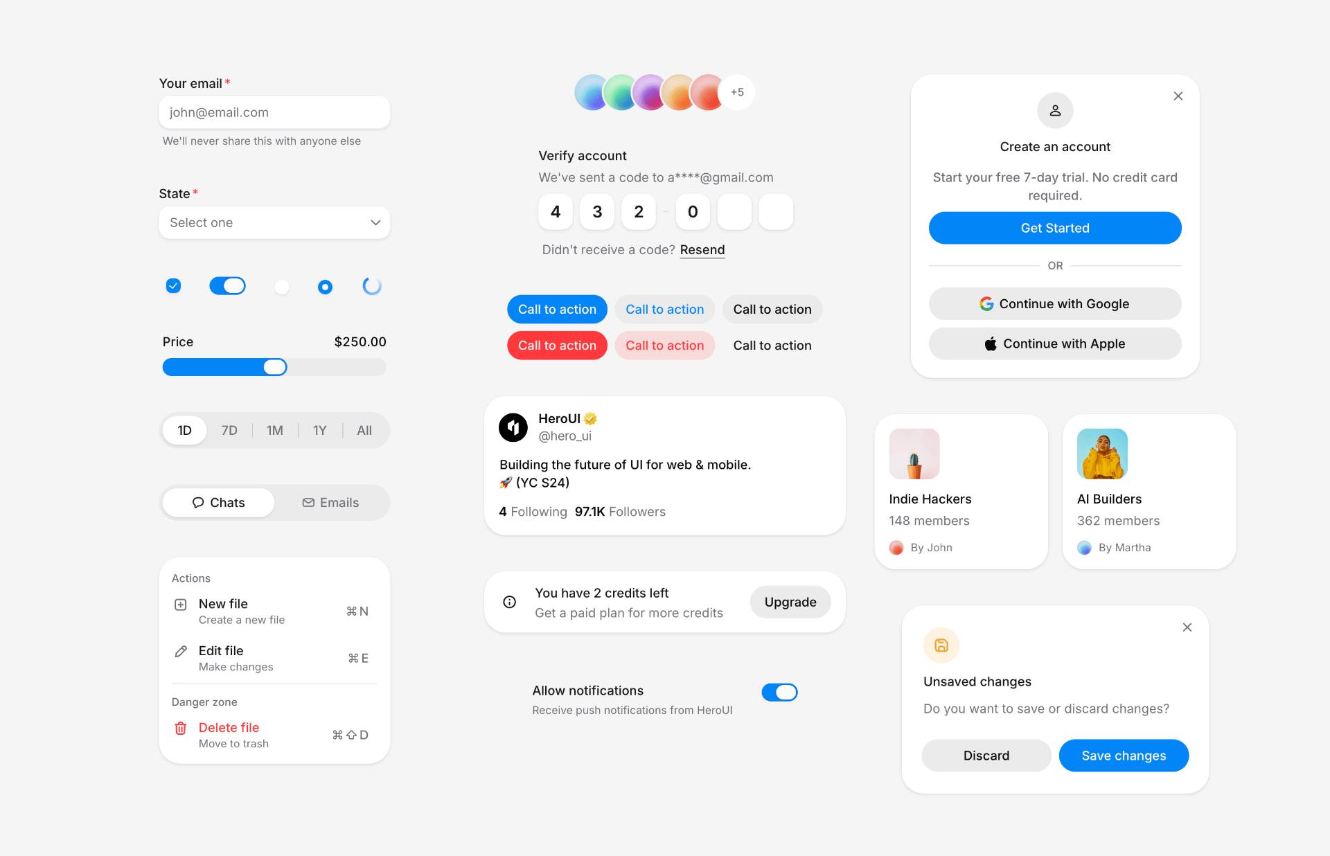 Watch the upstream demonstration recording
The redesign brings:
- New color system that brings v3's vision to life and stands out for its uniqueness
- Refined shadow system for better depth perception
- New variables and tokens for better customization
- Automatic
isOnSurfacesupport for form-based components - Enhanced border and spacing tokens
- Better contrast and accessibility
- Consistent component patterns across web and native
New Components
This release introduces 8 new essential components:
- Alert: Display important messages and notifications with status indicators.
- Checkbox & CheckboxGroup: Select multiple items from a list.
- InputOTP: One-time password input for authentication flows.
- Listbox: Display a list of options and allow single or multiple selection.
- Select: Dropdown selection component built on top of Listbox.
- Slider: Select a value from a range with custom marks and labels.
- Surface: Base surface component for creating elevated containers.
Alert
"use client";// Adapted from HeroUI v3.2.6 (e385ac202b2cdb94b1bf6fa76d32c31c8259cc5e), Apache-2.0.import { Alert, Button, CloseButton, Spinner } from "@lenso/ui";import * as stylex from "@stylexjs/stylex";import { s } from "../card/display.stylex";
export function Basic() { return ( <div {...stylex.props(s.alertStack)}> <Alert> <Alert.Indicator /> <Alert.Content> <Alert.Title>New features available</Alert.Title> <Alert.Description> Check out our latest updates including dark mode support and improved accessibility features. </Alert.Description> </Alert.Content> </Alert> <Alert status="accent"> <Alert.Indicator /> <Alert.Content> <Alert.Title>Update available</Alert.Title> <Alert.Description> A new version of the application is available. Please refresh to get the latest features and bug fixes. </Alert.Description> <Button xstyle={s.mobile2} size="sm" variant="primary"> Refresh </Button> </Alert.Content> <Button xstyle={s.desktopBlock} size="sm" variant="primary"> Refresh </Button> </Alert> <Alert status="danger"> <Alert.Indicator /> <Alert.Content> <Alert.Title>Unable to connect to server</Alert.Title> <Alert.Description> We're experiencing connection issues. Please try the following: <ul {...stylex.props(s.list)}> <li>Check your internet connection</li> <li {...stylex.props(s.space1)}>Refresh the page</li> <li {...stylex.props(s.space1)}>Clear your browser cache</li> </ul> </Alert.Description> <Button xstyle={s.mobile2} size="sm" variant="danger"> Retry </Button> </Alert.Content> <Button xstyle={s.desktopBlock} size="sm" variant="danger"> Retry </Button> </Alert> <Alert status="success"> <Alert.Indicator /> <Alert.Content> <Alert.Title>Profile updated successfully</Alert.Title> </Alert.Content> <CloseButton /> </Alert> <Alert status="accent"> <Alert.Indicator> <Spinner size="sm" /> </Alert.Indicator> <Alert.Content> <Alert.Title>Processing your request</Alert.Title> <Alert.Description> Please wait while we sync your data. This may take a few moments. </Alert.Description> </Alert.Content> </Alert> <Alert status="warning"> <Alert.Indicator /> <Alert.Content> <Alert.Title>Scheduled maintenance</Alert.Title> <Alert.Description> Our services will be unavailable on Sunday, March 15th from 2:00 AM to 6:00 AM UTC for scheduled maintenance. </Alert.Description> </Alert.Content> </Alert> </div> );}Local adaptation source above. Derived from HeroUI v3.2.6 source.
Checkbox & CheckboxGroup
"use client";/** Adapted from HeroUI v3.2.6. SPDX-License-Identifier: Apache-2.0 */import { Checkbox } from "@lenso/ui";
export function Basic() { return ( <Checkbox name="basic-terms"> <Checkbox.Content> <Checkbox.Control> <Checkbox.Indicator /> </Checkbox.Control> Accept terms and conditions </Checkbox.Content> </Checkbox> );}Local adaptation source above. Derived from HeroUI v3.2.6 source.
"use client";/** Adapted from HeroUI v3.2.6. SPDX-License-Identifier: Apache-2.0 */import { Checkbox, CheckboxGroup, TextField } from "@lenso/ui";import { labelStyles } from "@lenso/tokens/label";import { descriptionStyles } from "@lenso/tokens/description";import { checkboxSupportingStyles } from "@lenso/tokens/checkbox";import { useId } from "react";import * as stylex from "@stylexjs/stylex";
const interests = [ { value: "coding", label: "Coding", description: "Love building software" }, { value: "design", label: "Design", description: "Enjoy creating beautiful interfaces" }, { value: "writing", label: "Writing", description: "Passionate about content creation" },];export function Basic() { const id = useId(); return ( <TextField name="interests"> <CheckboxGroup aria-labelledby={`${id}-label`} aria-describedby={`${id}-help`}> <span id={`${id}-label`} {...stylex.props(labelStyles.label)}> Select your interests </span> <span id={`${id}-help`} {...stylex.props(descriptionStyles.description)}> Choose all that apply </span> {interests.map((interest) => ( <Checkbox key={interest.value} value={interest.value} aria-label={interest.label} aria-describedby={`${id}-${interest.value}`} > <Checkbox.Content> <Checkbox.Control> <Checkbox.Indicator /> </Checkbox.Control> {interest.label} </Checkbox.Content> <span id={`${id}-${interest.value}`} {...stylex.props(descriptionStyles.description, checkboxSupportingStyles.direct)} > {interest.description} </span> </Checkbox> ))} </CheckboxGroup> </TextField> );}Local adaptation source above. Derived from HeroUI v3.2.6 source.
InputOTP
"use client";// Adapted from HeroUI v3.2.6 (e385ac202b2cdb94b1bf6fa76d32c31c8259cc5e), Apache-2.0.import { InputOTP, Label, Link, TextField } from "@lenso/ui";import * as stylex from "@stylexjs/stylex";import { Slots, styles } from "./parts";export function Basic() { return ( <TextField name="code" xstyle={styles.field}> <div {...stylex.props(styles.heading)}> <Label>Verify account</Label> <p {...stylex.props(styles.muted)}>We've sent a code to a****@gmail.com</p> </div> <InputOTP length={6} name="code"> <Slots /> </InputOTP> <div {...stylex.props(styles.resend)}> <p {...stylex.props(styles.muted)}>Didn't receive a code?</p> <Link xstyle={styles.link} href="#"> Resend </Link> </div> </TextField> );}Local adaptation source above. Derived from HeroUI v3.2.6 source.
Listbox
"use client";
// Adapted from HeroUI v3.2.6 list-box-default (Apache-2.0).import * as stylex from "@stylexjs/stylex";import { descriptionStyles } from "@lenso/tokens/description";import { labelStyles } from "@lenso/tokens/label";import { Avatar, ListBox, ListBoxItem } from "@lenso/ui";
const users = [ { key: "1", textValue: "Bob", color: "blue" }, { key: "2", textValue: "Fred", color: "green" }, { key: "3", textValue: "Martha", color: "purple" },] as const;const styles = stylex.create({ root: { width: 220 }, details: { display: "flex", flexDirection: "column" },});
export function Default() { return ( <ListBox aria-label="Users" xstyle={styles.root} selectionMode="single"> {users.map((user) => ( <ListBoxItem key={user.key} itemKey={user.key} textValue={user.textValue}> <Avatar size="sm"> <Avatar.Image alt={user.textValue} src={`https://heroui-assets.nyc3.cdn.digitaloceanspaces.com/avatars/${user.color}.jpg`} /> <Avatar.Fallback>{user.textValue[0]}</Avatar.Fallback> </Avatar> <div {...stylex.props(styles.details)}> <span {...stylex.props(labelStyles.label)}>{user.textValue}</span> <span {...stylex.props(descriptionStyles.description)}> {user.textValue.toLowerCase()}@heroui.com </span> </div> <ListBoxItem.Indicator /> </ListBoxItem> ))} </ListBox> );}Local adaptation source above. Derived from HeroUI v3.2.6 source.
Select
"use client";/** HeroUI v3.2.6 adaptation. Copyright 2026 HeroUI. SPDX-License-Identifier: Apache-2.0 */import { SelectExample, states } from "./select-example";export function Default() { return <SelectExample label="State" choices={states} />;}Local adaptation source above. Derived from HeroUI v3.2.6 source.
Slider
"use client";/** Adapted from HeroUI v3.2.6. SPDX-License-Identifier: Apache-2.0 */import { Slider } from "@lenso/ui";import * as stylex from "@stylexjs/stylex";
const styles = stylex.create({ slider: { width: "100%", maxWidth: 320 } });export function Default() { return ( <Slider xstyle={styles.slider} defaultValue={30}> <Slider.Label>Volume</Slider.Label> <Slider.Output /> <Slider.Control> <Slider.Track> <Slider.Fill /> </Slider.Track> <Slider.Thumb aria-label="Volume" /> </Slider.Control> </Slider> );}Local adaptation source above. Derived from HeroUI v3.2.6 source.
Surface
"use client";// Adapted from HeroUI v3.2.6 (e385ac202b2cdb94b1bf6fa76d32c31c8259cc5e), Apache-2.0.import { Surface } from "@lenso/ui";import * as stylex from "@stylexjs/stylex";import { s } from "../card/display.stylex";
const variants = [ { variant: "default", label: "Default", description: "This is a default surface variant. It uses bg-surface styling.", }, { variant: "secondary", label: "Secondary", description: "This is a secondary surface variant. It uses bg-surface-secondary styling.", }, { variant: "tertiary", label: "Tertiary", description: "This is a tertiary surface variant. It uses bg-surface-tertiary styling.", }, { variant: "transparent", label: "Transparent", description: "This is a transparent surface variant. It has no background, suitable for overlays and cards with custom backgrounds.", },] as const;export function Variants() { return ( <div {...stylex.props(s.column4)}> {variants.map(({ variant, label, description }) => ( <div key={variant} {...stylex.props(s.column2)}> <p {...stylex.props(s.textSm, s.medium, s.muted)}>{label}</p> <Surface xstyle={[s.surface, variant === "transparent" && s.border]} variant={variant}> <h3 {...stylex.props(s.textBase, s.semibold, s.foreground)}>Surface Content</h3> <p {...stylex.props(s.textSm, s.muted)}>{description}</p> </Surface> </div> ))} </div> );}Local adaptation source above. Derived from HeroUI v3.2.6 source.
Improved Component APIs
Several components have been refined with better APIs:
- Link: Added
underlineandunderlineOffsetprops for better customization
"use client";
import { Link } from "@lenso/ui";
export function LinkBasic() { return ( <Link href="#"> Call to action <Link.Icon aria-hidden="true" /> </Link> );}Local adaptation source above. Derived from HeroUI v3.2.6 source.
- Card: Improved variants and styling system
"use client";// Adapted from HeroUI v3.2.6 (e385ac202b2cdb94b1bf6fa76d32c31c8259cc5e), Apache-2.0.// oxlint-disable jsx-a11y/prefer-tag-over-role -- A named SVG needs img semantics; an HTML img cannot render this icon.import { CircleDollar } from "@gravity-ui/icons";import { Avatar, Button, Card, CloseButton, Link } from "@lenso/ui";import * as stylex from "@stylexjs/stylex";import { s } from "./display.stylex";
const DOCS = "https://heroui-assets.nyc3.cdn.digitaloceanspaces.com/docs/";const AVATARS = "https://heroui-assets.nyc3.cdn.digitaloceanspaces.com/avatars/";
export function WithImages() { return ( <div {...stylex.props(s.gridOuter)}> <div {...stylex.props(s.grid)}> <Card xstyle={s.firstCard}> <div {...stylex.props(s.imageFrame)}> <img alt="Cherries" {...stylex.props(s.imageZoom)} loading="lazy" src={`${DOCS}cherries.jpeg`} /> </div> <div {...stylex.props(s.flexContent)}> <Card.Header xstyle={s.gap1}> <Card.Title xstyle={s.titleInset}>Become an ACME Creator!</Card.Title> <Card.Description> Lorem ipsum dolor sit amet consectetur. Sed arcu donec id aliquam dolor sed amet faucibus etiam. </Card.Description> <CloseButton aria-label="Close banner" xstyle={s.close} /> </Card.Header> <Card.Footer xstyle={s.footer}> <div {...stylex.props(s.column)}> <span {...stylex.props(s.textSm, s.medium, s.foreground)}>Only 10 spots</span> <span {...stylex.props(s.textXs, s.muted)}>Submission ends Oct 10.</span> </div> <Button xstyle={s.fullAuto}>Apply Now</Button> </Card.Footer> </div> </Card> <div {...stylex.props(s.gridRow)}> <div {...stylex.props(s.gridHalf)}> <Card xstyle={s.span12}> <div {...stylex.props(s.close, s.z10)}> <CloseButton aria-label="Close notification" /> </div> <Card.Header xstyle={s.gap3}> <CircleDollar aria-label="Dollar sign icon" {...stylex.props(s.primary, s.icon8, s.shrink0)} role="img" /> <div {...stylex.props(s.column1)}> <span {...stylex.props(s.textXs, s.medium, s.muted, s.uppercase)}>PAYMENT</span> <Card.Title xstyle={s.responsiveTitle}>You can now withdraw on crypto</Card.Title> <Card.Description xstyle={s.responsiveXs}> Add your wallet in settings to withdraw </Card.Description> </div> </Card.Header> <Card.Footer> <Link aria-label="Go to settings" href="#" rel="noopener noreferrer"> Go to settings <Link.Icon aria-hidden="true" /> </Link> </Card.Footer> </Card> <div {...stylex.props(s.gridRow)}> <Card xstyle={s.smallCard}> <Card.Header> <Avatar xstyle={s.roundedAvatar}> <Avatar.Image alt="Demo 1" src={`${DOCS}demo1.jpg`} /> <Avatar.Fallback>JK</Avatar.Fallback> </Avatar> </Card.Header> <Card.Content xstyle={s.mt1}> <p {...stylex.props(s.textSm, s.leading4, s.medium)}>Indie Hackers</p> <p {...stylex.props(s.textXs, s.muted)}>148 members</p> </Card.Content> <Card.Footer xstyle={s.row2}> <Avatar xstyle={s.avatarMini}> <Avatar.Image alt="John" src={`${AVATARS}red.jpg`} /> <Avatar.Fallback>JK</Avatar.Fallback> </Avatar> <p {...stylex.props(s.textXs, s.muted)}>By John</p> </Card.Footer> </Card> <Card xstyle={s.smallCard}> <Card.Header> <Avatar xstyle={s.roundedAvatar}> <Avatar.Image alt="Demo 2" src={`${DOCS}demo2.jpg`} /> <Avatar.Fallback>AB</Avatar.Fallback> </Avatar> </Card.Header> <Card.Content xstyle={s.mt1}> <p {...stylex.props(s.textSm, s.leading4, s.medium)}>AI Builders</p> <p {...stylex.props(s.textXs, s.muted)}>362 members</p> </Card.Content> <Card.Footer xstyle={s.row2}> <Avatar xstyle={s.avatarMini}> <Avatar.Image alt="John" src={`${AVATARS}blue.jpg`} /> <Avatar.Fallback>M</Avatar.Fallback> </Avatar> <p {...stylex.props(s.textXs, s.muted)}>By Martha</p> </Card.Footer> </Card> </div> </div> <Card xstyle={s.robotCard}> <img alt="NEO Home Robot" aria-hidden="true" {...stylex.props(s.imageCover)} src={`${DOCS}neo2.jpeg`} /> <Card.Header xstyle={[s.z10, s.white]}> <Card.Title xstyle={[s.textXs, s.semibold, s.tracking, s.black70]}>NEO</Card.Title> <Card.Description xstyle={[s.textSm, s.medium, s.black50]}> Home Robot </Card.Description> </Card.Header> <Card.Footer xstyle={s.robotFooter}> <div> <div {...stylex.props(s.textSm, s.medium, s.black)}>Available soon</div> <div {...stylex.props(s.textXs, s.black60)}>Get notified</div> </div> <Button xstyle={s.whiteButton} size="sm" variant="tertiary"> Notify me </Button> </Card.Footer> </Card> </div> <div {...stylex.props(s.gridRow)}> <Card xstyle={s.robotLarge}> <img alt="NEO Home Robot" aria-hidden="true" {...stylex.props(s.imageCover)} src={`${DOCS}neo1.jpeg`} /> <Card.Footer xstyle={s.robotLargeFooter}> <div> <div {...stylex.props(s.responsiveBase, s.medium, s.black)}>NEO</div> <div {...stylex.props(s.responsiveXs, s.medium, s.black50)}>$499/m</div> </div> <Button xstyle={s.whiteButton} size="sm" variant="tertiary"> Get now </Button> </Card.Footer> </Card> <div {...stylex.props(s.robotStack)}> <Card xstyle={s.eventCard} variant="transparent"> <img alt="Futuristic Robot" {...stylex.props(s.eventImage)} loading="lazy" src={`${DOCS}robot1.jpeg`} /> <div {...stylex.props(s.eventContent)}> <Card.Title xstyle={s.textSm}>Bridging the Future</Card.Title> <Card.Description xstyle={s.textXs}>Today, 6:30 PM</Card.Description> </div> </Card> <Card xstyle={s.eventCard} variant="transparent"> <img alt="Avocado" {...stylex.props(s.eventImage)} loading="lazy" src={`${DOCS}avocado.jpeg`} /> <div {...stylex.props(s.eventContent)}> <Card.Title xstyle={s.textSm}>Avocado Hackathon</Card.Title> <Card.Description xstyle={s.textXs}>Wed, 4:30 PM</Card.Description> </div> </Card> <Card xstyle={s.eventCard} variant="transparent"> <img alt="Sound Electro event" {...stylex.props(s.eventImage)} loading="lazy" src={`${DOCS}oranges.jpeg`} /> <div {...stylex.props(s.eventContent)}> <Card.Title xstyle={s.textSm}>Sound Electro | Beyond art</Card.Title> <Card.Description xstyle={s.textXs}>Fri, 8:00 PM</Card.Description> </div> </Card> </div> </div> </div> </div> );}Local adaptation source above. Derived from HeroUI v3.2.6 source.
- Chip: Enhanced with size variants and improved color system
"use client";// Adapted from HeroUI v3.2.6 (e385ac202b2cdb94b1bf6fa76d32c31c8259cc5e), Apache-2.0.import { Chip } from "@lenso/ui";import * as stylex from "@stylexjs/stylex";import { s } from "../card/display.stylex";
export function ChipBasic() { return ( <div {...stylex.props(s.wrap3)}> <Chip>Default</Chip> <Chip color="accent">Accent</Chip> <Chip color="success">Success</Chip> <Chip color="warning">Warning</Chip> <Chip color="danger">Danger</Chip> </div> );}Local adaptation source above. Derived from HeroUI v3.2.6 source.
- Switch: Redesigned from the ground up with improved visual design and animations
"use client";/** Adapted from HeroUI v3.2.6. SPDX-License-Identifier: Apache-2.0 */import { Switch } from "@lenso/ui";
export function Basic() { return ( <Switch> <Switch.Content> <Switch.Control> <Switch.Thumb /> </Switch.Control> Enable notifications </Switch.Content> </Switch> );}Local adaptation source above. Derived from HeroUI v3.2.6 source.
- RadioGroup: Redesigned from the ground up with better API and styling
export { Basic } from "./examples";Local adaptation source above. Derived from HeroUI v3.2.6 source.
Flexible Component Patterns
HeroUI now supports flexible component syntax. Use compound patterns with or without .Root, or named exports - all three patterns work identically.
Available patterns:
import { Avatar } from "@lenso/ui"
// 1. Compound pattern (no .Root needed) - recommended<Avatar> <Avatar.Image src="/avatar.jpg" alt="User" /> <Avatar.Fallback>JD</Avatar.Fallback></Avatar>
// 2. Compound pattern with .Root - still supported<Avatar.Root> <Avatar.Image src="/avatar.jpg" alt="User" /> <Avatar.Fallback>JD</Avatar.Fallback></Avatar.Root>
// 3. Named exportsimport { AvatarRoot, AvatarImage, AvatarFallback } from "@lenso/ui"
<AvatarRoot> <AvatarImage src="/avatar.jpg" alt="User" /> <AvatarFallback>JD</AvatarFallback></AvatarRoot>Simple components like Button work the same way:
import { Button } from "@lenso/ui"
// No .Root needed<Button>Label</Button>
// Or with .Root<Button.Root>Label</Button.Root>
// Or named exportimport { ButtonRoot } from "@lenso/ui"<ButtonRoot>Label</ButtonRoot>You can mix compound and named exports in the same component:
import { Avatar, AvatarFallback } from "@lenso/ui"
<Avatar> <Avatar.Image src="/avatar.jpg" alt="User" /> <AvatarFallback>JD</AvatarFallback></Avatar>This provides:
- Simpler API: Main components no longer require
.Rootsuffix - Flexibility: Choose between compound pattern, compound with
.Root, or named exports - Backward Compatibility: The
.Rootpattern still works - Naming Consistency: Standardized naming (e.g., "Container" instead of "Wrapper")
Global Animation Control
HeroUI now supports easy global animation control through the data-reduce-motion attribute. Simply add data-reduce-motion="true" to your <html> or <body> tag to disable all animations across your application.
<!DOCTYPE html><html data-reduce-motion="true"> <!-- All HeroUI animations will be disabled --></html>HeroUI automatically respects user motion preferences using the prefers-reduced-motion media query and extends Tailwind's motion-reduce: variant to support both system preferences and manual control via the data attribute. This provides flexible control over animations while maintaining accessibility best practices.
Learn more about animations and motion preferences in the Animation documentation.
⚠️ Breaking Changes
Design System Variables
Panel → Surface & Overlay
The --panel variable has been replaced with --surface and --overlay to better distinguish between non-overlay components (cards, accordions) and floating components (tooltips, popovers, modals).
Before:
--panel: var(--white);--panel-foreground: var(--foreground);--shadow-panel: 0 0 1px 0 rgba(0, 0, 0, 0.3) inset, 0 2px 8px 0 rgba(0, 0, 0, 0.08);After:
--surface: var(--white);--surface-foreground: var(--foreground);--overlay: var(--white);--overlay-foreground: var(--foreground);--shadow-surface: 0 2px 4px 0 rgba(0, 0, 0, 0.04), 0 1px 2px 0 rgba(0, 0, 0, 0.06), 0 0 1px 0 rgba(0, 0, 0, 0.06);--shadow-overlay: 0 4px 16px 0 rgba(24, 24, 27, 0.08), 0 8px 24px 0 rgba(24, 24, 27, 0.09);Migration:
- Replace
bg-panelwithbg-surfacefor non-overlay components - Replace
bg-panelwithbg-overlayfor floating components - Replace
shadow-panelwithshadow-surfaceorshadow-overlay - Replace
--color-panelwith--color-surfaceor--color-overlay
Surface Levels Simplified
The --surface-1, --surface-2, and --surface-3 variables have been removed. Surface levels are now automatically calculated from --surface using color-mix, so you only need to declare the base surface color.
Before (manual declaration):
--surface-1: var(--background);--surface-2: var(--color-neutral-100);--surface-3: var(--color-neutral-200);After (auto-calculated):
/* You only declare the base surface */--surface: var(--white);--surface-foreground: var(--foreground);
/* HeroUI automatically calculates these using color-mix */--color-surface-secondary: color-mix(in oklab, var(--surface) 94%, var(--surface-foreground) 6%);--color-surface-tertiary: color-mix(in oklab, var(--surface) 92%, var(--surface-foreground) 8%);--color-surface-quaternary: color-mix(in oklab, var(--surface) 86%, var(--surface-foreground) 14%);Customization:
You can override the default calculations using Tailwind's @theme directive:
@theme inline { --color-surface-secondary: color-mix(in oklab, var(--surface) 96%, var(--surface-foreground) 4%); --color-surface-tertiary: color-mix(in oklab, var(--surface) 94%, var(--surface-foreground) 6%); --color-surface-quaternary: color-mix(in oklab, var(--surface) 90%, var(--surface-foreground) 10%);}Migration:
- Replace
bg-surface-1withbg-surface(base surface) - Replace
bg-surface-2withbg-surface-secondary(auto-calculated) - Replace
bg-surface-3withbg-surface-tertiary(auto-calculated)
The same auto-calculation pattern applies to:
- Background shades: Calculated from
--background→background-secondary,background-tertiary,background-quaternary - Soft colors: Calculated from status colors →
accent-soft,danger-soft,warning-soft,success-soft
Border Width Default Changed
The default border width has changed from 1px to 0px. Borders are now opt-in rather than default.
Before:
--border-width: 1px;After:
--border-width: 0px; /* no border by default */Migration:
- If you rely on default borders, explicitly set
border-widthin your custom styles - Form fields now use
transparentborders by default
Border Color Default Changed
The default border color opacity has changed from 15% to 0% (transparent).
Before:
--border: oklch(0 0 0 / 15%);After:
--border: oklch(0 0 0 / 0%);Field Border Default:
--field-border: transparent; /* no border by default on form fields */Shadow System Updates
The shadow system has been completely redesigned with separate shadows for surfaces and overlays.
Before:
--panel-shadow: 0 0 1px 0 rgba(0, 0, 0, 0.3) inset, 0 2px 8px 0 rgba(0, 0, 0, 0.08);--field-shadow: 0 0 0 0 rgba(255, 255, 255, 0.1) inset, 0 1px 2px 0 rgba(0, 0, 0, 0.05);After (Light):
--surface-shadow: 0 2px 4px 0 rgba(0, 0, 0, 0.04), 0 1px 2px 0 rgba(0, 0, 0, 0.06), 0 0 1px 0 rgba(0, 0, 0, 0.06);--overlay-shadow: 0 4px 16px 0 rgba(24, 24, 27, 0.08), 0 8px 24px 0 rgba(24, 24, 27, 0.09);--field-shadow: 0 2px 4px 0 rgba(0, 0, 0, 0.04), 0 1px 2px 0 rgba(0, 0, 0, 0.06), 0 0 1px 0 rgba(0, 0, 0, 0.06);After (Dark):
--surface-shadow: 0 0 0 0 transparent inset; /* No shadow on dark mode */--overlay-shadow: 0 0 0 0 transparent inset; /* No shadow on dark mode */--field-shadow: 0 0 0 0 transparent inset; /* Transparent shadow to allow ring utilities to work */Accent Color Updates
The accent color has been updated for better contrast and visual appeal.
Before:
--accent: var(--color-neutral-950);--accent-foreground: var(--snow);After:
--accent: oklch(0.6204 0.195 253.83);--accent-foreground: var(--snow);Status Color Refinements
Success, warning, and danger colors have been refined for better consistency and contrast.
Success:
- Before:
oklch(0.5503 0.1244 153.56) - After:
oklch(0.7329 0.1935 150.81) - Foreground changed from
var(--snow)tovar(--eclipse)in light mode
Warning:
- Before:
oklch(0.7186 0.1521 64.85) - After:
oklch(0.7819 0.1585 72.33)(light),oklch(0.8203 0.1388 76.34)(dark)
Danger:
- Before:
oklch(0.6259 0.1908 29.19) - After:
oklch(0.6532 0.2328 25.74)(light),oklch(0.594 0.1967 24.63)(dark)
Component API Changes
Chip Component
The Chip component's type prop has been renamed to color, and a new size prop has been added. A new soft variant has been introduced.
Before:
import { Chip } from "@lenso/ui";
<Chip type="danger" variant="secondary">Label</Chip>After:
import { Chip } from "@lenso/ui";
<Chip color="danger" variant="soft" size="md">Label</Chip>Migration:
- Replace
typeprop withcolorprop - Use
sizeprop (sm,md,lg) to control chip size - The
softvariant provides a subtle appearance for less prominent chips
Link Component
The Link component now supports underline and underlineOffset props, and includes asChild support.
Before:
import { Link } from "@lenso/ui";
<Link href="#">Link text</Link>After:
import { Link } from "@lenso/ui";
<Link href="#" underline="hover" underlineOffset={4}>Link text</Link>New Props:
underline:"none" | "hover" | "always"- Controls underline visibilityunderlineOffset:number- Controls underline offset from text
Type Reference Syntax
Due to the dual pattern implementation, type references through the namespace syntax are no longer supported. Use object-style syntax or named type imports instead.
Before (no longer works):
type AvatarProps = Avatar.RootPropsAfter (Option 1 - Object-style syntax):
type AvatarProps = Avatar["RootProps"]After (Option 2 - Named type imports, recommended):
import type { AvatarRootProps } from "@lenso/ui"
type AvatarProps = AvatarRootPropsThis change affects all compound components when accessing prop types.
Tabs Component Renaming
The Tabs component's wrapper element has been renamed for consistency:
- Compound property:
Tabs.ListWrapper→Tabs.ListContainer - Named export:
TabListWrapper→TabListContainer - CSS class:
.tabs__list-wrapper→.tabs__list-container - Data attribute:
data-slot="tabs-list-wrapper"→data-slot="tabs-list-container"
Migration:
Find and replace all instances of TabListWrapper with TabListContainer:
# Component usageTabListWrapper → TabListContainerTabs.ListWrapper → Tabs.ListContainer
# CSS selectors (if using custom styles).tabs__list-wrapper → .tabs__list-container[data-slot="tabs-list-wrapper"] → [data-slot="tabs-list-container"]Removed Variables
The following variables have been removed:
--panel→ Use--surfaceor--overlay--panel-foreground→ Use--surface-foregroundor--overlay-foreground--surface-1,--surface-2,--surface-3→ Use background shades or surface levels--accent-soft→ Use--color-accent-soft(now calculated)--radius-paneland--radius-panel-inner→ Use standard radius values
Design System Updates
New Color System
Surface vs Overlay Concept
The design system now distinguishes between two types of elevated components:
- Surface: Used for non-overlay components like cards, accordions, and disclosure groups that sit on the page
- Overlay: Used for floating components like tooltips, popovers, modals, and menus that appear above the page
This distinction provides:
- Better visual hierarchy
- Appropriate shadow depths
- Improved dark mode contrast
- Clearer component semantics
Auto-Calculated Color System
HeroUI now automatically calculates shade levels and soft color variants using CSS color-mix. You only need to declare the base colors, and HeroUI handles the rest.
Background Shade Levels
Background shades are automatically calculated from --background:
/* You only declare the base */--background: oklch(0.9702 0 0);--foreground: var(--eclipse);
/* HeroUI automatically calculates these */--color-background-secondary: color-mix(in oklab, var(--color-background) 96%, var(--color-foreground) 4%);--color-background-tertiary: color-mix(in oklab, var(--color-background) 92%, var(--color-foreground) 8%);--color-background-quaternary: color-mix(in oklab, var(--color-background) 86%, var(--color-foreground) 14%);Surface Levels
Surface levels are automatically calculated from --surface:
/* You only declare the base */--surface: var(--white);--surface-foreground: var(--foreground);
/* HeroUI automatically calculates these */--color-surface-secondary: color-mix(in oklab, var(--surface) 94%, var(--surface-foreground) 6%);--color-surface-tertiary: color-mix(in oklab, var(--surface) 92%, var(--surface-foreground) 8%);--color-surface-quaternary: color-mix(in oklab, var(--surface) 86%, var(--surface-foreground) 14%);Soft Color Variants
Soft color variants are automatically calculated from status colors:
/* You declare the base status colors */--accent: oklch(0.6204 0.195 253.83);--danger: oklch(0.6532 0.2328 25.74);--warning: oklch(0.7819 0.1585 72.33);--success: oklch(0.7329 0.1935 150.81);
/* HeroUI automatically calculates these at 15% opacity */--color-accent-soft: color-mix(in oklab, var(--color-accent) 15%, transparent);--color-danger-soft: color-mix(in oklab, var(--color-danger) 15%, transparent);--color-warning-soft: color-mix(in oklab, var(--color-warning) 15%, transparent);--color-success-soft: color-mix(in oklab, var(--color-success) 15%, transparent);Each soft variant includes hover states (20% opacity) and foreground colors for proper contrast.
Customization:
You can override any auto-calculated values using Tailwind's @theme directive:
@theme inline { /* Adjust surface levels */ --color-surface-secondary: color-mix(in oklab, var(--surface) 96%, var(--surface-foreground) 4%);
/* Adjust soft colors */ --color-accent-soft: color-mix(in oklab, var(--color-accent) 20%, transparent);}This auto-calculation system reduces the number of variables you need to manage while providing full customization when needed.
Shadow System
The shadow system has been redesigned to provide:
- Separate shadows for surfaces and overlays
- Better depth perception
- Dark mode support (transparent shadows)
- Consistent field shadows
Shadows automatically adapt to light and dark modes, providing appropriate depth cues for each theme.
Focus System
The focus color now uses the accent color for consistency:
--focus: var(--accent);This ensures focus indicators align with your brand colors while maintaining accessibility.
Typography Tokens
Several typography-related variables have been removed in favor of using Tailwind's typography utilities directly. The design system now focuses on color and spacing tokens, letting Tailwind handle typography.
Migration Guide
Step 1: Update Design System Variables
Replace old panel variables with surface/overlay:
/* Before */.my-card { background: var(--panel); box-shadow: var(--shadow-panel);}
/* After */.my-card { background: var(--surface); box-shadow: var(--shadow-surface);}
.my-tooltip { background: var(--overlay); box-shadow: var(--shadow-overlay);}Step 2: Update Surface Levels
Surface levels are now automatically calculated from --surface, so you don't need to manually declare them. Simply use the new utility classes:
/* Before */.bg-surface-1 → .bg-surface (base surface).bg-surface-2 → .bg-surface-secondary (auto-calculated).bg-surface-3 → .bg-surface-tertiary (auto-calculated)
/* You can also use background shades */.bg-surface-2 → .bg-background-secondary (auto-calculated from --background).bg-surface-3 → .bg-background-tertiary (auto-calculated from --background)Note: Surface levels (surface-secondary, surface-tertiary, etc.) are automatically calculated based on your --surface color. No manual CSS variables needed unless you want to customize the calculations.
Step 3: Update Component Props
Update Chip and Link components:
// Chip: type → color, add size if needed<Chip type="danger" /> → <Chip color="danger" size="md" />
// Link: Add underline props if customizing underlines<Link href="#">Text</Link> // Still works, underline props are optionalStep 4: Simplify Component Patterns (Optional)
If you adopted the .Root suffix from v3.0.0-alpha.35, you can now simplify your code by removing it:
Before (v3.0.0-alpha.35):
<Avatar.Root> <Avatar.Image src="..." alt="..." /> <Avatar.Fallback>JD</Avatar.Fallback></Avatar.Root>After (simpler):
<Avatar> <Avatar.Image src="..." alt="..." /> <Avatar.Fallback>JD</Avatar.Fallback></Avatar>Note: The .Root syntax still works if you prefer it.
Step 5: Update Type References
If you're using namespace syntax for types, switch to object-style syntax or named imports:
Before:
type ButtonProps = Button.RootPropsAfter (Option 1 - Object-style):
type ButtonProps = Button["RootProps"]After (Option 2 - Named imports, recommended):
import type { ButtonRootProps } from "@lenso/ui"
type ButtonProps = ButtonRootPropsStep 6: Update Tabs Component
Replace TabListWrapper with TabListContainer:
Before:
import { Tabs } from "@lenso/ui"
<Tabs.Root> <Tabs.ListWrapper> <Tabs.List> <Tabs.Tab id="home">Home<Tabs.Indicator /></Tabs.Tab> </Tabs.List> </Tabs.ListWrapper> <Tabs.Panel id="home">Content</Tabs.Panel></Tabs.Root>After:
import { Tabs } from "@lenso/ui"
<Tabs> <Tabs.ListContainer> <Tabs.List> <Tabs.Tab id="home">Home<Tabs.Indicator /></Tabs.Tab> </Tabs.List> </Tabs.ListContainer> <Tabs.Panel id="home">Content</Tabs.Panel></Tabs>Step 7: Handle Border Changes
If your custom styles rely on default borders:
/* Add explicit borders where needed */.my-component { border-width: 1px; border-color: var(--color-border);}Step 8: Update Status Colors
If you've customized status colors, review the new values and adjust your custom theme if needed:
/* Check if your custom status colors need updates */--success: oklch(0.7329 0.1935 150.81); /* New value */--warning: oklch(0.7819 0.1585 72.33); /* New value */--danger: oklch(0.6532 0.2328 25.74); /* New value */Automated Migration
For large codebases, you can use find-and-replace:
# Panel → Surface--panel → --surfacebg-panel → bg-surfaceshadow-panel → shadow-surface
# Panel → Overlay (for floating components)--panel → --overlay (where appropriate)bg-panel → bg-overlay (for tooltips, popovers, etc.)shadow-panel → shadow-overlay (for floating components)
# Chip type proptype=" → color="
# Surface levelsbg-surface-1 → bg-surfacebg-surface-2 → bg-surface-secondarybg-surface-3 → bg-surface-tertiary
# Tabs componentTabListWrapper → TabListContainerTabs.ListWrapper → Tabs.ListContainer
# Type referencesComponent.RootProps → Component["RootProps"] or use named importsComponent Updates
Card Component
Card component has been refined with improved variants and better semantic structure. The component now uses the new surface system for consistent styling.
Accordion Component
Accordion now uses the surface system for better visual consistency with other components.
Form Components
Form components (Input, TextField, TextArea) have been updated to use the new field border system (transparent by default) for a cleaner look while maintaining accessibility.
Component Pattern Updates
All components now support flexible patterns. Components that support the dual pattern include:
- Simple components: Button, Link, Spinner, Chip, Kbd
- Compound components: Accordion, Avatar, Card, Disclosure, Fieldset, Popover, RadioGroup, Switch, Tabs, Tooltip
You can use any of the three patterns (compound without .Root, compound with .Root, or named exports) with all these components.
HeroUI Pro
HeroUI Pro is being reshaped from the ground up on top of the new design system. The new Pro version will feature:
- New components built on top of HeroUI v3
- Tailwind CSS v4 native support
- CSS native animations
- Enhanced customization options
We'll share more updates soon.
Roadmap
We're working towards a stable release in Q4 this year (2025). This beta release brings us significantly closer to that goal with:
- Comprehensive component set
- Refined design system
- Improved developer experience
- Better performance
Community
The reception on the native side has been phenomenal. Thank you for supporting us as we build HeroUI v3! Your feedback helps us improve every day.
See what the community is saying: HeroUI Native Reception
Links
- Component Documentation
- Design System - Figma Kit V3
- HeroUI Native
- GitHub Repository
- GitHub PR #5872
Contributors
Thanks to everyone who contributed to this release, helping us create a design system that's both beautiful and practical!
HeroUI contributors