v3.0.0-rc.1
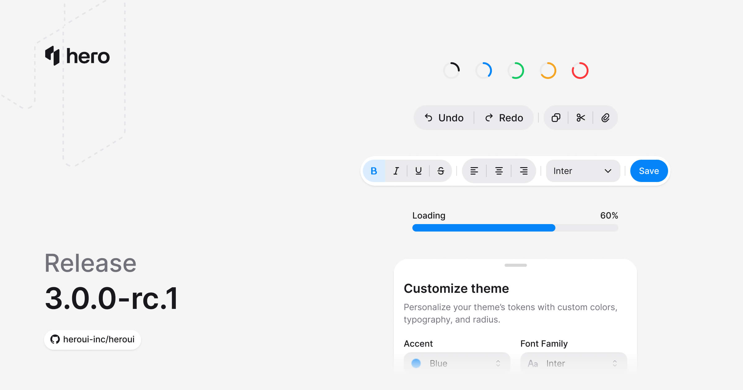
7 new components (Drawer, ToggleButton, ToggleButtonGroup, Meter, ProgressBar, ProgressCircle, Toolbar), Table & ListBox virtualization, ButtonGroup improvements, and bug fixes.
Seven new components: Drawer, ToggleButton, ToggleButtonGroup, Meter, ProgressBar, ProgressCircle, and Toolbar. Table and ListBox gain virtualization, ButtonGroup gets a Separator sub-component + vertical orientation, and React Aria Components is bumped to v1.16.0.
Installation
Update to the latest version:
npm i @lenso/tokens@rc @lenso/ui@rcUsing AI assistants? Simply prompt "Hey Cursor, update HeroUI to the latest version" and your AI assistant will automatically compare versions and apply the necessary changes. Learn more about the HeroUI MCP Server.
What's New
New Components
- Drawer: Slide-out panel with drag-to-dismiss, 4 placements, backdrop variants, scrollable body (Docs)
- ToggleButton: Selected/unselected toggle with all button variants + icon-only mode (Docs)
- ToggleButtonGroup: Single or multi-select toggle group, attached/detached layouts, orientation (Docs)
- Meter: Value within a known range — disk usage, password strength, quotas (Docs)
- ProgressBar: Linear progress, determinate + indeterminate, colors, custom formatting (Docs)
- ProgressCircle: Circular SVG progress with customizable track + fill circles (Docs)
- Toolbar: Groups buttons, toggles, and separators with horizontal or vertical orientation (Docs)
Drawer
Slide-out panel overlay with top/bottom/left/right placement, drag-to-dismiss gestures, and backdrop variants. Compound parts: Trigger, Backdrop, Content, Dialog, Header, Heading, Body, Footer, Handle, CloseTrigger.
"use client";
// Adapted from HeroUI v3.2.6 drawer-basic (Apache-2.0).import { Button, Drawer } from "@lenso/ui";
export function Basic() { return ( <Drawer.Provider> <Drawer swipeDirection="right"> <Drawer.Trigger render={<Button variant="secondary" />}>Open Drawer</Drawer.Trigger> <Drawer.Portal> <Drawer.Backdrop /> <Drawer.Viewport> <Drawer.Popup> <Drawer.Content> <Drawer.Header> <Drawer.Title>Drawer Title</Drawer.Title> </Drawer.Header> <Drawer.Body> <p> This is a bottom drawer built with React Aria's Modal component. It slides up from the bottom of the screen with a smooth CSS transition. </p> </Drawer.Body> <Drawer.Footer> <Drawer.Close render={<Button variant="secondary" />}>Cancel</Drawer.Close> <Drawer.Close render={<Button />}>Confirm</Drawer.Close> </Drawer.Footer> </Drawer.Content> </Drawer.Popup> </Drawer.Viewport> </Drawer.Portal> </Drawer> </Drawer.Provider> );}Local adaptation source above. Derived from HeroUI v3.2.6 source.
Placements:
"use client";
// Adapted from HeroUI v3.2.6 drawer-placements (Apache-2.0).import * as stylex from "@stylexjs/stylex";import { Button, CloseIcon, Drawer } from "@lenso/ui";import { styles } from "./styles";
export function Placements() { const placements = ["bottom", "top", "left", "right"] as const; return ( <div {...stylex.props(styles.row)}> {placements.map((placement) => ( <Drawer.Provider key={placement}> <Drawer swipeDirection={ placement === "bottom" ? "down" : placement === "top" ? "up" : placement } > <Drawer.Trigger render={<Button variant="secondary" />}> {placement.charAt(0).toUpperCase() + placement.slice(1)} </Drawer.Trigger> <Drawer.Portal> <Drawer.Backdrop /> <Drawer.Viewport> <Drawer.Popup> <Drawer.Content> <Drawer.Close aria-label="Close drawer" render={ <Button isIconOnly size="sm" variant="tertiary" xstyle={styles.cornerClose} /> } > <CloseIcon /> </Drawer.Close> {placement === "bottom" && <Drawer.Handle />} <Drawer.Header> <Drawer.Title> {placement.charAt(0).toUpperCase() + placement.slice(1)} Drawer </Drawer.Title> </Drawer.Header> <Drawer.Body> <p> This drawer slides in from the <strong>{placement}</strong> edge of the screen. </p> </Drawer.Body> <Drawer.Footer> <Drawer.Close render={<Button variant="secondary" />}>Cancel</Drawer.Close> <Drawer.Close render={<Button />}>Done</Drawer.Close> </Drawer.Footer> {placement === "top" && <Drawer.Handle />} </Drawer.Content> </Drawer.Popup> </Drawer.Viewport> </Drawer.Portal> </Drawer> </Drawer.Provider> ))} </div> );}Local adaptation source above. Derived from HeroUI v3.2.6 source.
With Form:
"use client";
// Adapted from HeroUI v3.2.6 drawer-with-form (Apache-2.0).import * as stylex from "@stylexjs/stylex";import { Button, CloseIcon, Drawer, Input, Label, TextField } from "@lenso/ui";import { styles } from "./styles";
export function WithForm() { return ( <Drawer.Provider> <Drawer swipeDirection="right"> <Drawer.Trigger render={<Button variant="secondary" />}>Edit Profile</Drawer.Trigger> <Drawer.Portal> <Drawer.Backdrop /> <Drawer.Viewport> <Drawer.Popup> <Drawer.Content> <Drawer.Close aria-label="Close drawer" render={ <Button isIconOnly size="sm" variant="tertiary" xstyle={styles.cornerClose} /> } > <CloseIcon /> </Drawer.Close> <Drawer.Header> <Drawer.Title>Edit Profile</Drawer.Title> </Drawer.Header> <Drawer.Body> <form {...stylex.props(styles.form)}> <TextField fullWidth name="name"> <Label>Name</Label> <Input type="text" placeholder="Enter your name" variant="secondary" /> </TextField> <TextField fullWidth name="email"> <Label>Email</Label> <Input type="email" placeholder="Enter your email" variant="secondary" /> </TextField> <TextField fullWidth name="bio"> <Label>Bio</Label> <Input placeholder="Tell us about yourself" variant="secondary" /> </TextField> </form> </Drawer.Body> <Drawer.Footer> <Drawer.Close render={<Button variant="secondary" />}>Cancel</Drawer.Close> <Drawer.Close render={<Button />}>Save Changes</Drawer.Close> </Drawer.Footer> </Drawer.Content> </Drawer.Popup> </Drawer.Viewport> </Drawer.Portal> </Drawer> </Drawer.Provider> );}Local adaptation source above. Derived from HeroUI v3.2.6 source.
Toggle Button
Stateful toggle between selected and unselected. All button variants and sizes, icon-only mode, controlled or uncontrolled.
"use client";
import { Heart } from "@gravity-ui/icons";import { ToggleButton } from "@lenso/ui";
export function Basic() { return ( <ToggleButton> <ToggleButton.Icon> <Heart /> </ToggleButton.Icon> Like </ToggleButton> );}Local adaptation source above. Derived from HeroUI v3.2.6 source.
Variants:
"use client";// Adapted from HeroUI v3.2.6 (e385ac2), Apache-2.0.import { Heart } from "@gravity-ui/icons";import { ToggleButton } from "@lenso/ui";import * as stylex from "@stylexjs/stylex";import { styles } from "./source.stylex";export function Variants() { return ( <div {...stylex.props(styles.row)}> <ToggleButton> <ToggleButton.Icon> <Heart /> </ToggleButton.Icon> Default </ToggleButton> <ToggleButton variant="ghost"> <ToggleButton.Icon> <Heart /> </ToggleButton.Icon> Ghost </ToggleButton> </div> );}Local adaptation source above. Derived from HeroUI v3.2.6 source.
Toggle Button Group
Single or multi-select toggle group. Attached (connected) and detached layouts, vertical orientation, full-width, and a Separator sub-component.
"use client";
import { Bold, Italic, Strikethrough, Underline } from "@gravity-ui/icons";import { ToggleButton, ToggleButtonGroup } from "@lenso/ui";
export function Basic() { return ( <ToggleButtonGroup multiple aria-label="Text formatting"> <ToggleButton isIconOnly aria-label="Bold" value="bold"> <ToggleButton.Icon> <Bold /> </ToggleButton.Icon> </ToggleButton> <ToggleButton isIconOnly aria-label="Italic" value="italic"> <ToggleButtonGroup.Separator /> <ToggleButton.Icon> <Italic /> </ToggleButton.Icon> </ToggleButton> <ToggleButton isIconOnly aria-label="Underline" value="underline"> <ToggleButtonGroup.Separator /> <ToggleButton.Icon> <Underline /> </ToggleButton.Icon> </ToggleButton> <ToggleButton isIconOnly aria-label="Strikethrough" value="strikethrough"> <ToggleButtonGroup.Separator /> <ToggleButton.Icon> <Strikethrough /> </ToggleButton.Icon> </ToggleButton> </ToggleButtonGroup> );}Local adaptation source above. Derived from HeroUI v3.2.6 source.
Selection Mode:
"use client";export { SelectionMode } from "./source";Local adaptation source above. Derived from HeroUI v3.2.6 source.
Attached Mode:
"use client";export { Attached } from "./source";Local adaptation source above. Derived from HeroUI v3.2.6 source.
Meter
Value within a known range — disk usage, password strength, quotas. Compound parts: Root, Output, Track, Fill.
"use client";
import { Meter } from "@lenso/ui";import * as stylex from "@stylexjs/stylex";const styles = stylex.create({ meter: { width: 256 } });
export function Basic() { return ( <Meter aria-label="Storage" xstyle={styles.meter} value={60}> <Meter.Label>Storage</Meter.Label> <Meter.Output /> <Meter.Track> <Meter.Fill /> </Meter.Track> </Meter> );}Local adaptation source above. Derived from HeroUI v3.2.6 source.
Colors:
"use client";// Adapted from HeroUI v3.2.6 (Apache-2.0).import { Meter } from "@lenso/ui";import * as stylex from "@stylexjs/stylex";const styles = stylex.create({ column: { display: "flex", width: 256, flexDirection: "column", gap: 24 },});export function Colors() { return ( <div {...stylex.props(styles.column)}> {(["default", "accent", "success", "warning", "danger"] as const).map((color) => ( <Meter key={color} color={color} value={50}> <Meter.Label> {color[0]?.toUpperCase()} {color.slice(1)} </Meter.Label> <Meter.Output /> <Meter.Track> <Meter.Fill /> </Meter.Track> </Meter> ))} </div> );}export default Colors;Local adaptation source above. Derived from HeroUI v3.2.6 source.
Progress Bar
Linear progress indicator with determinate + indeterminate states, color variants, sizes, and custom value display. Compound parts: Root, Output, Track, Fill.
"use client";
import { ProgressBar } from "@lenso/ui";import * as stylex from "@stylexjs/stylex";const styles = stylex.create({ progress: { width: 256 } });
export function Basic() { return ( <ProgressBar aria-label="Loading" xstyle={styles.progress} value={60}> <ProgressBar.Label>Loading</ProgressBar.Label> <ProgressBar.Output /> <ProgressBar.Track> <ProgressBar.Fill /> </ProgressBar.Track> </ProgressBar> );}Local adaptation source above. Derived from HeroUI v3.2.6 source.
Indeterminate:
"use client";// Adapted from HeroUI v3.2.6 (Apache-2.0); null is Base UI's indeterminate value.import { ProgressBar } from "@lenso/ui";import * as stylex from "@stylexjs/stylex";const styles = stylex.create({ progress: { width: 256 } });export function Indeterminate() { return ( <ProgressBar aria-label="Loading" xstyle={styles.progress} value={null}> <ProgressBar.Label>Loading...</ProgressBar.Label> <ProgressBar.Track> <ProgressBar.Fill /> </ProgressBar.Track> </ProgressBar> );}export default Indeterminate;Local adaptation source above. Derived from HeroUI v3.2.6 source.
Progress Circle
Circular SVG progress with TrackCircle and FillCircle sub-components for direct SVG control. Determinate + indeterminate states.
"use client";
import { ProgressCircle } from "@lenso/ui";
export function Basic() { return ( <ProgressCircle aria-label="Loading" value={60}> <ProgressCircle.Track> <ProgressCircle.TrackCircle /> <ProgressCircle.FillCircle /> </ProgressCircle.Track> </ProgressCircle> );}Local adaptation source above. Derived from HeroUI v3.2.6 source.
Custom SVG:
"use client";// Adapted from HeroUI v3.2.6 (Apache-2.0).import { ProgressCircle } from "@lenso/ui";import * as stylex from "@stylexjs/stylex";const styles = stylex.create({ row: { display: "flex", alignItems: "flex-end", gap: 24 } });export function CustomSvg() { return ( <div {...stylex.props(styles.row)}> <ProgressCircle aria-label="Thin circle" value={60}> <ProgressCircle.Track strokeWidth={2} viewBox="0 0 36 36"> <ProgressCircle.TrackCircle cx={18} cy={18} r={17} strokeWidth={2} /> <ProgressCircle.FillCircle cx={18} cy={18} r={17} strokeWidth={2} /> </ProgressCircle.Track> </ProgressCircle> <ProgressCircle aria-label="Default circle" value={60}> <ProgressCircle.Track> <ProgressCircle.TrackCircle /> <ProgressCircle.FillCircle /> </ProgressCircle.Track> </ProgressCircle> <ProgressCircle aria-label="Thick circle" value={60}> <ProgressCircle.Track strokeWidth={6} viewBox="0 0 36 36"> <ProgressCircle.TrackCircle cx={18} cy={18} r={15} strokeWidth={6} /> <ProgressCircle.FillCircle cx={18} cy={18} r={15} strokeWidth={6} /> </ProgressCircle.Track> </ProgressCircle> </div> );}export default CustomSvg;Local adaptation source above. Derived from HeroUI v3.2.6 source.
Toolbar
Groups buttons, toggle buttons, and separators into an accessible toolbar. Horizontal or vertical orientation, composes with ButtonGroup and ToggleButtonGroup.
"use client";export { Basic } from "./source";Local adaptation source above. Derived from HeroUI v3.2.6 source.
With Button Group:
"use client";export { WithButtonGroup } from "./source";Local adaptation source above. Derived from HeroUI v3.2.6 source.
Component Improvements
ButtonGroup Enhancements
New ButtonGroup.Separator sub-component adds an explicit visual divider between buttons. Works in both horizontal and vertical orientations.
"use client";// Adapted from HeroUI v3.2.6 (e385ac2), Apache-2.0.import { ChevronDown, ChevronLeft, ChevronRight, CodeFork, Ellipsis, Picture, Pin, QrCode, Star, TextAlignCenter, TextAlignJustify, TextAlignLeft, TextAlignRight, ThumbsDown, ThumbsUp, Video,} from "@gravity-ui/icons";import { Button, ButtonGroup, Chip, Dropdown } from "@lenso/ui";import * as stylex from "@stylexjs/stylex";import { basicStyles as styles } from "./basic.stylex";import { styles as sourceStyles } from "./source.stylex";export function Basic() { return ( <div {...stylex.props(styles.root)}> <div {...stylex.props(styles.section)}> <ButtonGroup> <Button>Merge pull request</Button> <Dropdown> <Dropdown.Trigger render={<Button isIconOnly aria-label="More options" xstyle={styles.splitTrigger} />} > <ButtonGroup.Separator /> <Button.Icon> <ChevronDown /> </Button.Icon> </Dropdown.Trigger> <Dropdown.Portal> <Dropdown.Positioner side="bottom" align="end"> <Dropdown.Popup xstyle={styles.popup}> {[ { id: "merge", label: "Create a merge commit", description: "All commits from this branch will be added to the base branch", }, { id: "squash", label: "Squash and merge", description: "The 14 commits from this branch will be combined into one commit in the base branch", }, { id: "rebase", label: "Rebase and merge", description: "The 14 commits from this branch will be rebased and added to the base branch", }, ].map((item) => ( <Dropdown.Item key={item.id} xstyle={styles.item}> <span {...stylex.props(sourceStyles.menuLabel)}>{item.label}</span> <span {...stylex.props(sourceStyles.menuDescription)}> {item.description} </span> </Dropdown.Item> ))} </Dropdown.Popup> </Dropdown.Positioner> </Dropdown.Portal> </Dropdown> </ButtonGroup> </div> <div {...stylex.props(styles.section)}> <div {...stylex.props(styles.row)}> <ButtonGroup variant="tertiary"> <Button> <CodeFork {...stylex.props(styles.smallIcon)} /> Fork <Chip color="accent" size="sm" variant="soft"> 24 </Chip> </Button> <Button isIconOnly aria-label="More fork options"> <ButtonGroup.Separator /> <Button.Icon> <ChevronDown /> </Button.Icon> </Button> </ButtonGroup> <ButtonGroup variant="tertiary"> <Button isIconOnly aria-label="Show QR code"> <Button.Icon> <QrCode /> </Button.Icon> </Button> <Button> <ButtonGroup.Separator /> Scan to pay </Button> </ButtonGroup> <ButtonGroup variant="tertiary"> <Button> <Button.Icon> <ThumbsUp /> </Button.Icon> <span {...stylex.props(styles.count)}>2.4K</span> </Button> <Button isIconOnly aria-label="Dislike"> <ButtonGroup.Separator /> <Button.Icon> <ThumbsDown /> </Button.Icon> </Button> </ButtonGroup> <ButtonGroup variant="tertiary"> <Button> <Star {...stylex.props(styles.smallIcon)} /> Star </Button> <Button xstyle={styles.countButton}> <ButtonGroup.Separator /> <Chip color="accent" size="sm" variant="soft"> 104 </Chip> </Button> </ButtonGroup> <ButtonGroup variant="tertiary"> <Button> <Button.Icon> <Pin /> </Button.Icon> Pinned </Button> <Button isIconOnly aria-label="More pin options"> <ButtonGroup.Separator /> <Button.Icon> <ChevronDown /> </Button.Icon> </Button> </ButtonGroup> </div> </div> <div {...stylex.props(styles.section)}> <ButtonGroup variant="tertiary"> <Button> <Button.Icon> <ChevronLeft /> </Button.Icon> Previous </Button> <Button> <ButtonGroup.Separator /> Next <Button.Icon> <ChevronRight /> </Button.Icon> </Button> </ButtonGroup> </div> <div {...stylex.props(styles.section)}> <ButtonGroup variant="tertiary"> <Button> <Button.Icon> <Picture /> </Button.Icon> Photos </Button> <Button> <ButtonGroup.Separator /> <Button.Icon> <Video /> </Button.Icon> Videos </Button> <Button isIconOnly aria-label="More options"> <ButtonGroup.Separator /> <Button.Icon> <Ellipsis /> </Button.Icon> </Button> </ButtonGroup> </div> <div {...stylex.props(styles.section)}> <ButtonGroup variant="tertiary"> <Button>Left</Button> <Button> <ButtonGroup.Separator /> Center </Button> <Button> <ButtonGroup.Separator /> Right </Button> </ButtonGroup> </div> <div {...stylex.props(styles.section)}> <ButtonGroup variant="tertiary"> {[ { label: "Align left", icon: <TextAlignLeft /> }, { label: "Align center", icon: <TextAlignCenter /> }, { label: "Align right", icon: <TextAlignRight /> }, { label: "Justify", icon: <TextAlignJustify /> }, ].map((item, index) => ( <Button key={item.label} isIconOnly aria-label={item.label}> {index > 0 && <ButtonGroup.Separator />} <Button.Icon>{item.icon}</Button.Icon> </Button> ))} </ButtonGroup> </div> </div> );}Local adaptation source above. Derived from HeroUI v3.2.6 source.
Table & ListBox Virtualization
Table and ListBox now support virtualization via React Aria's Virtualizer for large datasets. Virtualizer, TableLayout, and ListLayout are re-exported from @lenso/ui.
"use client";// HeroUI v3.2.6 virtualization adaptation (Apache-2.0); native row spacers.import { Table } from "@lenso/ui";import { styles } from "./data";const first = [ "Emma", "Liam", "Olivia", "Noah", "Ava", "James", "Sophia", "Oliver", "Isabella", "Lucas", "Mia", "Ethan", "Charlotte", "Mason", "Amelia", "Logan", "Harper", "Alexander", "Ella", "Benjamin",];const last = [ "Smith", "Johnson", "Williams", "Brown", "Jones", "Garcia", "Miller", "Davis", "Rodriguez", "Martinez", "Anderson", "Taylor", "Thomas", "Jackson", "White", "Harris", "Clark", "Lewis", "Robinson", "Walker",];const roles = [ "Software Engineer", "Senior Engineer", "Staff Engineer", "Product Manager", "Designer", "Data Analyst", "QA Engineer", "DevOps Engineer", "Marketing Manager", "Sales Representative",];const users = Array.from({ length: 1000 }, (_, index) => ({ key: index + 1, name: `${first[index % 20]} ${last[Math.floor(index / 20) % 20]}`, role: roles[index % 10], email: `${first[index % 20]!.toLowerCase()}.${last[Math.floor(index / 20) % 20]!.toLowerCase()}@acme.com`,}));export function Virtualization() { return ( <Table> <Table.ScrollContainer xstyle={styles.virtualViewport}> <Table.Content aria-label="Virtualized table with 1000 rows" xstyle={styles.resizing}> <Table.Header xstyle={styles.sticky}> <Table.Column columnKey="name" minWidth={160}> Name </Table.Column> <Table.Column columnKey="role" minWidth={220}> Role </Table.Column> <Table.Column columnKey="email" minWidth={240}> Email </Table.Column> </Table.Header> <Table.Body items={users} virtualized={{ height: 300, rowHeight: 42 }}> {(user) => ( <Table.Row itemKey={user.key}> <Table.Cell>{user.name}</Table.Cell> <Table.Cell>{user.role}</Table.Cell> <Table.Cell>{user.email}</Table.Cell> </Table.Row> )} </Table.Body> </Table.Content> </Table.ScrollContainer> </Table> );}Local adaptation source above. Derived from HeroUI v3.2.6 source.
ButtonGroup Orientation
ButtonGroup accepts an orientation prop ("horizontal" | "vertical") with correct border-radius handling and separator direction for both axes. The root element was upgraded from <div> to React Aria's Group for proper role="group" semantics.
"use client";export { Orientation } from "./source";Local adaptation source above. Derived from HeroUI v3.2.6 source.
ButtonGroup Focus Ring
Focus rings on grouped buttons now use ring-inset so they stay within button bounds instead of overlapping neighbors.
Granular Component Imports
@lenso/ui now supports per-component subpath entrypoints for more explicit imports (#6301):
// Before — root entrypointimport { Button } from "@lenso/ui";
// After — granular subpath importimport { Button } from "@lenso/ui/button";Dependencies
Upgraded react-aria-components from v1.15.1 to v1.16.0 and related packages:
| Package | Old | New |
|---|---|---|
react-aria-components | 1.15.1 | 1.16.0 |
@react-aria/i18n | 3.12.15 | 3.12.16 |
@react-aria/utils | 3.33.0 | 3.33.1 |
@react-types/shared | 3.33.0 | 3.33.1 |
@react-types/color | 3.1.3 | 3.1.4 |
@internationalized/date | 3.11.0 | 3.12.0 |
@react-stately/data | 3.15.1 | 3.15.2 |
Bug Fixes
- InputGroup: Focus styles now trigger only when the actual input/textarea is focused (
:has([data-slot]:focus)) instead of any focusable child via:focus-within(#6274) - Avatar: Fallback element inherits
border-radiusfrom the parent instead of hardcodingrounded-full, soclassNameoverrides apply correctly (#6300) - Modal & AlertDialog: Backdrop click events no longer propagate through portals to parent elements (#6297)
- Table: Fixed header rounding and background color bleeding in Firefox (#6298)
Links
Contributors
Thanks to everyone who contributed to this release!
HeroUI contributors