v3.0.0-beta.8
3 new components (Badge, Pagination, Table), DateField improvements, and key API/style fixes.
This release adds three new components: Badge, Pagination, and Table, plus new InputContainer composition APIs for DateField and TimeField.
⚠️ Breaking changes: TextField CSS classes were renamed from .text-field to .textfield.
Installation
Update to the latest version:
npm i @lenso/tokens@beta @lenso/ui@betaUsing AI assistants? Simply prompt "Hey Cursor, update HeroUI to the latest version" and your AI assistant will automatically compare versions and apply the necessary changes. Learn more about the HeroUI MCP Server.
What's New
New Components
- Badge: Compact status + count indicator with color, variant, placement, and size options. (Docs)
- Pagination: Compound pagination primitives with summary, ellipsis, and previous/next controls. (Docs)
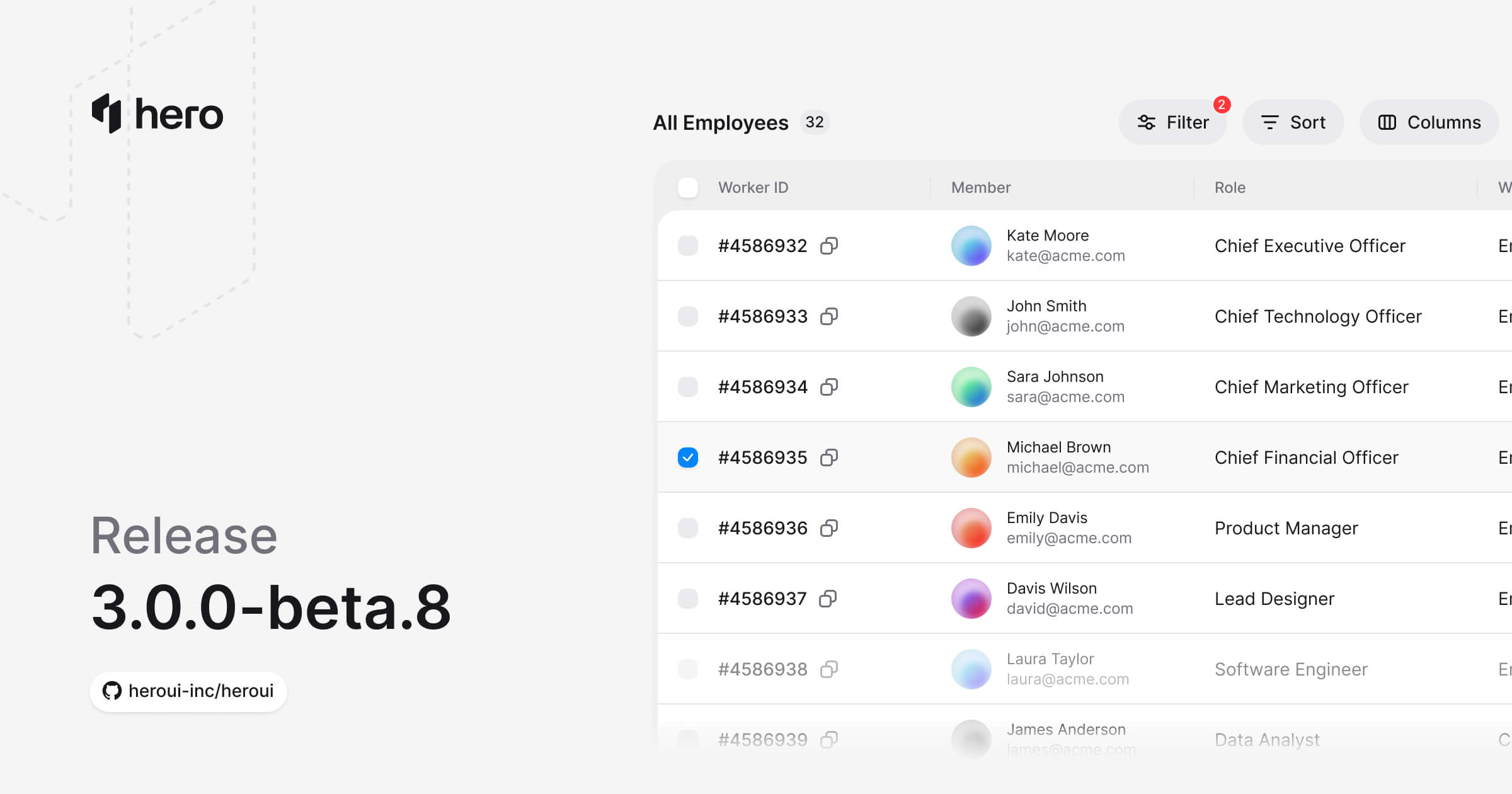
- Table: Data table primitives with sorting, selection, resizing, async loading, and footer composition. (Docs)
Badge
New badge primitives for counters, labels, and anchored overlays with Badge.Anchor and Badge.Label.
"use client";// oxlint-disable jsx-a11y/prefer-tag-over-role -- The CSS-painted status dot has no image resource for an HTML img.// Adapted from HeroUI v3.2.6 (e385ac202b2cdb94b1bf6fa76d32c31c8259cc5e), Apache-2.0.import { Avatar, Badge } from "@lenso/ui";import * as stylex from "@stylexjs/stylex";import { s } from "../card/display.stylex";
export function BadgeBasic() { return ( <div {...stylex.props(s.row6)}> <Badge.Anchor> <Avatar> <Avatar.Image alt="John Doe" src="https://heroui-assets.nyc3.cdn.digitaloceanspaces.com/avatars/green.jpg" /> <Avatar.Fallback>JD</Avatar.Fallback> </Avatar> <Badge color="danger" size="sm"> 5 </Badge> </Badge.Anchor> <Badge.Anchor> <Avatar> <Avatar.Image alt="Alex Brown" src="https://heroui-assets.nyc3.cdn.digitaloceanspaces.com/avatars/orange.jpg" /> <Avatar.Fallback>AB</Avatar.Fallback> </Avatar> <Badge color="accent" size="sm"> New </Badge> </Badge.Anchor> <Badge.Anchor> <Avatar> <Avatar.Image alt="Chris Davis" src="https://heroui-assets.nyc3.cdn.digitaloceanspaces.com/avatars/blue.jpg" /> <Avatar.Fallback>CD</Avatar.Fallback> </Avatar> <Badge role="img" aria-label="Online" color="success" placement="bottom-right" size="sm" /> </Badge.Anchor> </div> );}Local adaptation source above. Derived from HeroUI v3.2.6 source.
Pagination
New navigation component built with composable parts (Root, Content, Item, Link, Previous, Next, Summary, Ellipsis).
"use client";export { PaginationWithEllipsis } from "./source";Local adaptation source above. Derived from HeroUI v3.2.6 source.
Table
Compound data table on React Aria with sortable columns, row selection, custom cells, load-more sentinel rows, and resizable columns.
"use client";
// Adapted from HeroUI v3.2.6 table-basic (Apache-2.0).import * as stylex from "@stylexjs/stylex";import { Table } from "@lenso/ui";
const rows = [ { key: "kate", name: "Kate Moore", role: "CEO", status: "Active", email: "[email protected]" }, { key: "john", name: "John Smith", role: "CTO", status: "Active", email: "[email protected]" }, { key: "sara", name: "Sara Johnson", role: "CMO", status: "On Leave", email: "[email protected]" }, { key: "michael", name: "Michael Brown", role: "CFO", status: "Active", email: "[email protected]", },] as const;const styles = stylex.create({ content: { minWidth: 600 } });
export function Basic() { return ( <Table> <Table.ScrollContainer> <Table.Content aria-label="Team members" xstyle={styles.content}> <Table.Header> <Table.Column columnKey="name">Name</Table.Column> <Table.Column columnKey="role">Role</Table.Column> <Table.Column columnKey="status">Status</Table.Column> <Table.Column columnKey="email">Email</Table.Column> </Table.Header> <Table.Body> <Table.Collection items={rows}> {(row) => ( <Table.Row itemKey={row.key}> <Table.Cell>{row.name}</Table.Cell> <Table.Cell>{row.role}</Table.Cell> <Table.Cell>{row.status}</Table.Cell> <Table.Cell>{row.email}</Table.Cell> </Table.Row> )} </Table.Collection> </Table.Body> </Table.Content> </Table.ScrollContainer> </Table> );}Local adaptation source above. Derived from HeroUI v3.2.6 source.
Custom Cells:
"use client";// HeroUI v3.2.6 custom-cells adaptation (Apache-2.0).import { useState, type Key } from "react";import * as stylex from "@stylexjs/stylex";import { Icon } from "@iconify/react";import { Avatar, Button, Table, type SortDescriptor } from "@lenso/ui";import { Status, styles, users, type User } from "./data";const workers = users.slice(0, 5).map((user, index) => ({ ...user, key: [4586932, 5273849, 7492836, 8293746, 1234567][index]!, role: [ "Chief Executive Officer", "Chief Technology Officer", "Chief Marketing Officer", "Chief Financial Officer", "Product Manager", ][index]!, color: ["red", "green", "blue", "purple", "orange"][index],}));export function CustomCells() { const [selected, setSelected] = useState<Set<Key>>(new Set()); const [sort, setSort] = useState<SortDescriptor>({ column: "name", direction: "ascending" }); const sorted = [...workers].sort( (a, b) => String(a[sort.column as keyof User]).localeCompare(String(b[sort.column as keyof User])) * (sort.direction === "ascending" ? 1 : -1), ); return ( <Table> <Table.ScrollContainer> <Table.Content aria-label="Table with custom cells" xstyle={styles.customCells} selectionMode="multiple" selectedKeys={selected} onSelectionChange={setSelected} sortDescriptor={sort} onSortChange={setSort} > <Table.Header> <Table.Column columnKey="selection" width={48}> <Table.SelectionCheckbox /> </Table.Column> {[ ["key", "Worker ID"], ["name", "Member"], ["role", "Role"], ["status", "Status"], ].map(([key, title]) => ( <Table.Column key={key} columnKey={key!} allowsSorting> {({ sortDirection }) => ( <Table.SortableColumnHeader sortDirection={sortDirection}> {title} </Table.SortableColumnHeader> )} </Table.Column> ))} <Table.Column columnKey="actions">Actions</Table.Column> </Table.Header> <Table.Body> {sorted.map((user) => ( <Table.Row key={user.key} itemKey={user.key}> <Table.Cell> <Table.SelectionCheckbox aria-label={`Select ${user.name}`} /> </Table.Cell> <Table.Cell> <div {...stylex.props(styles.row)}> #{user.key} <Button isIconOnly aria-label={`Copy ID #${user.key}`} size="sm" variant="ghost" > <Icon icon="gravity-ui:copy" width={16} aria-hidden="true" /> </Button> </div> </Table.Cell> <Table.Cell> <div {...stylex.props(styles.row)}> <Avatar size="sm"> <Avatar.Image alt={user.name} src={`https://heroui-assets.nyc3.cdn.digitaloceanspaces.com/avatars/${user.color}.jpg`} /> <Avatar.Fallback> {user.name .split(" ") .map((name) => name[0]) .join("")} </Avatar.Fallback> </Avatar> <div {...stylex.props(styles.detail)}> <span>{user.name}</span> <span {...stylex.props(styles.muted)}>{user.email}</span> </div> </div> </Table.Cell> <Table.Cell>{user.role}</Table.Cell> <Table.Cell> <Status status={user.status} /> </Table.Cell> <Table.Cell> <div {...stylex.props(styles.row)}> {(["View", "Edit", "Delete"] as const).map((action, index) => ( <Button key={action} isIconOnly aria-label={`${action} ${user.name}`} size="sm" variant={action === "Delete" ? "danger-soft" : "tertiary"} > <Icon icon={`gravity-ui:${["eye", "pencil", "trash-bin"][index]}`} width={16} aria-hidden="true" /> </Button> ))} </div> </Table.Cell> </Table.Row> ))} </Table.Body> </Table.Content> </Table.ScrollContainer> </Table> );}Local adaptation source above. Derived from HeroUI v3.2.6 source.
Pagination:
"use client";// HeroUI v3.2.6 pagination adaptation (Apache-2.0).import { useState } from "react";import { Table } from "@lenso/ui";import { Headers, Pages, Rows, styles, users } from "./data";export function PaginationDemo() { const [page, setPage] = useState(1); return ( <Table> <Table.ScrollContainer> <Table.Content aria-label="Table with pagination" xstyle={styles.content}> <Headers /> <Table.Body> <Rows items={users.slice((page - 1) * 4, page * 4)} /> </Table.Body> </Table.Content> </Table.ScrollContainer> <Table.Footer> <Pages page={page} count={2} total={8} setPage={setPage} /> </Table.Footer> </Table> );}Local adaptation source above. Derived from HeroUI v3.2.6 source.
Empty State:
"use client";// HeroUI v3.2.6 empty-state adaptation (Apache-2.0).import * as stylex from "@stylexjs/stylex";import { Icon } from "@iconify/react";import { EmptyState, Table } from "@lenso/ui";import { Headers, styles } from "./data";const empty = stylex.create({ root: { minHeight: 200 }, content: { minHeight: 140, display: "flex", flexDirection: "column", alignItems: "center", justifyContent: "center", gap: 16, textAlign: "center", color: "var(--muted)", },});export function EmptyStateDemo() { return ( <Table xstyle={empty.root}> <Table.ScrollContainer> <Table.Content aria-label="Empty table" xstyle={styles.content}> <Headers /> <Table.Body> <tr> <td colSpan={4}> <EmptyState xstyle={empty.content}> <Icon icon="gravity-ui:tray" width={24} aria-hidden="true" /> <span>No results found</span> </EmptyState> </td> </tr> </Table.Body> </Table.Content> </Table.ScrollContainer> </Table> );}Local adaptation source above. Derived from HeroUI v3.2.6 source.
Component + API Improvements
DateField and TimeField Enhancements
DateField and TimeField now expose InputContainer to wrap input segments between prefix and suffix content.
Before:
<DateField.Group> <DateField.Prefix>...</DateField.Prefix> <DateField.Input> {(segment) => <DateField.Segment segment={segment} />} </DateField.Input> <DateField.Suffix>...</DateField.Suffix></DateField.Group>After:
<DateField.Group> <DateField.Prefix>...</DateField.Prefix> <DateField.InputContainer> <DateField.Input> {(segment) => <DateField.Segment segment={segment} />} </DateField.Input> </DateField.InputContainer> <DateField.Suffix>...</DateField.Suffix></DateField.Group>"use client";/** Adapted from HeroUI v3.2.6 release-input-container.json. Copyright NextUI Inc. Apache-2.0. */import { DateRangePicker, TimeField } from "@lenso/ui";import { getLocalTimeZone, parseZonedDateTime } from "@internationalized/date";import * as stylex from "@stylexjs/stylex";import { formatStyles } from "../date-picker/format-controls";import { PickerCalendar, RangeInput } from "./parts";
export function InputContainer() { const localTimeZone = getLocalTimeZone(); const defaultValue = { start: parseZonedDateTime(`2026-02-03T08:45:00[${localTimeZone}]`), end: parseZonedDateTime(`2026-02-10T18:45:00[${localTimeZone}]`), }; return ( <DateRangePicker shouldForceLeadingZeros xstyle={formatStyles.releaseField} defaultValue={defaultValue} granularity="second" hourCycle={12} > {({ state }) => ( <> <DateRangePicker.Label>Date range</DateRangePicker.Label> <RangeInput container /> <DateRangePicker.Popover xstyle={formatStyles.releasePopover}> <PickerCalendar /> <div {...stylex.props(formatStyles.times)}> <div {...stylex.props(formatStyles.timeRow)}> <span {...stylex.props(formatStyles.label)}>Start Time</span> <TimeField shouldForceLeadingZeros aria-label="Start Time" granularity="second" hourCycle={12} value={state.timeRange?.start ?? null} onChange={(value) => state.setTime("start", value)} > <TimeField.Group variant="secondary"> <TimeField.Input> {(segment) => <TimeField.Segment segment={segment} />} </TimeField.Input> </TimeField.Group> </TimeField> </div> <div {...stylex.props(formatStyles.timeRow)}> <span {...stylex.props(formatStyles.label)}>End Time</span> <TimeField shouldForceLeadingZeros aria-label="End Time" granularity="second" hourCycle={12} value={state.timeRange?.end ?? null} onChange={(value) => state.setTime("end", value)} > <TimeField.Group variant="secondary"> <TimeField.Input> {(segment) => <TimeField.Segment segment={segment} />} </TimeField.Input> </TimeField.Group> </TimeField> </div> </div> </DateRangePicker.Popover> </> )} </DateRangePicker> );}Local adaptation source above. Derived from HeroUI v3.2.6 source.
⚠️ Breaking Changes
TextField Class + Path Renames
TextField style naming was normalized to avoid conflicts with Tailwind's text-* utility prefix.
| Component | Old Class Name | New Class Name | Notes |
|---|---|---|---|
| TextField Root | .text-field | .textfield | Root class renamed |
| TextField Full Width | .text-field--full-width | .textfield--full-width | Modifier class renamed |
Additional renames in the same change:
- Style file:
text-field.css->textfield.css - Styles export path:
@lenso/tokens/src/components/text-field->@lenso/tokens/src/components/textfield
Style Fixes
- RangeCalendar: Added rounded corners to calendar cells for range selection visuals (#6270)
Bug Fixes
- Added required-state red asterisk behavior for DatePicker and DateRangePicker by propagating
data-requiredfromisRequired(#6270) - Fixed missing invalid trigger styling in Autocomplete and Select by scoping invalid styles to root state (#6270)
- Updated TextField docs/demo references to the new
textfield-*demo keys and source/style paths (#6270)
Links
Contributors
Thanks to everyone who contributed to this release!
HeroUI contributors