v3.0.0-beta.2
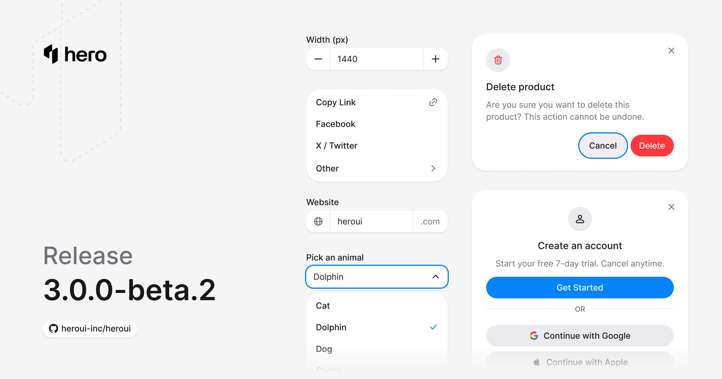
Six new components (AlertDialog, ComboBox, Dropdown, InputGroup, Modal, NumberField), Select API improvements, and component refinements.
This release introduces six essential new components, improves the Select component API, and includes various refinements and bug fixes.
Installation
Update to the latest version:
npm i @lenso/tokens@beta @lenso/ui@betaUsing AI assistants? Simply prompt "Hey Cursor, update HeroUI to the latest version" and your AI assistant will automatically compare versions and apply the necessary changes. Learn more about the HeroUI MCP Server.
What's New
New Components
This release introduces 6 new essential components:
- AlertDialog: Modal dialog for important decisions that require user confirmation. (Documentation)
- ComboBox: Combines a text input with a listbox, allowing users to filter a list of options. (Documentation)
- Dropdown: Displays a list of actions or options that a user can choose. (Documentation)
- InputGroup: Group related input controls with prefix and suffix elements for enhanced form fields. (Documentation)
- Modal: Dialog overlay for focused user interactions and important content. (Documentation)
- NumberField: Number input with increment/decrement buttons, validation, and internationalized formatting. (Documentation)
AlertDialog
"use client";
// Adapted from HeroUI v3.2.6 alert-dialog-default (Apache-2.0).import * as stylex from "@stylexjs/stylex";import { AlertDialog, Button } from "@lenso/ui";
const styles = stylex.create({ popup: { maxWidth: 400 } });
export function Default() { return ( <AlertDialog> <AlertDialog.Trigger render={<Button variant="danger" />}>Delete Project</AlertDialog.Trigger> <AlertDialog.Portal> <AlertDialog.Backdrop /> <AlertDialog.Viewport> <AlertDialog.Popup xstyle={styles.popup}> <AlertDialog.Close aria-label="Close dialog" /> <AlertDialog.Header> <AlertDialog.Icon variant="danger" /> <AlertDialog.Title>Delete project permanently?</AlertDialog.Title> </AlertDialog.Header> <AlertDialog.Body> <AlertDialog.Description> This will permanently delete <strong>My Awesome Project</strong> and all of its data. This action cannot be undone. </AlertDialog.Description> </AlertDialog.Body> <AlertDialog.Footer> <AlertDialog.Close render={<Button variant="tertiary" />}>Cancel</AlertDialog.Close> <AlertDialog.Close render={<Button variant="danger" />}> Delete Project </AlertDialog.Close> </AlertDialog.Footer> </AlertDialog.Popup> </AlertDialog.Viewport> </AlertDialog.Portal> </AlertDialog> );}Local adaptation source above. Derived from HeroUI v3.2.6 source.
ComboBox
"use client";// HeroUI v3.2.6, Apache-2.0. Native Base UI adaptation.import { AnimalPicker } from "./shared";export function Default() { return <AnimalPicker />;}Local adaptation source above. Derived from HeroUI v3.2.6 source.
Dropdown
"use client";
// Adapted from HeroUI v3.2.6 dropdown-default (Apache-2.0).import { Button, Dropdown } from "@lenso/ui";import { ActionItem, Popup } from "./_shared";
export function Default() { return ( <Dropdown> <Dropdown.Trigger render={<Button aria-label="Menu" variant="secondary" />}> Actions </Dropdown.Trigger> <Popup> <ActionItem label="New file" onClick={() => console.log("Selected: new-file")} /> <ActionItem label="Copy link" onClick={() => console.log("Selected: copy-link")} /> <ActionItem label="Edit file" onClick={() => console.log("Selected: edit-file")} /> <ActionItem label="Delete file" variant="danger" onClick={() => console.log("Selected: delete-file")} /> </Popup> </Dropdown> );}Local adaptation source above. Derived from HeroUI v3.2.6 source.
Modal
"use client";
// Adapted from HeroUI v3.2.6 modal-default (Apache-2.0).import { Rocket } from "@gravity-ui/icons";import * as stylex from "@stylexjs/stylex";import { Button, Modal } from "@lenso/ui";
const styles = stylex.create({ popup: { maxWidth: 360 }, icon: { backgroundColor: "var(--default)", color: "var(--foreground)" }, rocket: { width: 20, height: 20 }, continue: { width: "100%" },});
export function Default() { return ( <Modal> <Modal.Trigger render={<Button variant="secondary" />}>Open Modal</Modal.Trigger> <Modal.Portal> <Modal.Backdrop /> <Modal.Viewport> <Modal.Popup xstyle={styles.popup}> <Modal.Close aria-label="Close dialog" /> <Modal.Header> <Modal.Icon xstyle={styles.icon}> <Rocket {...stylex.props(styles.rocket)} /> </Modal.Icon> <Modal.Title>Welcome to HeroUI</Modal.Title> </Modal.Header> <Modal.Body> <Modal.Description> A beautiful, fast, and modern React UI library for building accessible and customizable web applications with ease. </Modal.Description> </Modal.Body> <Modal.Footer> <Modal.Close render={<Button xstyle={styles.continue} />}>Continue</Modal.Close> </Modal.Footer> </Modal.Popup> </Modal.Viewport> </Modal.Portal> </Modal> );}Local adaptation source above. Derived from HeroUI v3.2.6 source.
InputGroup
"use client";// Adapted from HeroUI v3.2.6, Apache-2.0.import { Globe } from "@gravity-ui/icons";import { InputGroup, Label, TextField } from "@lenso/ui";import * as stylex from "@stylexjs/stylex";const styles = stylex.create({ field: { width: "100%", maxWidth: 280 }, icon: { width: 16, height: 16, color: "var(--muted)" },});export function WithIconPrefixAndTextSuffix() { return ( <TextField xstyle={styles.field} name="website"> <Label>Website</Label> <InputGroup> <InputGroup.Prefix> <Globe aria-hidden="true" {...stylex.props(styles.icon)} /> </InputGroup.Prefix> <InputGroup.Input xstyle={styles.field} defaultValue="heroui" /> <InputGroup.Suffix>.com</InputGroup.Suffix> </InputGroup> </TextField> );}Local adaptation source above. Derived from HeroUI v3.2.6 source.
NumberField
"use client";
// Adapted from HeroUI v3.2.6 (e385ac202b2cdb94b1bf6fa76d32c31c8259cc5e), Apache-2.0.import { Label, NumberField, TextField } from "@lenso/ui";import { Controls, styles } from "./parts";
export function Basic() { return ( <TextField name="width" xstyle={styles.field}> <NumberField defaultValue={1024} min={0} name="width"> <Label>Width</Label> <Controls /> </NumberField> </TextField> );}Local adaptation source above. Derived from HeroUI v3.2.6 source.
Style Improvements
Custom Variants and Theme Compatibility
Enhanced CSS variants and theme system for better customization:
Motion Preferences:
- New
motion-safevariant withdata-reduce-motion="true"attribute matching - Enhanced
motion-reducenow supports ancestor elements and pseudo-elements
Dark Mode:
- Class and
data-theme="dark"attribute selectors now take precedence overprefers-color-scheme - Full support for pseudo-elements in dark mode
Theme Variables:
- Expanded light theme scope to support nested themes (
:root,.light,.default,[data-theme="light"],[data-theme="default"])
Component Improvements
Select Component API Update
The Select component's API has been improved for better consistency with other components. The Content subcomponent has been renamed to Popover.
Before:
<Select> <Select.Trigger> <Select.Value /> <Select.Indicator /> </Select.Trigger> <Select.Content> <ListBox> {/* items */} </ListBox> </Select.Content></Select>After:
<Select> <Select.Trigger> <Select.Value /> <Select.Indicator /> </Select.Trigger> <Select.Popover> <ListBox> {/* items */} </ListBox> </Select.Popover></Select>Chip Component Refinements
Chip component sizes have been updated for better consistency:
- Small (
sm):px-1 py-0 text-xs - Medium (
md):text-xs(now explicitly set) - Large (
lg):px-3 py-1 text-sm font-medium
Separator Component Enhancement
The Separator component now automatically detects when it's placed inside a surface component (one that uses bg-surface) and applies the appropriate divider color for better visibility. A new isOnSurface prop is also available for manual control.
New Calculated Variable:
--color-separator-on-surface: A calculated variable (automatically generated usingcolor-mix) that ensures the separator is visible when placed on a surface background. Like other calculated variables, it can be overridden in your theme.
Usage:
<div className="bg-surface"> <Separator isOnSurface /></div>The isOnSurface prop is automatically applied when the Separator detects a SurfaceContext provider (used by components like Card, Alert, Popover, Modal, etc.).
You can also use the calculated variable directly with Tailwind classes:
<div className="bg-surface"> <div className="h-px w-full bg-separator-on-surface" /></div>Animation Improvements
- Loading state spinner color updated for better visibility
- Select and Slider component styles adjusted for improved animations
- Checkbox animation improved (faster transition)
- Better support for
prefers-reduced-motionwith pseudo elements
⚠️ Breaking Changes
Select Component
The Select.Content subcomponent has been renamed to Select.Popover for consistency with other components like ComboBox and Dropdown.
Migration:
Replace all instances of Select.Content with Select.Popover:
// Before<Select.Content> <ListBox>...</ListBox></Select.Content>
// After<Select.Popover> <ListBox>...</ListBox></Select.Popover>Type imports:
// Beforeimport type { SelectContentProps } from "@lenso/ui"
// Afterimport type { SelectPopoverProps } from "@lenso/ui"Named exports:
// Beforeimport { SelectContent } from "@lenso/ui"
// Afterimport { SelectPopover } from "@lenso/ui"CSS Variables and Utilities: Divider → Separator
All CSS variables and utility classes related to divider have been renamed to separator for consistency with the Separator component name.
CSS Variables:
/* Before */border-bottom: 1px solid var(--divider);
/* After */border-bottom: 1px solid var(--separator);Tailwind Utility Classes:
// Before<div className="bg-divider" /><div className="border-divider" />
// After<div className="bg-separator" /><div className="border-separator" />Theme Overrides:
If you have custom themes that override the divider variable, update them:
/* Before */:root { --divider: oklch(92% 0.004 286.32);}
.dark { --divider: oklch(22% 0.006 286.033);}
/* After */:root { --separator: oklch(92% 0.004 286.32);}
.dark { --separator: oklch(22% 0.006 286.033);}Bug Fixes
- Fixed loading state spinner color for better visibility
- Fixed bordered focus styles taking precedence over hover states
- Fixed animation stuttering in documentation
- Improved modal form styling
- Enhanced motion reduce support for pseudo elements
- Fixed mobile hover states sticking after touch interactions by wrapping hover styles in
@media (hover: hover)media queries. Also simplified data attribute selectors by removing unnecessary="true"value checks.
Links
Contributors
Thanks to everyone who contributed to this release!
HeroUI contributors