v3.0.0-beta.6
6 new color components (ColorPicker, ColorArea, ColorSlider, ColorField, ColorSwatch, ColorSwatchPicker), toast improvements, and various style fixes.
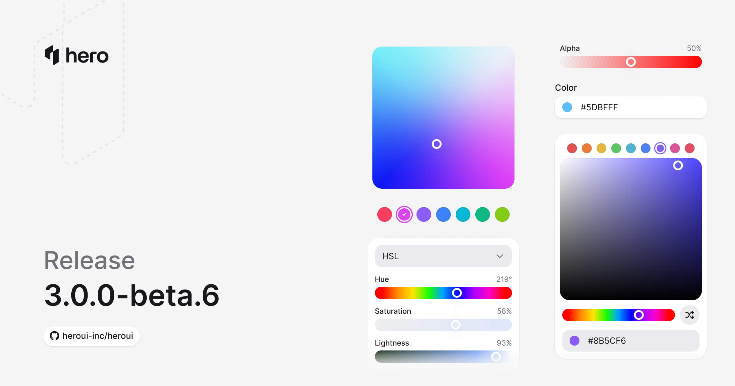
This release introduces a comprehensive Color System with six new components for color selection and manipulation: ColorPicker, ColorArea, ColorSlider, ColorField, ColorSwatch, and ColorSwatchPicker. Also includes Separator variants and various style improvements.
Installation
Update to the latest version:
npm i @lenso/tokens@beta @lenso/ui@betaUsing AI assistants? Simply prompt "Hey Cursor, update HeroUI to the latest version" and your AI assistant will automatically compare versions and apply the necessary changes. Learn more about the HeroUI MCP Server.
What's New
Color System
We're excited to introduce a comprehensive Color System - a complete suite of components for color selection, manipulation, and display. These components are built on React Aria's color primitives and work together seamlessly.
Key features:
- Full Color Space Support: Work with HSL, HSB, and RGB color spaces
- Channel-based Editing: Manipulate individual color channels (hue, saturation, lightness, brightness, red, green, blue, alpha)
- Accessible by Default: Full keyboard navigation and screen reader support
- Composable Design: Mix and match components to build custom color pickers
New Components
This release introduces 6 new color components:
- ColorPicker: Complete color picker with trigger, popover, and composable internals. (Documentation)
- ColorArea: 2D gradient area for selecting two color channels simultaneously. (Documentation)
- ColorSlider: Single-channel slider for precise color adjustments. (Documentation)
- ColorField: Text input for entering and editing color values. (Documentation)
- ColorSwatch: Visual color preview with support for transparency. (Documentation)
- ColorSwatchPicker: Grid of selectable color swatches for quick color selection. (Documentation)
ColorPicker
The ColorPicker is a compound component that combines all color components into a complete color selection experience.
"use client";
import { ColorArea, ColorPicker, ColorSlider, ColorSwatch } from "@lenso/ui";import * as stylex from "@stylexjs/stylex";
const styles = stylex.create({ area: { maxWidth: "100%" }, slider: { gap: 4, paddingInline: 4 }, output: { color: "var(--muted)" },});export function Basic() { return ( <ColorPicker defaultValue="#0485F7"> <ColorPicker.Trigger> <ColorSwatch size="lg" /> <span>Pick a color</span> </ColorPicker.Trigger> <ColorPicker.Popover> <ColorArea aria-label="Color area" xstyle={styles.area} colorSpace="hsb" xChannel="saturation" yChannel="brightness" > <ColorArea.Thumb /> </ColorArea> <ColorSlider aria-label="Hue" channel="hue" xstyle={styles.slider} colorSpace="hsb"> <span>Hue</span> <ColorSlider.Output xstyle={styles.output} /> <ColorSlider.Track> <ColorSlider.Thumb /> </ColorSlider.Track> </ColorSlider> </ColorPicker.Popover> </ColorPicker> );}Local adaptation source above. Derived from HeroUI v3.2.6 source.
ColorArea
A 2D gradient area for selecting two color channels at once, typically saturation and brightness.
"use client";
import { ColorArea } from "@lenso/ui";
export function ColorAreaBasic() { return ( <ColorArea aria-label="Color area" defaultValue="rgb(116, 52, 255)"> <ColorArea.Thumb /> </ColorArea> );}Local adaptation source above. Derived from HeroUI v3.2.6 source.
ColorSlider
A slider for adjusting individual color channels like hue, saturation, lightness, or alpha.
"use client";
import { ColorSlider } from "@lenso/ui";import * as stylex from "@stylexjs/stylex";
const styles = stylex.create({ slider: { width: "100%", maxWidth: 320 } });export function Basic() { return ( <ColorSlider aria-label="Hue" channel="hue" xstyle={styles.slider} defaultValue="hsl(0, 100%, 50%)" > <span>Hue</span> <ColorSlider.Output /> <ColorSlider.Track> <ColorSlider.Thumb /> </ColorSlider.Track> </ColorSlider> );}Local adaptation source above. Derived from HeroUI v3.2.6 source.
With different channels:
"use client";/** Adapted from HeroUI v3.2.6. Apache-2.0. */import { ColorSlider, ColorSwatch, parseColor } from "@lenso/ui";import { useState } from "react";import * as stylex from "@stylexjs/stylex";import { styles } from "../color-picker/source.stylex";export function Channels() { const [color, setColor] = useState(parseColor("hsl(0, 100%, 50%)")); return ( <div {...stylex.props(styles.column, styles.xs)}> {(["hue", "saturation", "lightness"] as const).map((channel) => ( <ColorSlider key={channel} channel={channel} value={color} onChange={setColor}> <ColorSlider.Label xstyle={styles.capitalize}>{channel}</ColorSlider.Label> <ColorSlider.Output /> <ColorSlider.Track> <ColorSlider.Thumb /> </ColorSlider.Track> </ColorSlider> ))} <div {...stylex.props(styles.row2)}> <ColorSwatch color={color} size="sm" /> <p {...stylex.props(styles.muted)}> Current color: <code {...stylex.props(styles.mono)}>{color.toString("hsl")}</code> </p> </div> </div> );}Local adaptation source above. Derived from HeroUI v3.2.6 source.
ColorField
A text input field for entering color values directly. Supports various color formats.
"use client";
import { ColorField, ColorSwatch, parseColor } from "@lenso/ui";import { useState } from "react";import * as stylex from "@stylexjs/stylex";
const styles = stylex.create({ field: { width: 280, maxWidth: "100%" } });export function Basic() { const [color, setColor] = useState<ReturnType<typeof parseColor> | null>(() => parseColor("#0485F7"), ); return ( <ColorField xstyle={styles.field} name="color" value={color} onChange={setColor}> <ColorField.Label>Color</ColorField.Label> <ColorField.Group> <ColorField.Prefix> <ColorSwatch {...(color ? { color } : {})} size="xs" /> </ColorField.Prefix> <ColorField.Input /> </ColorField.Group> </ColorField> );}Local adaptation source above. Derived from HeroUI v3.2.6 source.
ColorSwatch
A visual display of a color value with support for transparency patterns.
"use client";
import { ColorSwatch } from "@lenso/ui";import * as stylex from "@stylexjs/stylex";
const styles = stylex.create({ row: { display: "flex", alignItems: "center", gap: 12 } });export function ColorSwatchBasic() { return ( <div {...stylex.props(styles.row)}> <ColorSwatch aria-label="Blue" color="#0485F7" /> <ColorSwatch aria-label="Red" color="#EF4444" /> <ColorSwatch aria-label="Amber" color="#F59E0B" /> <ColorSwatch aria-label="Green" color="#10B981" /> <ColorSwatch aria-label="Fuchsia" color="#D946EF" /> </div> );}Local adaptation source above. Derived from HeroUI v3.2.6 source.
ColorSwatchPicker
A grid of color swatches for quick color selection from a predefined palette.
"use client";
import { ColorSwatchPicker } from "@lenso/ui";
const colors = ["#F43F5E", "#D946EF", "#8B5CF6", "#3B82F6", "#06B6D4", "#10B981", "#84CC16"];export function Basic() { return ( <ColorSwatchPicker aria-label="Choose a color"> {colors.map((color) => ( <ColorSwatchPicker.Item key={color} color={color}> <ColorSwatchPicker.Swatch /> <ColorSwatchPicker.Indicator /> </ColorSwatchPicker.Item> ))} </ColorSwatchPicker> );}Local adaptation source above. Derived from HeroUI v3.2.6 source.
Component Improvements
Toast Enhancements
The Toast component has been significantly improved with new features and better stability (#6151):
New Features:
- Loading State: Added
isLoadingprop to show a spinner instead of the default indicator - Default Timeout: Toasts now auto-dismiss after 4 seconds by default (configurable via
timeoutprop) - Width Control: Added
widthprop toToast.Providerfor customizable toast width - Adaptive Height: Toasts now adapt their height based on content
- Better Stacking: Fixed layout shifts when toasts stack using absolute positioning and height synchronization
- Improved Close Handling: Deferred
onClosecallback to prevent toast transition deadlock - Front-most Close Button: Close button only appears on the front-most toast for cleaner UI
- Enhanced Promise Support: Improved
toast.promise()with better loading states and error handling
New Demos:
- Promise & Loading states
- Callbacks and timeout handling
"use client";
// Adapted from HeroUI v3.2.6 variants, Apache-2.0.import { HardDrive, Persons } from "@gravity-ui/icons";import * as stylex from "@stylexjs/stylex";import { Button, Toast } from "@lenso/ui";import { Notifications, styles, type ToastData } from "./_shared";
function Messages() { const manager = Toast.useToastManager<ToastData>(); return ( <> <div {...stylex.props(styles.frame)}> <div {...stylex.props(styles.buttons)}> <Button size="sm" variant="tertiary" onClick={() => { const id = manager.add({ title: "You have been invited to join a team", description: "Bob sent you an invitation to join HeroUI team", type: "default", data: { indicator: <Persons />, actionStyle: "tertiary" }, actionProps: { children: "Dismiss", onClick: () => manager.close(id) }, }); }} > Default toast </Button> <Button size="sm" variant="secondary" onClick={() => { const id = manager.add({ title: "You have 2 credits left", description: "Get a paid plan for more credits", type: "accent", actionProps: { children: "Upgrade", onClick: () => manager.close(id) }, }); }} > Accent toast </Button> <Button xstyle={styles.successText} size="sm" variant="tertiary" onClick={() => { const id = manager.add({ title: "You have upgraded your plan", description: "You can continue using HeroUI Chat", type: "success", data: { actionStyle: "success" }, actionProps: { children: "Billing", onClick: () => manager.close(id) }, }); }} > Success toast </Button> <Button xstyle={styles.warningText} size="sm" variant="tertiary" onClick={() => { const id = manager.add({ title: "You have no credits left", description: "Upgrade to a paid plan to continue", type: "warning", data: { actionStyle: "warning" }, actionProps: { children: "Upgrade", onClick: () => manager.close(id) }, }); }} > Warning toast </Button> <Button size="sm" variant="danger-soft" onClick={() => { const id = manager.add({ title: "Storage is full", description: "Remove files to release space. Adding more text to demonstrate longer content display", type: "danger", data: { indicator: <HardDrive />, actionStyle: "danger" }, actionProps: { children: "Remove", onClick: () => manager.close(id) }, }); }} > Danger toast </Button> </div> </div> <Notifications /> </> );}
export function Variants() { return ( <Toast.Provider> <Messages /> </Toast.Provider> );}Local adaptation source above. Derived from HeroUI v3.2.6 source.
Separator Variants
Added variants to the Separator component for different visual styles.
Chip Component - Label Slot
The Chip component now supports a Chip.Label subcomponent for better visual alignment. When removing start or end content (like icons), the label text was too close to the chip edges. Plain text children are automatically wrapped in <Chip.Label> for backward compatibility.
Usage:
import { Chip } from '@lenso/ui';
// Automatic wrapping (backward compatible)<Chip>Label text</Chip>
// Explicit label with custom styling<Chip> <Chip.Label className="font-bold">Custom Label</Chip.Label></Chip>
// Mixing icons and labels<Chip> <Icon icon="gravity-ui:check" /> <Chip.Label>With Icon</Chip.Label></Chip>Style Fixes
- Overlay Content: Fixed blur effect on overlay content (#6136)
- Invalid Field: Converted ring to outline for invalid field states (#6184)
- Link with Button: Fixed styling for Link components using button variants (#6138)
- Toast Content: Fixed vertical alignment of toast content (#6147)
- Safari SVG: Fixed SVG shifting issue in Safari (#6149)
- Placeholder Color: Aligned placeholder color with input text (#6139)
- Tooltip: Removed cursor style from tooltip trigger component
- CSS Variables: Made calculated variables depend only on root variables (#6154)
Bug Fixes
- Fixed page interactivity during view transitions (#6128)
- Fixed markdown URL formatting (#6162)
- Fixed incorrect link to combo box page (#6164)
- Fixed autocomplete styles import order in index.css
- Fixed hyphenated format for CSS classes (#6191)
⚠️ Breaking Changes
Toast Component - Container Renamed to Provider
The Toast.Container component has been renamed to Toast.Provider for better semantic clarity (#6151).
Before:
<Toast.Container placement="bottom" />After:
<Toast.Provider placement="bottom" />Additional Changes:
- Default
gapprop changed from14to12pixels - Default
timeoutis now4000(4 seconds) instead of requiring explicit timeout Toast.Actionhas been renamed toToast.ActionButtonfor consistency
CSS Class Naming Convention
CSS classes have been renamed to use hyphenated format for consistency (#6141). This follows BEM conventions more closely and improves compatibility with Tailwind CSS.
Important Note: The textarea class was initially renamed to text-area but was rolled back to textarea in PR #6191 due to conflicts with Tailwind's native textarea class. No changes are needed for TextArea component classes.
Component Class Name Changes
The following CSS class names have been updated. If you have custom CSS targeting these classes directly, update your selectors:
| Component | Old Class Name | New Class Name | Notes |
|---|---|---|---|
| ComboBox | .combobox | .combo-box | All related classes updated |
.combobox__input-group | .combo-box__input-group | ||
.combobox__trigger | .combo-box__trigger | ||
.combobox__popover | .combo-box__popover | ||
.combobox--full-width | .combo-box--full-width | ||
| ListBox | .listbox | .list-box | All related classes updated |
| ListBoxItem | .listbox-item | .list-box-item | All related classes updated |
.listbox-item__indicator | .list-box-item__indicator | ||
.listbox-item--default | .list-box-item--default | ||
.listbox-item--danger | .list-box-item--danger | ||
| ListBoxSection | .listbox-section | .list-box-section | All related classes updated |
| TextArea | .textarea | .textarea | No change - Rolled back to avoid Tailwind conflict |
Migration Guide
Before:
/* Custom styles targeting old class names */.combobox { /* styles */}
.listbox-item { /* styles */}After:
/* Update to new hyphenated class names */.combo-box { /* styles */}
.list-box-item { /* styles */}JavaScript/TypeScript Updates:
If you're using these class names in JavaScript or TypeScript code:
// Before<div className="combobox" /><ListBoxItem className="listbox-item" />
// After<div className="combo-box" /><ListBoxItem className="list-box-item" />Note: Component props and TypeScript types remain unchanged. Only CSS class names have been updated.
Removed CSS Variables
Several CSS variables have been removed as part of the surface color refactoring (#6204). These variables were either replaced with direct variable references or removed entirely.
Surface Color Variables
The following calculated surface color variables have been removed and replaced with direct variable references:
Removed:
--color-surface-secondary(was calculated viacolor-mix)--color-surface-tertiary(was calculated viacolor-mix)
Replacement:
These variables now directly reference the base variables defined in variables.css:
--color-surface-secondary→ Usesvar(--surface-secondary)directly--color-surface-tertiary→ Usesvar(--surface-tertiary)directly
The base variables --surface-secondary and --surface-tertiary are now defined directly in variables.css instead of being calculated in theme.css.
On Surface Color Variables
All --color-on-surface-* variables have been removed entirely:
Removed:
--color-on-surface--color-on-surface-foreground--color-on-surface-hover--color-on-surface-focus--color-on-surface-secondary--color-on-surface-secondary-foreground--color-on-surface-secondary-hover--color-on-surface-secondary-focus--color-on-surface-tertiary--color-on-surface-tertiary-foreground--color-on-surface-tertiary-hover--color-on-surface-tertiary-focus
Migration:
If you were using these variables, update your code to use the appropriate surface variables directly:
/* Before */.element { background: var(--color-on-surface); color: var(--color-on-surface-foreground);}
.element:hover { background: var(--color-on-surface-hover);}
/* After */.element { background: var(--surface-secondary); color: var(--surface-secondary-foreground);}
.element:hover { background: color-mix(in oklab, var(--surface-secondary) 92%, var(--surface-secondary-foreground) 8%);}Or use the Tailwind utilities:
// Before<div className="bg-on-surface text-on-surface-foreground" />
// After<div className="bg-surface-secondary text-surface-secondary-foreground" />Related PR: #6204
Links
Contributors
Thanks to everyone who contributed to this release!
HeroUI contributors