v3.0.0-beta.4
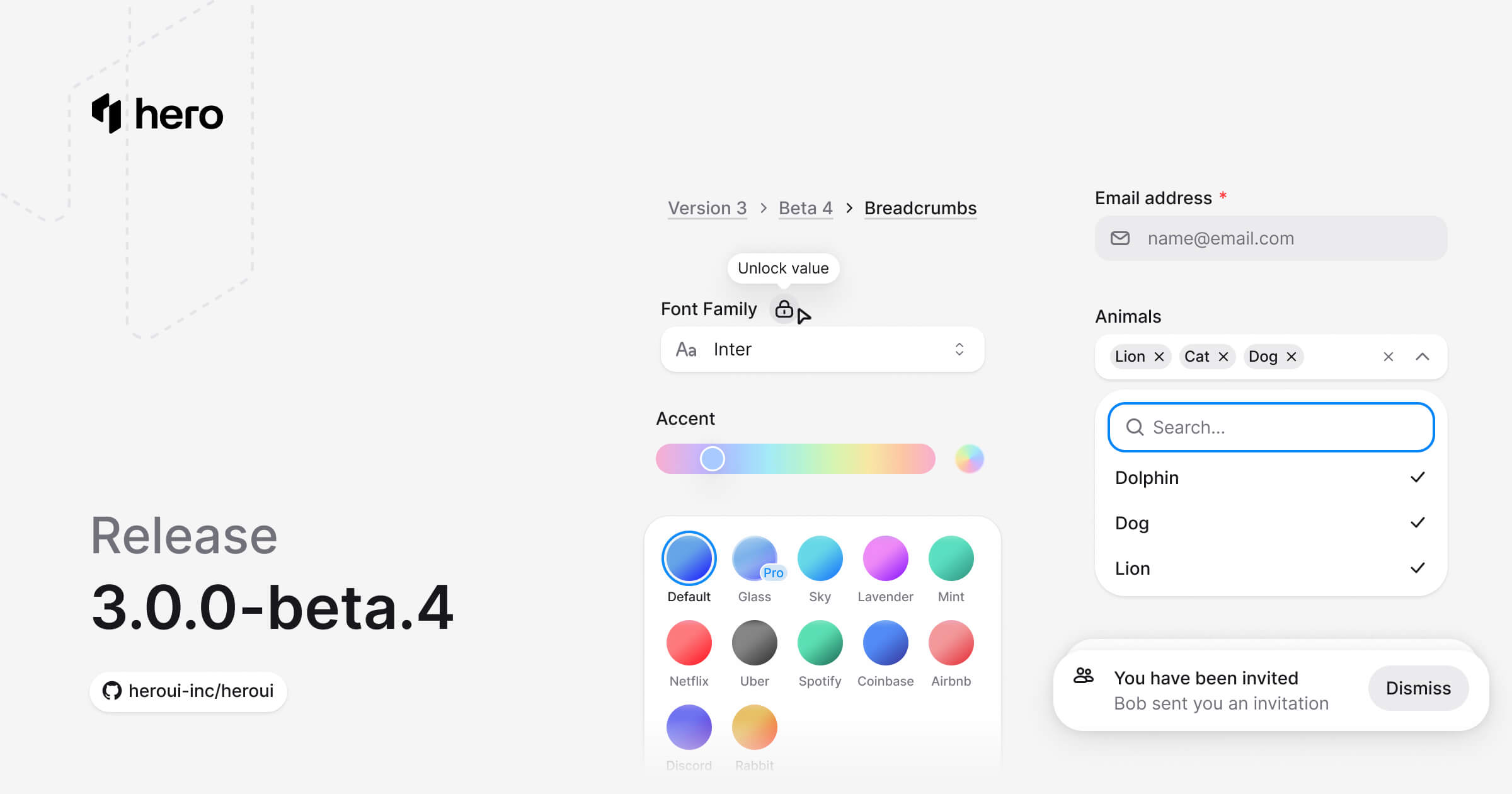
New Theme Builder, three new components (Autocomplete, Breadcrumbs, Toast), Tabs secondary variant, Input/InputGroup variants, and various improvements.
Critical Build Issue Fixed: This version (beta.4) had a critical build issue that has been fixed in beta.5. Please upgrade to @lenso/[email protected] and @lenso/[email protected] to ensure proper TypeScript declaration generation and export resolution.
This release introduces the new Theme Builder for visual theme customization, three new components (Autocomplete, Breadcrumbs, Toast), adds secondary variant to Tabs, primary/secondary variants to Input and InputGroup, TextArea support for InputGroup, and ⚠️ breaking changes removing Link's underline variants and the isInSurface prop from form components.
Installation
Update to the latest version:
npm i @lenso/tokens@beta @lenso/ui@betaUsing AI assistants? Simply prompt "Hey Cursor, update HeroUI to the latest version" and your AI assistant will automatically compare versions and apply the necessary changes. Learn more about the HeroUI MCP Server.
What's New
Theme Builder
We're excited to introduce the Theme Builder - a powerful visual tool for creating and customizing HeroUI themes. Build your perfect theme with real-time preview and export ready-to-use CSS.
Key features:
- Visual Color Editing: Adjust colors using OKLCH color pickers with intuitive sliders for lightness, chroma, and hue
- Real-time Preview: See your changes instantly on live component previews
- Custom Accent Colors: Define your brand colors and watch them propagate across all components
- Preset Themes: Start from curated presets like Default, Airbnb, Coinbase, Discord, and more
- Export Ready: Generate CSS variables ready to copy into your project
- Light & Dark Mode: Customize both themes simultaneously with linked or independent values
- Keyboard Shortcuts: Undo/redo support and quick actions for efficient workflow
Try it now at v3.heroui.com/themes.
New Components
This release introduces 3 new essential components:
- Autocomplete: Combines a select with filtering, allowing users to search and select from a list of options. (Documentation)
- Breadcrumbs: Navigation breadcrumbs showing the current page's location within a hierarchy. (Documentation)
- Toast: Display temporary notifications and messages with automatic dismissal and customizable placement. (Documentation)
Autocomplete
"use client";/** HeroUI v3.2.6 adaptation. SPDX-License-Identifier: Apache-2.0 */import { NativeAutocomplete } from "./_native";
export const states = [ { id: "florida", name: "Florida" }, { id: "delaware", name: "Delaware" }, { id: "california", name: "California" }, { id: "texas", name: "Texas" }, { id: "new-york", name: "New York" }, { id: "washington", name: "Washington" },];export default function Default() { return ( <NativeAutocomplete items={states} label="States to Visit" placeholder="Select states" multiple chips hideClear /> );}Local adaptation source above. Derived from HeroUI v3.2.6 source.
Breadcrumbs
"use client";
import { Breadcrumbs } from "@lenso/ui";
export function BreadcrumbsBasic() { return ( <Breadcrumbs> <Breadcrumbs.Item href="#">Home</Breadcrumbs.Item> <Breadcrumbs.Item href="#">Products</Breadcrumbs.Item> <Breadcrumbs.Item href="#">Electronics</Breadcrumbs.Item> <Breadcrumbs.Item>Laptop</Breadcrumbs.Item> </Breadcrumbs> );}export default BreadcrumbsBasic;Local adaptation source above. Derived from HeroUI v3.2.6 source.
Toast
This component is currently in preview and some features might not work as expected.
"use client";
// Adapted from HeroUI v3.2.6 variants, Apache-2.0.import { HardDrive, Persons } from "@gravity-ui/icons";import * as stylex from "@stylexjs/stylex";import { Button, Toast } from "@lenso/ui";import { Notifications, styles, type ToastData } from "./_shared";
function Messages() { const manager = Toast.useToastManager<ToastData>(); return ( <> <div {...stylex.props(styles.frame)}> <div {...stylex.props(styles.buttons)}> <Button size="sm" variant="tertiary" onClick={() => { const id = manager.add({ title: "You have been invited to join a team", description: "Bob sent you an invitation to join HeroUI team", type: "default", data: { indicator: <Persons />, actionStyle: "tertiary" }, actionProps: { children: "Dismiss", onClick: () => manager.close(id) }, }); }} > Default toast </Button> <Button size="sm" variant="secondary" onClick={() => { const id = manager.add({ title: "You have 2 credits left", description: "Get a paid plan for more credits", type: "accent", actionProps: { children: "Upgrade", onClick: () => manager.close(id) }, }); }} > Accent toast </Button> <Button xstyle={styles.successText} size="sm" variant="tertiary" onClick={() => { const id = manager.add({ title: "You have upgraded your plan", description: "You can continue using HeroUI Chat", type: "success", data: { actionStyle: "success" }, actionProps: { children: "Billing", onClick: () => manager.close(id) }, }); }} > Success toast </Button> <Button xstyle={styles.warningText} size="sm" variant="tertiary" onClick={() => { const id = manager.add({ title: "You have no credits left", description: "Upgrade to a paid plan to continue", type: "warning", data: { actionStyle: "warning" }, actionProps: { children: "Upgrade", onClick: () => manager.close(id) }, }); }} > Warning toast </Button> <Button size="sm" variant="danger-soft" onClick={() => { const id = manager.add({ title: "Storage is full", description: "Remove files to release space. Adding more text to demonstrate longer content display", type: "danger", data: { indicator: <HardDrive />, actionStyle: "danger" }, actionProps: { children: "Remove", onClick: () => manager.close(id) }, }); }} > Danger toast </Button> </div> </div> <Notifications /> </> );}
export function Variants() { return ( <Toast.Provider> <Messages /> </Toast.Provider> );}Local adaptation source above. Derived from HeroUI v3.2.6 source.
Component Improvements
Tabs Secondary Variant
Added a new secondary variant to Tabs with an underline indicator style. The secondary variant supports both horizontal and vertical orientations.
"use client";export { Secondary } from "./source";Local adaptation source above. Derived from HeroUI v3.2.6 source.
Usage:
<Tabs variant="secondary"> <Tabs.ListContainer> <Tabs.List aria-label="Options"> <Tabs.Tab id="overview"> Overview <Tabs.Indicator /> </Tabs.Tab> <Tabs.Tab id="analytics"> Analytics <Tabs.Indicator /> </Tabs.Tab> </Tabs.List> </Tabs.ListContainer> <Tabs.Panel id="overview">Content</Tabs.Panel> <Tabs.Panel id="analytics">Content</Tabs.Panel></Tabs>Input Variants
Added primary and secondary variants to the Input component:
primary(default): Standard styling with shadow, suitable for most use casessecondary: Lower emphasis variant without shadow, suitable for use in Surface components
"use client";// Adapted from HeroUI v3.2.6 (e385ac202b2cdb94b1bf6fa76d32c31c8259cc5e), Apache-2.0.import { Input } from "@lenso/ui";import * as stylex from "@stylexjs/stylex";const styles = stylex.create({ root: { display: "flex", width: 240, flexDirection: "column", gap: 8 },});export function Variants() { return ( <div {...stylex.props(styles.root)}> <Input fullWidth placeholder="Primary input" variant="primary" /> <Input fullWidth placeholder="Secondary input" variant="secondary" /> </div> );}Local adaptation source above. Derived from HeroUI v3.2.6 source.
InputGroup Enhancements
The InputGroup component received several improvements:
TextArea Support: Use InputGroup.TextArea for multiline text inputs with prefix and suffix elements.
"use client";// Adapted from HeroUI v3.2.6, Apache-2.0.import { ArrowUp, At, Microphone, PlugConnection, Plus } from "@gravity-ui/icons";import { Button, InputGroup, Kbd, Spinner, TextField, Tooltip } from "@lenso/ui";import * as stylex from "@stylexjs/stylex";import { useState } from "react";const styles = stylex.create({ field: { display: "flex", flexDirection: "column", width: { default: 384, "@media (min-width: 640px)": 512 }, }, group: { display: "flex", flexDirection: "column", gap: 8, borderRadius: 24, paddingBlock: 8 }, prefix: { paddingInline: 12, paddingBlock: 0 }, input: { width: "100%", resize: "none", paddingInline: 14, paddingBlock: 0 }, suffix: { display: "flex", width: "100%", alignItems: "center", gap: 6, paddingInline: 12, paddingBlock: 0, }, actions: { marginInlineStart: "auto", display: "flex", alignItems: "center", gap: 6 }, tooltip: { display: "flex", alignItems: "center", gap: 4 }, hint: { fontSize: 12, lineHeight: "16px" }, key: { height: 16, borderRadius: "var(--radius-sm)", paddingInline: 4 },});export function WithTextArea() { const [value, setValue] = useState(""); const [isSubmitting, setIsSubmitting] = useState(false); const handleSubmit = () => { if (!value.trim()) return; setIsSubmitting(true); setTimeout(() => { setIsSubmitting(false); setValue(""); }, 1000); }; return ( <TextField fullWidth xstyle={styles.field} name="prompt"> <InputGroup fullWidth xstyle={styles.group}> <InputGroup.Prefix xstyle={styles.prefix}> <Button aria-label="Add context" size="sm" variant="outline"> <At aria-hidden="true" /> Add Context </Button> </InputGroup.Prefix> <InputGroup.TextArea aria-label="Prompt input" xstyle={styles.input} placeholder="Assign tasks or ask anything..." rows={5} value={value} onChange={(event) => setValue(event.target.value)} /> <InputGroup.Suffix xstyle={styles.suffix}> <Tooltip> <Tooltip.Trigger delay={0} render={<Button isIconOnly aria-label="Attach file" size="sm" variant="tertiary" />} > <Plus aria-hidden="true" /> </Tooltip.Trigger> <Tooltip.Portal> <Tooltip.Positioner> <Tooltip.Popup> <p {...stylex.props(styles.hint)}>Add a files and more</p> </Tooltip.Popup> </Tooltip.Positioner> </Tooltip.Portal> </Tooltip> <Tooltip> <Tooltip.Trigger delay={0} render={<Button isIconOnly aria-label="Connect Apps" size="sm" variant="tertiary" />} > <PlugConnection aria-hidden="true" /> </Tooltip.Trigger> <Tooltip.Portal> <Tooltip.Positioner> <Tooltip.Popup> <p {...stylex.props(styles.hint)}>Connect apps</p> </Tooltip.Popup> </Tooltip.Positioner> </Tooltip.Portal> </Tooltip> <div {...stylex.props(styles.actions)}> <Tooltip> <Tooltip.Trigger delay={0} render={<Button isIconOnly aria-label="Voice input" size="sm" variant="ghost" />} > <Microphone aria-hidden="true" /> </Tooltip.Trigger> <Tooltip.Portal> <Tooltip.Positioner> <Tooltip.Popup> <p {...stylex.props(styles.hint)}>Voice input</p> </Tooltip.Popup> </Tooltip.Positioner> </Tooltip.Portal> </Tooltip> <Tooltip> <Tooltip.Trigger delay={0} render={ <Button isIconOnly aria-label="Send prompt" disabled={!value.trim()} isLoading={isSubmitting} onClick={handleSubmit} /> } > {isSubmitting ? ( <Spinner color="current" size="sm" /> ) : ( <ArrowUp aria-hidden="true" /> )} </Tooltip.Trigger> <Tooltip.Portal> <Tooltip.Positioner> <Tooltip.Popup xstyle={styles.tooltip}> <p {...stylex.props(styles.hint)}>Send</p> <Kbd xstyle={styles.key}> <Kbd.Abbr keyValue="enter" /> </Kbd> </Tooltip.Popup> </Tooltip.Positioner> </Tooltip.Portal> </Tooltip> </div> </InputGroup.Suffix> </InputGroup> </TextField> );}Local adaptation source above. Derived from HeroUI v3.2.6 source.
Variants: Added primary and secondary variants matching the Input component.
"use client";// Adapted from HeroUI v3.2.6, Apache-2.0.import { Envelope } from "@gravity-ui/icons";import { InputGroup, Label, TextField } from "@lenso/ui";import * as stylex from "@stylexjs/stylex";const styles = stylex.create({ stack: { display: "flex", flexDirection: "column", gap: 16 }, field: { width: 280 }, icon: { width: 16, height: 16, color: "var(--muted)" },});export function Variants() { return ( <div {...stylex.props(styles.stack)}> <TextField xstyle={styles.field} name="primary"> <Label>Primary variant</Label> <InputGroup variant="primary"> <InputGroup.Prefix> <Envelope aria-hidden="true" {...stylex.props(styles.icon)} /> </InputGroup.Prefix> <InputGroup.Input placeholder="[email protected]" /> </InputGroup> </TextField> <TextField xstyle={styles.field} name="secondary"> <Label>Secondary variant</Label> <InputGroup variant="secondary"> <InputGroup.Prefix> <Envelope aria-hidden="true" {...stylex.props(styles.icon)} /> </InputGroup.Prefix> <InputGroup.Input placeholder="[email protected]" /> </InputGroup> </TextField> </div> );}Local adaptation source above. Derived from HeroUI v3.2.6 source.
Button & ButtonGroup Outline Variants
Added a new outline variant to both Button and ButtonGroup components for outlined styling.
"use client";// Adapted from HeroUI v3.2.6 (e385ac2), Apache-2.0.import { Button, ButtonGroup } from "@lenso/ui";import * as stylex from "@stylexjs/stylex";import { styles } from "./source.stylex";export function OutlineVariant() { return ( <div {...stylex.props(styles.column)}> <div {...stylex.props(styles.section)}> <p {...stylex.props(styles.muted)}>Button</p> <div {...stylex.props(styles.row)}> <Button variant="outline">Outline</Button> </div> </div> <div {...stylex.props(styles.section)}> <p {...stylex.props(styles.muted)}>ButtonGroup</p> <ButtonGroup variant="outline"> <Button>First</Button> <Button>Second</Button> <Button>Third</Button> </ButtonGroup> </div> </div> );}Local adaptation source above. Derived from HeroUI v3.2.6 source.
AlertDialog Size Support
Added size support to AlertDialog component, allowing you to control the dialog size.
"use client";// Adapted from HeroUI v3.2.6 alert-dialog-sizes (Apache-2.0).import { Rocket } from "@gravity-ui/icons";import * as stylex from "@stylexjs/stylex";import { AlertDialog, Button } from "@lenso/ui";
const styles = stylex.create({ row: { display: "flex", flexWrap: "wrap", gap: 16 }, icon: { backgroundColor: "var(--default)", color: "var(--foreground)" }, rocket: { width: 20, height: 20 },});
export function Sizes() { const sizes = ["xs", "sm", "md", "lg", "cover"] as const; return ( <div {...stylex.props(styles.row)}> {sizes.map((size) => ( <AlertDialog key={size}> <AlertDialog.Trigger render={<Button variant="secondary" />}> {size.charAt(0).toUpperCase() + size.slice(1)} </AlertDialog.Trigger> <AlertDialog.Portal> <AlertDialog.Backdrop /> <AlertDialog.Viewport> <AlertDialog.Popup size={size}> <AlertDialog.Close aria-label="Close dialog" /> <AlertDialog.Header> <AlertDialog.Icon variant="default" xstyle={styles.icon}> <Rocket {...stylex.props(styles.rocket)} /> </AlertDialog.Icon> <AlertDialog.Title> Size: {size.charAt(0).toUpperCase() + size.slice(1)} </AlertDialog.Title> </AlertDialog.Header> <AlertDialog.Body> <AlertDialog.Description> {size === "cover" ? ( <> This alert dialog uses the <code>cover</code> size variant. It spans the full screen with margins: 16px on mobile and 40px on desktop. Maintains rounded corners and standard padding. Perfect for critical confirmations that need maximum width while preserving alert dialog aesthetics. </> ) : ( <> This alert dialog uses the <code>{size}</code> size variant. On mobile devices, all sizes adapt to near full-width for optimal viewing. On desktop, each size provides a different maximum width to suit various content needs. </> )} </AlertDialog.Description> </AlertDialog.Body> <AlertDialog.Footer> <AlertDialog.Close render={<Button variant="tertiary" />}> Cancel </AlertDialog.Close> <AlertDialog.Close render={<Button />}>Confirm</AlertDialog.Close> </AlertDialog.Footer> </AlertDialog.Popup> </AlertDialog.Viewport> </AlertDialog.Portal> </AlertDialog> ))} </div> );}Local adaptation source above. Derived from HeroUI v3.2.6 source.
Checkbox Animation Improvements
Faster animation and increased stroke width for better feedback on Checkbox.
"use client";/** Adapted from HeroUI v3.2.6. SPDX-License-Identifier: Apache-2.0 */import { Checkbox } from "@lenso/ui";
export function Basic() { return ( <Checkbox name="basic-terms"> <Checkbox.Content> <Checkbox.Control> <Checkbox.Indicator /> </Checkbox.Control> Accept terms and conditions </Checkbox.Content> </Checkbox> );}Local adaptation source above. Derived from HeroUI v3.2.6 source.
Link Text Decoration
The Link component now uses Tailwind CSS classes for text decoration instead of built-in variants. This provides more flexibility and follows Tailwind conventions.
Available Tailwind utilities:
underline- Always visible underlineno-underline- Remove underlinehover:underline- Underline appears on hoverdecoration-primary,decoration-secondary, etc. - Set underline colordecoration-1,decoration-2,decoration-4- Control thicknessunderline-offset-1,underline-offset-2, etc. - Adjust spacing
"use client";// Adapted from HeroUI v3.2.6 (e385ac2), Apache-2.0.import { Link } from "@lenso/ui";import * as stylex from "@stylexjs/stylex";import { styles } from "./source.stylex";export function LinkUnderlineAndOffset() { return ( <div {...stylex.props(styles.sections)}> <div {...stylex.props(styles.section)}> <p {...stylex.props(styles.caption)}>Default hover underline</p> <Link href="#"> Hover to see the underline <Link.Icon /> </Link> </div> <div {...stylex.props(styles.section)}> <p {...stylex.props(styles.caption)}>Always visible underline</p> <Link href="#" xstyle={styles.underline}> Underline always visible <Link.Icon /> </Link> </div> <div {...stylex.props(styles.section)}> <p {...stylex.props(styles.caption)}>No underline</p> <Link href="#" xstyle={styles.noUnderline}> Link without any underline <Link.Icon /> </Link> </div> <div {...stylex.props(styles.section)}> <p {...stylex.props(styles.caption)}>Changing the underline offset</p> <div {...stylex.props(styles.column)}> {[styles.offset1, styles.offset2, styles.offset3, styles.offset4].map((offset, index) => ( <Link key={index} href="#" xstyle={offset}> Offset {index + 1} ({index + 1}px space) <Link.Icon /> </Link> ))} </div> </div> </div> );}Local adaptation source above. Derived from HeroUI v3.2.6 source.
⚠️ Breaking Changes
Link Component - Removed Underline Variants
The Link component's built-in underline and underlineOffset props have been removed. Use Tailwind CSS classes instead for text decoration.
Before:
<Link href="#" underline="hover" underlineOffset={4}> Link text</Link>After:
<Link href="#" className="hover:underline underline-offset-4"> Link text</Link>Available Tailwind classes:
underline,no-underline,hover:underline- Decoration linedecoration-primary,decoration-muted, etc. - Decoration colordecoration-solid,decoration-dashed,decoration-dotted- Decoration styledecoration-1,decoration-2,decoration-4- Decoration thicknessunderline-offset-1,underline-offset-2,underline-offset-4- Underline offset
For more details, see the Link documentation.
Form Components - Removed isInSurface Prop
The isInSurface prop and automatic surface detection have been removed from form-based components. Instead, use the variant="secondary" prop when placing form components inside Surface, Card, or other surface-based containers.
Before:
<Surface> {/* Input automatically detected surface context */} <Input isInSurface /></Surface>After:
<Surface> {/* Use variant="secondary" for surface backgrounds */} <Input variant="secondary" /></Surface>Affected components:
- Input
- InputGroup
- TextField
- TextArea
- SearchField
- NumberField
- DateField
- TimeField
- Select
- ComboBox
- Autocomplete
The secondary variant provides lower emphasis styling without shadow, which is appropriate for use on surface backgrounds.
Style Fixes
- Button: Updated secondary button colors for improved visual consistency
- Checkbox: Optimized animation speed and increased stroke width for better feedback (see Checkbox Animation Improvements)
- Link: Updated decoration styles and transition timings
- Focus Visible: Added
:not(:focus)to focus-visible selectors to prevent conflicts with hover states - Separator: Fixed styles to only apply to horizontal separator
Bug Fixes
- Fixed Link with Button variants styling
- Fixed Fieldset flexbox quirk in Safari with BEM styles
- Fixed SearchField empty state to properly disable clear button
- Fixed ButtonGroup context to only apply to direct children
- Fixed ButtonGroup
BUTTON_GROUP_CHILDre-export for type declarations
Dependencies
Direct Exports from React Aria Components
HeroUI now provides direct exports from react-aria-components for easier access to primitives and utilities. These exports are particularly useful for React Aria Framework setup.
Providers:
RouterProvider- Configure React Aria links to use your client-side routerI18nProvider- Set the locale used by React Aria components
Hooks and Utilities:
isRTL- Check if a locale is right-to-leftuseLocale- Access the current locale and directionuseFilter- Filter and sort collections
Components:
Collection- Collection component for managing listsListBoxLoadMoreItem- ListBox item for loading more items
i18n Utilities:
getLocalizationScript- Get localization script for server-side rendering (fromreact-aria-components/i18n)
All of these can be imported directly from @lenso/ui:
import { RouterProvider, I18nProvider, isRTL, useLocale, useFilter, getLocalizationScript} from "@lenso/ui";Links
- Theme Builder
- Component Documentation
- Design System - Figma Kit V3 (updated)
- GitHub Repository
- GitHub PR #6121
Contributors
Thanks to everyone who contributed to this release!
HeroUI contributors